> ## Documentation Index
> Fetch the complete documentation index at: https://docs.userpilot.com/llms.txt
> Use this file to discover all available pages before exploring further.
# Style Checklist Widget
> To pick out a Theme for your Checklist, go to Style. You can pick out either a Light or Dark Theme. You also have the option to create your theme.
## Style Widget
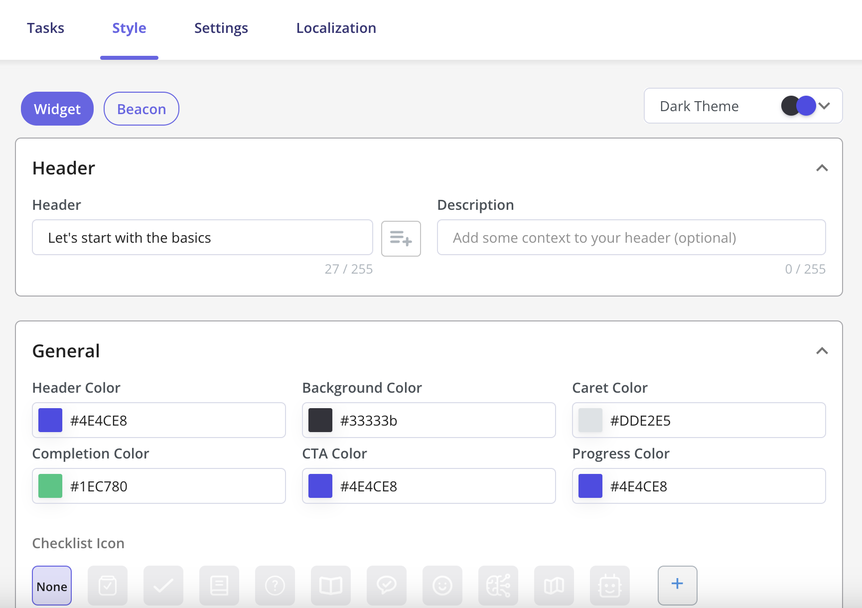
To pick out a Theme for your Checklist, go to **Style**. You can pick out either a **Light** or **Dark** Theme. You also have the option to create your theme.
 The **Widget** gives you the option to add an Icon to your checklist or upload and add your own.
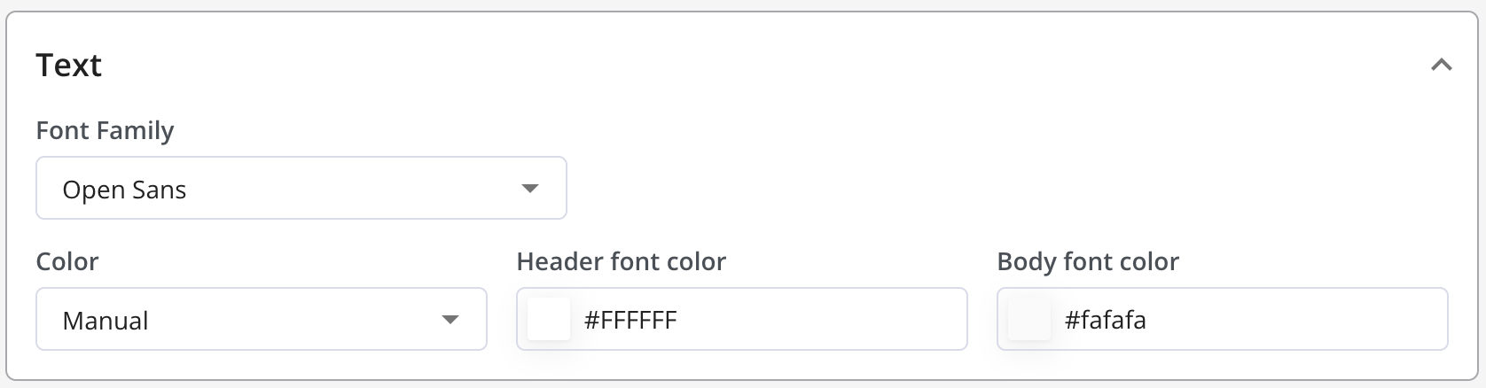
 Next, it's time to pick out your Text Font and Color. You can even [add your own font](https://docs.userpilot.com/in-app-engagement/flows/getting-started/themes#customizing-your-font)
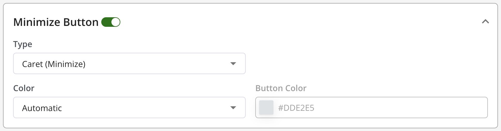
 And finally, the **Close Button**. This feature is optional, but if you do activate it, it gives you the option of either minimizing or dismissing your Checklist.
 ## Checklist Custom CSS
You can now customize the Checklist using Custom CSS from the themes section as per your use case.
## Checklist Custom CSS
You can now customize the Checklist using Custom CSS from the themes section as per your use case.
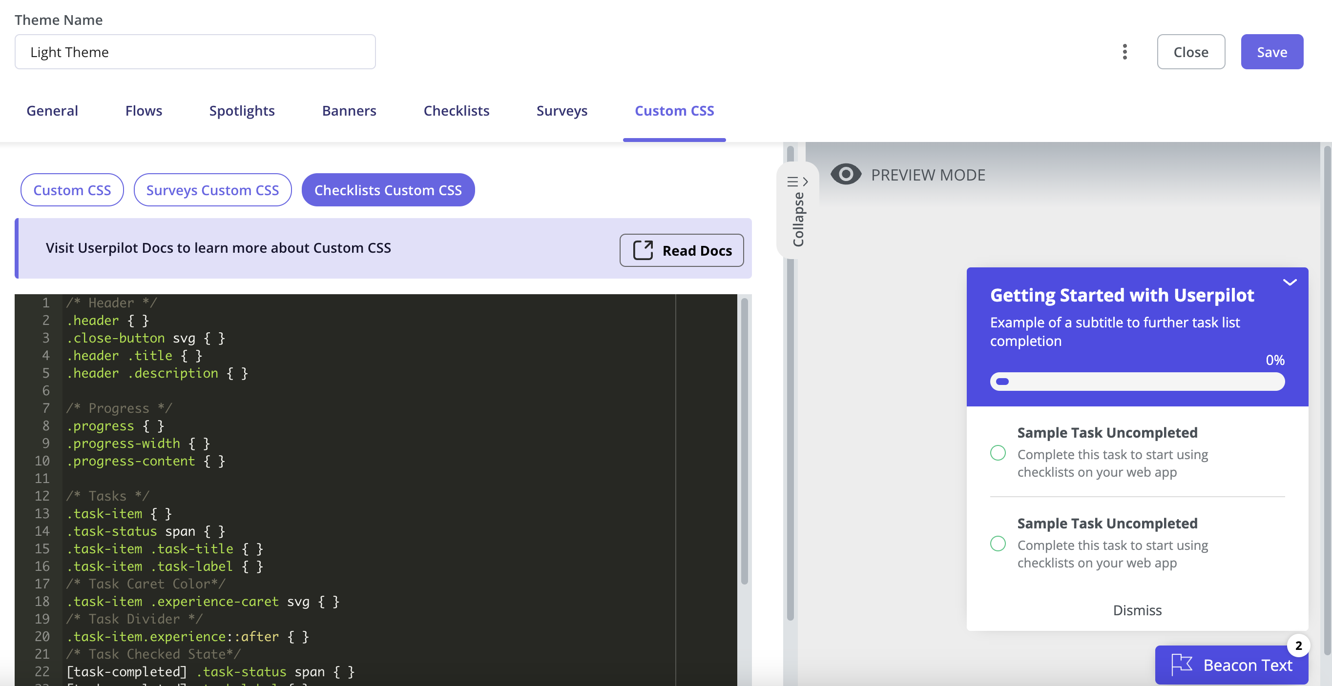 **For example:**
* You can change the color of a task's title and description once it's completed.
* You can update the Checklist beacon's color to reflect when all tasks are completed.
**For example:**
* You can change the color of a task's title and description once it's completed.
* You can update the Checklist beacon's color to reflect when all tasks are completed.
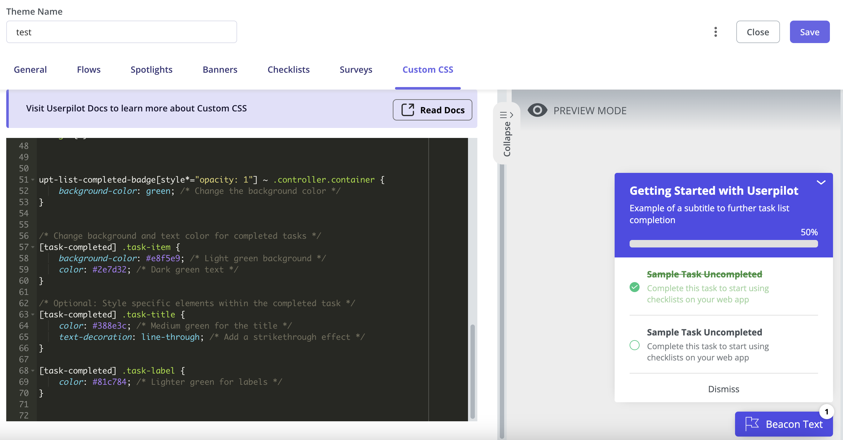
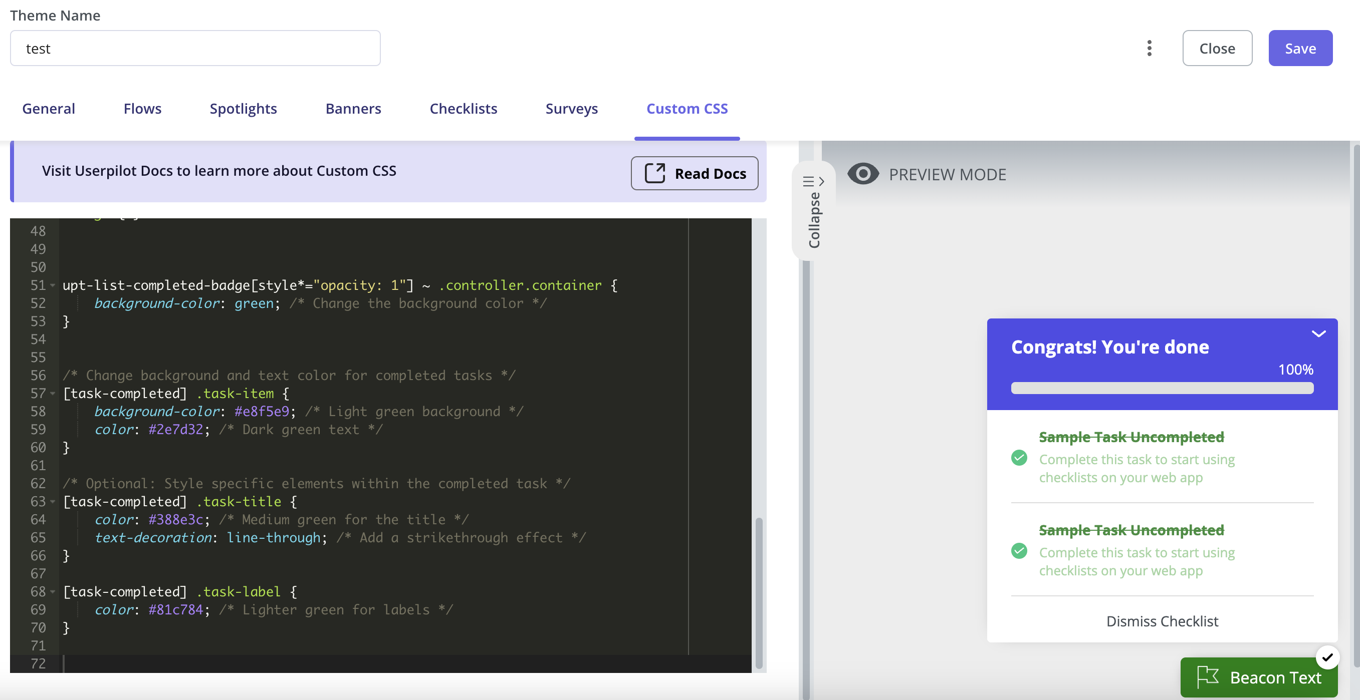 * You can also customize the height and width of the beacon/widget and add some padding to the text/progress bar as per your preferences.