> ## Documentation Index
> Fetch the complete documentation index at: https://docs.userpilot.com/llms.txt
> Use this file to discover all available pages before exploring further.
# Build a Mobile Slideout
> Mobile Slideouts are single-step overlays that appear over part of your mobile apps screen. Unlike multi-screen Carousels that take over the entire display,.
## Overview
Mobile Slideouts are single-step overlays that appear over part of your mobile apps screen. Unlike multi-screen Carousels that take over the entire display, Slideouts offer a lighter-touch way to communicate with users without disrupting their context completely.
They’re perfect for highlighting a new feature, prompting an action, or providing important updates in a subtle yet effective format.
Slideouts are easy to build, and a fully customizable code is required.
## **Use Cases**
* Share time-sensitive announcements without taking over the whole screen.
* Encourage completion of key actions (like verifying email or enabling notifications).
* Communicate important alerts or policy updates in a less intrusive way.
## Prerequisite
To start showing Mobile Slideouts to your end users, you’ll need to install the Userpilot script in your mobile application. Feel free to share the [installation instructions](https://docs.userpilot.com/developer/installation/mobile/overview) with your engineering team, or reach out to our support team at [support@userpilot.com](mailto:support@userpilot.com) if you encounter any issues during installation.
## How to Create a Slideout
Go to **Engagement > Mobile** in the navbar and click **Create Content**.
.png?fit=max&auto=format&n=0hCXw5eVRU6iqpYB&q=85&s=8ec3c01a2268cf4671eadf66371969b3)
.png?fit=max&auto=format&n=6mq0DeMvNIpVRWN5&q=85&s=aa65fc3df31b5f3db984576d2adb4a73) Select **Slideout** as your content type.
Select **Slideout** as your content type.
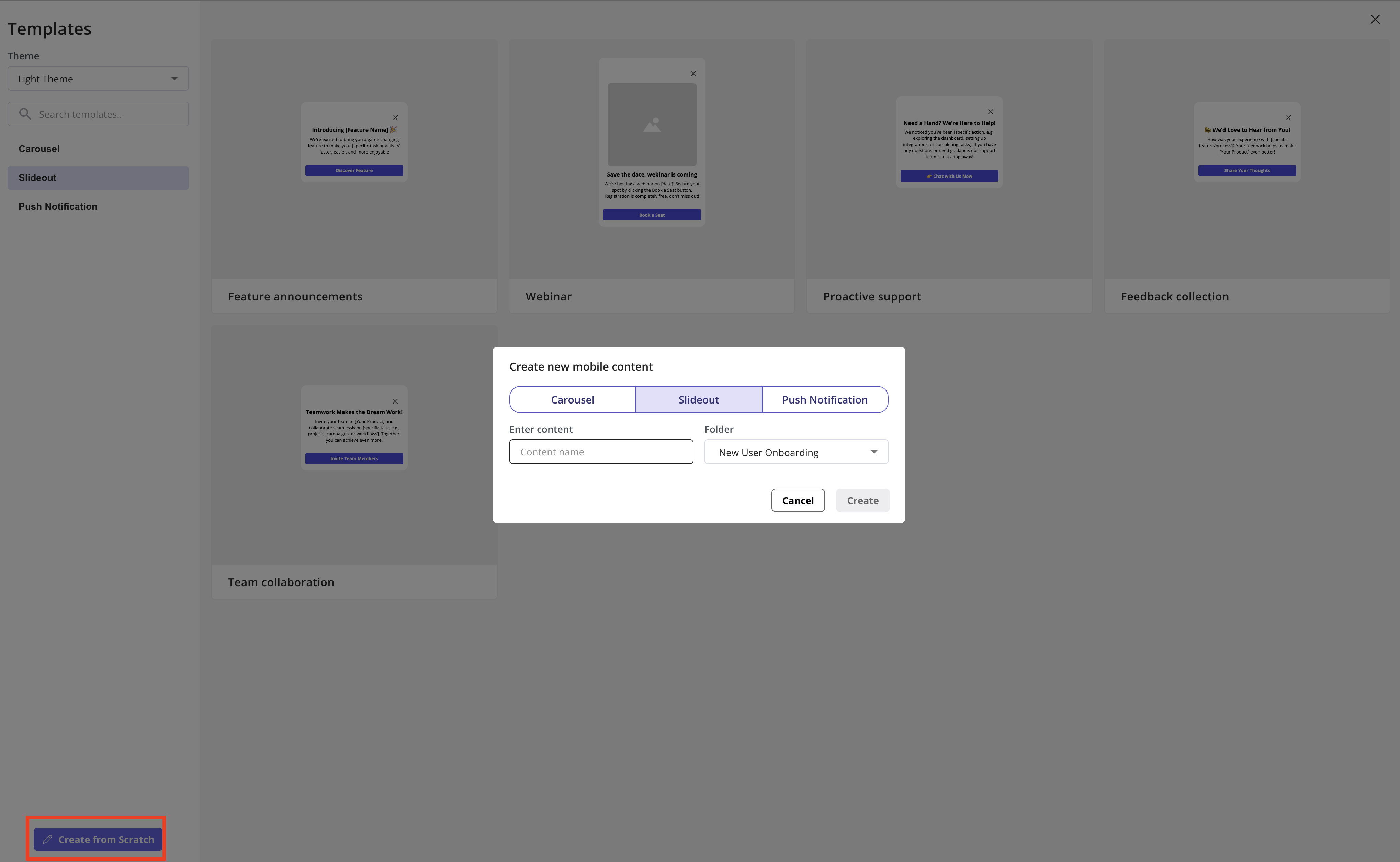
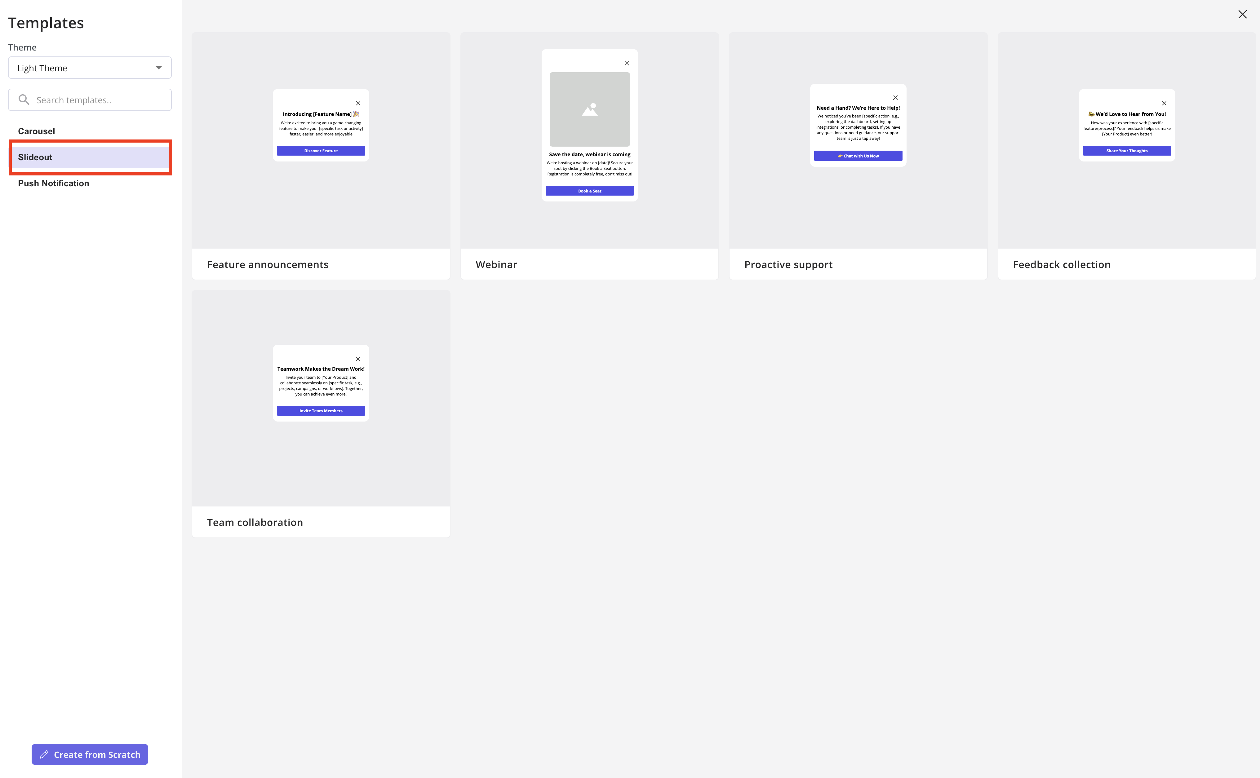 Choose to **start from scratch** **or** pick **from a template**.
For this example, we’ll start from scratch, name your Slideout, and select a folder to organize it in the Mobile Content Overview table.
Choose to **start from scratch** **or** pick **from a template**.
For this example, we’ll start from scratch, name your Slideout, and select a folder to organize it in the Mobile Content Overview table.
 ## Design your slideout
Unlike Carousels (which support multiple screens in a flow), a Slideout consists of just one screen, making the design simpler and more focused.
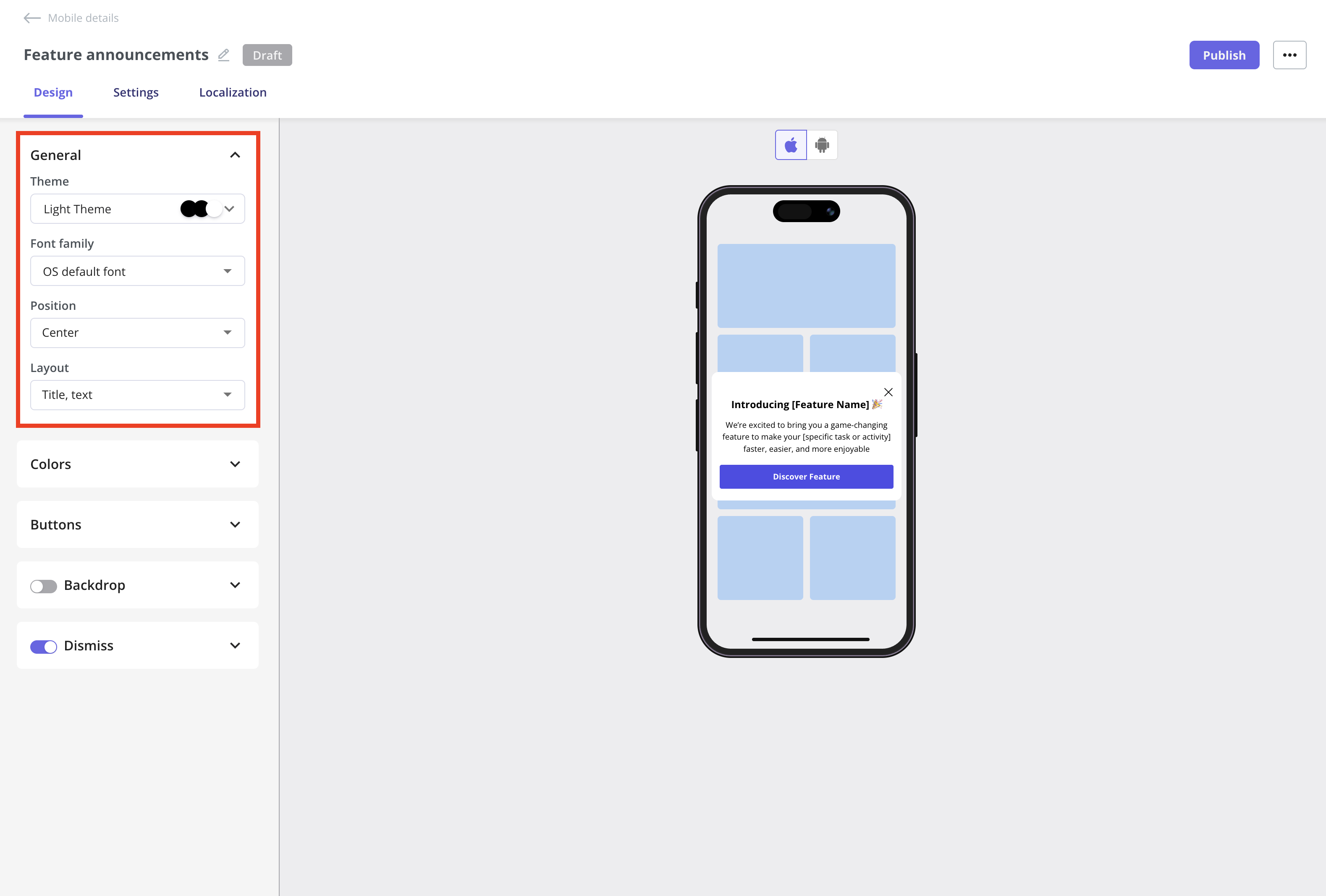
You’ll find all design options in the Design tab:
### General section
* **Themes:** Choose a theme that matches your app’s overall style.
* **Font family:** Select the font used in your slideout. By default, it uses the OS's default font to ensure a familiar, consistent experience on all devices.
* **Position:** Set the position of your content on the screen. You can choose:
* **Center:** Align content to the center of the screen.
* **Bottom:** Display the content at the bottom of the screen.
* **Layout:** The layout defines the arrangement of the image, title, and text. For example, you can place an image at the top with a title and description below, or choose other configurations to match your needs.
## Design your slideout
Unlike Carousels (which support multiple screens in a flow), a Slideout consists of just one screen, making the design simpler and more focused.
You’ll find all design options in the Design tab:
### General section
* **Themes:** Choose a theme that matches your app’s overall style.
* **Font family:** Select the font used in your slideout. By default, it uses the OS's default font to ensure a familiar, consistent experience on all devices.
* **Position:** Set the position of your content on the screen. You can choose:
* **Center:** Align content to the center of the screen.
* **Bottom:** Display the content at the bottom of the screen.
* **Layout:** The layout defines the arrangement of the image, title, and text. For example, you can place an image at the top with a title and description below, or choose other configurations to match your needs.
 ### Colors section
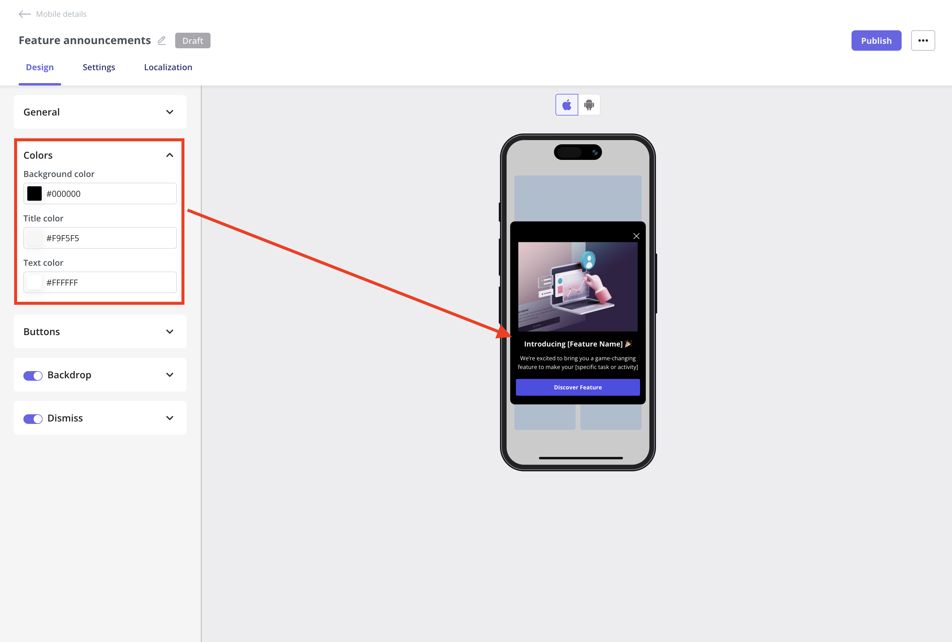
You can customize the background color of the slideout, as well as the title and text colors, by using a hex code.
### Colors section
You can customize the background color of the slideout, as well as the title and text colors, by using a hex code.
 ### Button section
Customize the button width, radius, background color, label color, and border colors using hex codes as needed.
**Button actions**
Determines what happens when the user taps the button:
* Close
* Simply closes the Slideout.
* Best for informational messages or dismissible prompts.
* Open Deep Link in the App
* Opens a specific screen or section inside your app via a deep link.
* Great for driving users directly to features or pages that match the message.
Ask your engineering team for the deep links to the screen you want users to open.
### Button section
Customize the button width, radius, background color, label color, and border colors using hex codes as needed.
**Button actions**
Determines what happens when the user taps the button:
* Close
* Simply closes the Slideout.
* Best for informational messages or dismissible prompts.
* Open Deep Link in the App
* Opens a specific screen or section inside your app via a deep link.
* Great for driving users directly to features or pages that match the message.
Ask your engineering team for the deep links to the screen you want users to open.
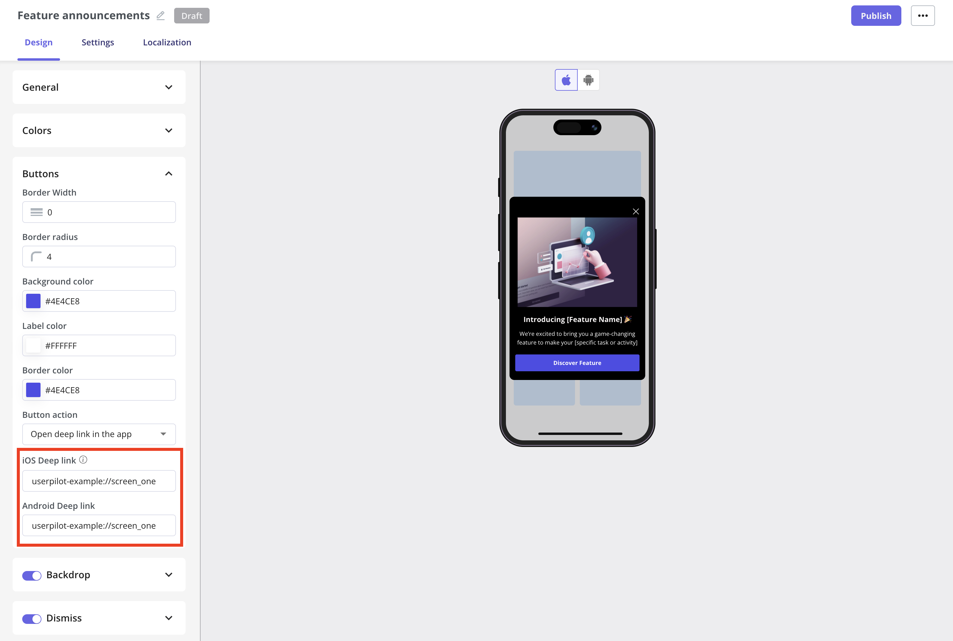
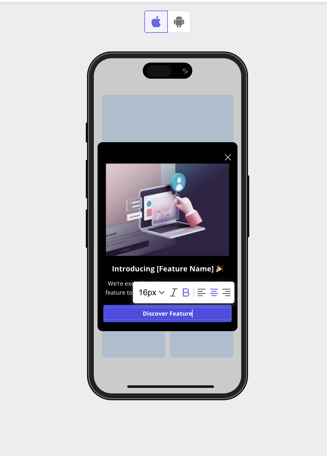
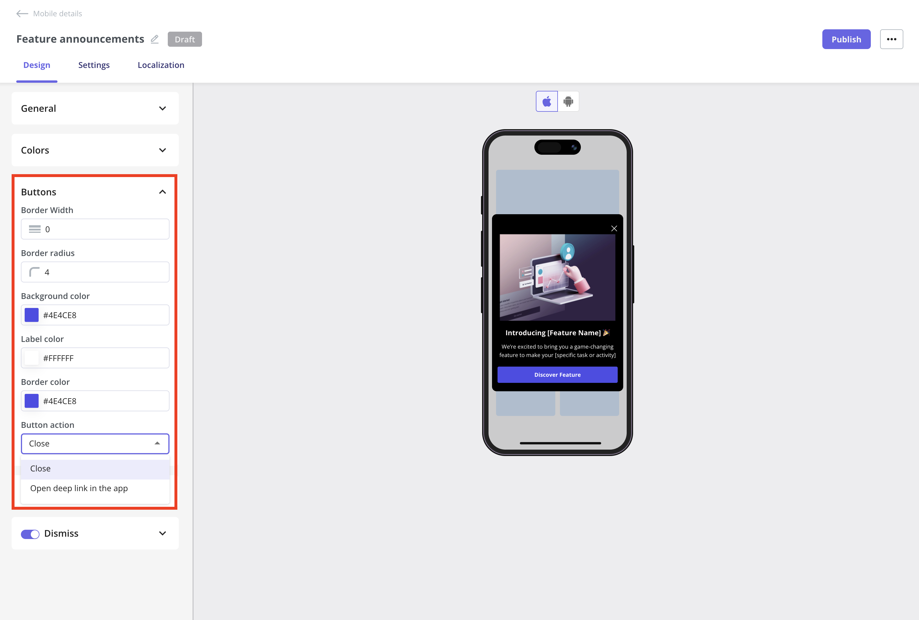 If you'd like to change the button label, simply click on the button in the mobile mockup within the Slideout editor, and you can edit it directly on the spot.
 **Key terms to know**
**Deep Link**
A deep link is a special URL that doesn't just open the app, but navigates directly to a specific screen or function inside it.
For example, instead of opening your app’s home screen, it might open the Settings page, a product detail view.
### **Backdrop section**
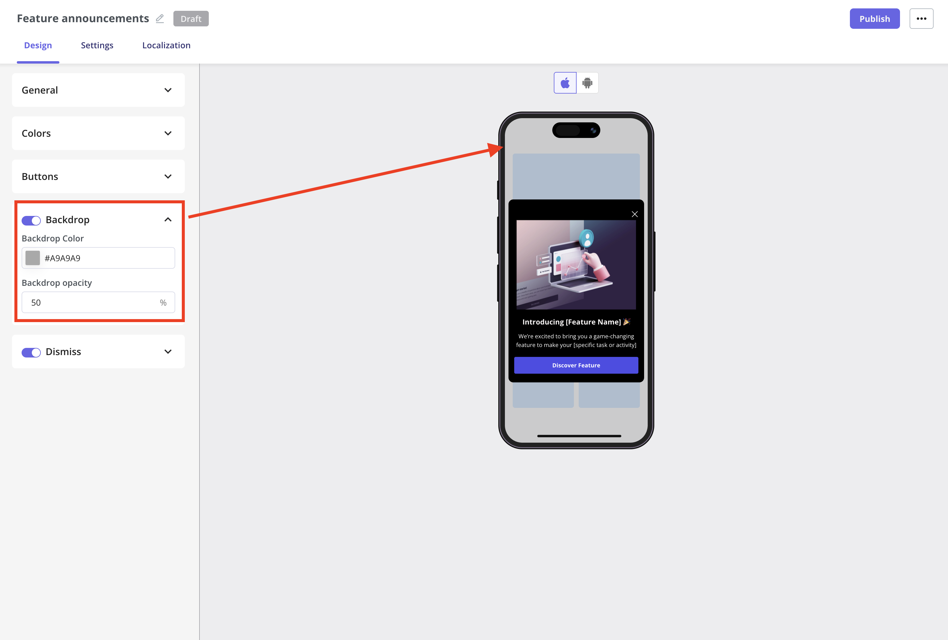
Use the toggle to control how much emphasis your message has, and customize the backdrop color and opacity to suit your design.
**Key terms to know**
**Deep Link**
A deep link is a special URL that doesn't just open the app, but navigates directly to a specific screen or function inside it.
For example, instead of opening your app’s home screen, it might open the Settings page, a product detail view.
### **Backdrop section**
Use the toggle to control how much emphasis your message has, and customize the backdrop color and opacity to suit your design.
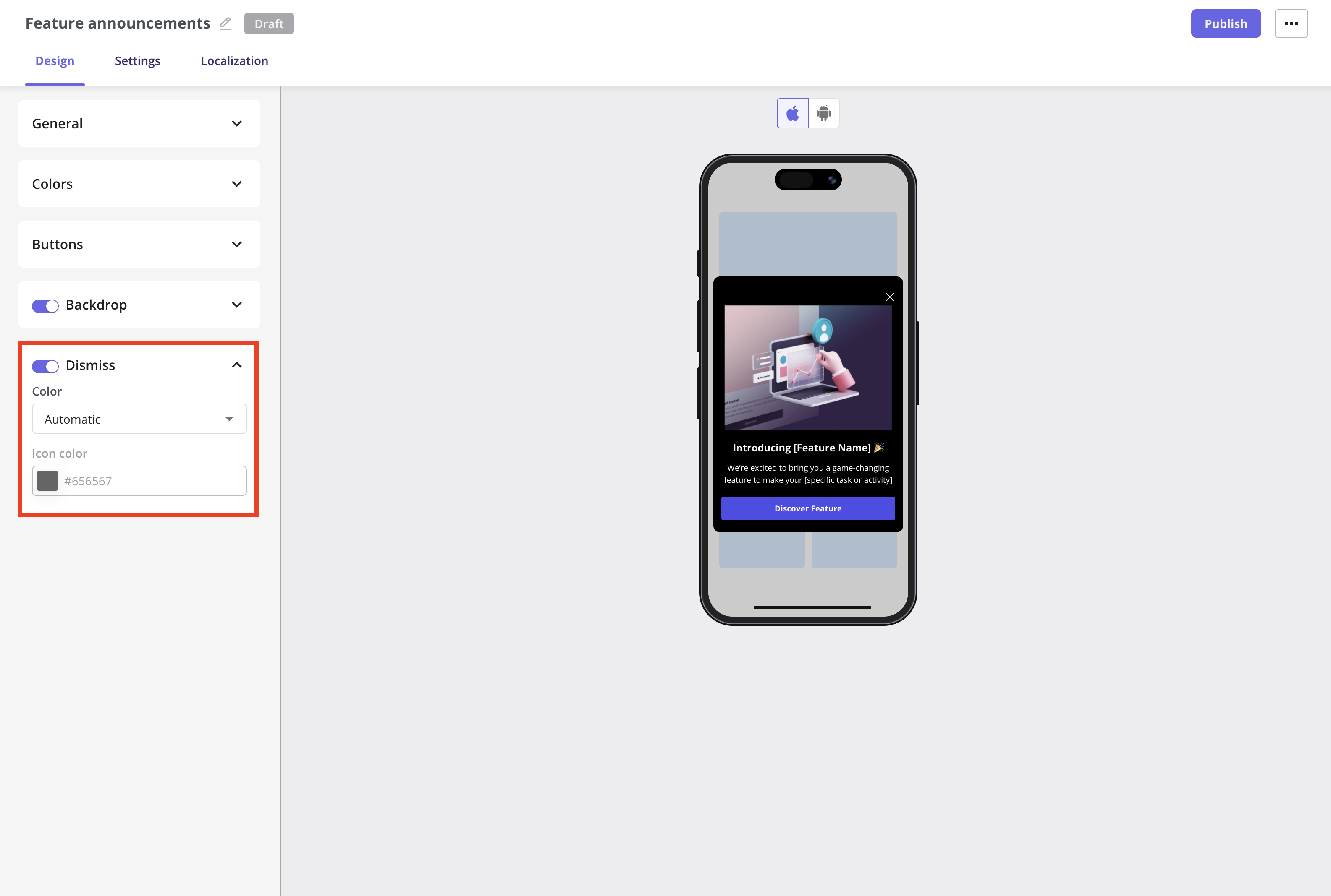
 ### **Dismiss section**
Customize the dismiss button that allows users to close the slideout at any time. You can customize the appearance of the dismiss icon using the toggle to enable or disable it.
* **Color:** Lets you choose the color of the dismiss icon (e.g., **Automatic** to match the theme or a **custom** color).
* **Icon Color:** Enables you to specify the exact **color** of the dismiss icon using a **hex code**
### **Dismiss section**
Customize the dismiss button that allows users to close the slideout at any time. You can customize the appearance of the dismiss icon using the toggle to enable or disable it.
* **Color:** Lets you choose the color of the dismiss icon (e.g., **Automatic** to match the theme or a **custom** color).
* **Icon Color:** Enables you to specify the exact **color** of the dismiss icon using a **hex code**
 ## Customize the slideout content
The content of each slideout section can be edited directly inline.
### Image
You can **update** the **image** and **alt text** to support **accessibility** by **clicking** the **edit icon**, then **adjusting** the **Size & Space** settings to **customize** its **appearance**.
* **Width and Height:** set the dimensions of your image in pixels to control its size on the screen.
* **Fill:** the image will expand to fill the available space, possibly cropping to maintain coverage. Best for full-width, impactful visuals.
* **Fit:** the image will resize to fit within the space without cropping, maintaining its original aspect ratio. Best for clear, uncropped images.
* **Corner Radius:** adjust the roundness of the image corners in pixels for a softer or more modern look.
**Additional explanation of how Userpilot handles images with Fill and Fit options:**
**Fill** is like saying, I want this entire space covered, no matter what.
When you choose **Fill**, **Userpilot** will **stretch or squash** the **image** to completely cover the **width** and **height** of the frame.
* It doesn’t **preserve** the original **aspect ratio**, which means the image might end up looking **distorted** if it wasn’t designed for that shape.
* Think of it like stretching a small sticker over a big box—you’ll cover every corner, but it might look a bit warped.
* This option is great for **abstract backgrounds** or **placeholder visuals** where **distortion** isn’t a problem.
**For example:**
* Your **frame** is 300×300.
* Your **image** is 200×300.
* Result? It’s **stretched to 300×300**, changing its proportions to fit perfectly in the space, even if it looks a little off.
Now, let’s talk about **Fit**. This option says, Show my image as it really is, no distortion allowed.
When you choose **Fit**, **Userpilot** will **scale** the **image proportionally** so the entire thing is visible within the frame.
* The **aspect ratio** is **preserved**, so the image keeps its original shape.
* It might not **fill** the whole space, leaving **empty areas** (like letterboxing) on the sides or top and bottom.
* This is perfect when you want users to see your **logo**, **product image**, or any visual that needs to look **exactly right**.
**For example:**
* Your **frame** is 300×300.
* Your **image** is 200×300.
* Result? The image stays **200×300**, perfectly centered, with **50pt** padding on either side to fill the space evenly.
**In short:**
* Choose **Fill** if you want to cover the entire space, even if that means distorting the image.
* Choose **Fit** if you want to preserve your image’s original shape, even if there’s empty space around it.
Videos aren’t supported in Mobile slideouts at the moment, but you can include animated GIFs instead.
### Header
The following formatting options are supported for the header:
* **Headings:** H1, H2, and H3.
* **Horizontal Alignment:** Left, Center, and Right.
* **Link:** **Navigate** your users to a specific URL. Userpilot will open the browser to display the link.
* **Personalization:** Insert user or company properties to create a more personalized experience.
### Text
The following formatting options are supported for the text:
* **Font Size:** Set your font size in pixels. Userpilot will automatically convert it to the appropriate unit for mobile, adjusting to the device dimensions to ensure the text is readable.
* **Horizontal Alignment:** Left, Center, or Right.
* **Font Style:** Apply Bold or Italic styling.
* **Link:** Direct users to a specific URL. Userpilot will open the browser to display the link.
* **Personalization:** Insert user or company properties to create a more personalized experience.
## Customize the slideout content
The content of each slideout section can be edited directly inline.
### Image
You can **update** the **image** and **alt text** to support **accessibility** by **clicking** the **edit icon**, then **adjusting** the **Size & Space** settings to **customize** its **appearance**.
* **Width and Height:** set the dimensions of your image in pixels to control its size on the screen.
* **Fill:** the image will expand to fill the available space, possibly cropping to maintain coverage. Best for full-width, impactful visuals.
* **Fit:** the image will resize to fit within the space without cropping, maintaining its original aspect ratio. Best for clear, uncropped images.
* **Corner Radius:** adjust the roundness of the image corners in pixels for a softer or more modern look.
**Additional explanation of how Userpilot handles images with Fill and Fit options:**
**Fill** is like saying, I want this entire space covered, no matter what.
When you choose **Fill**, **Userpilot** will **stretch or squash** the **image** to completely cover the **width** and **height** of the frame.
* It doesn’t **preserve** the original **aspect ratio**, which means the image might end up looking **distorted** if it wasn’t designed for that shape.
* Think of it like stretching a small sticker over a big box—you’ll cover every corner, but it might look a bit warped.
* This option is great for **abstract backgrounds** or **placeholder visuals** where **distortion** isn’t a problem.
**For example:**
* Your **frame** is 300×300.
* Your **image** is 200×300.
* Result? It’s **stretched to 300×300**, changing its proportions to fit perfectly in the space, even if it looks a little off.
Now, let’s talk about **Fit**. This option says, Show my image as it really is, no distortion allowed.
When you choose **Fit**, **Userpilot** will **scale** the **image proportionally** so the entire thing is visible within the frame.
* The **aspect ratio** is **preserved**, so the image keeps its original shape.
* It might not **fill** the whole space, leaving **empty areas** (like letterboxing) on the sides or top and bottom.
* This is perfect when you want users to see your **logo**, **product image**, or any visual that needs to look **exactly right**.
**For example:**
* Your **frame** is 300×300.
* Your **image** is 200×300.
* Result? The image stays **200×300**, perfectly centered, with **50pt** padding on either side to fill the space evenly.
**In short:**
* Choose **Fill** if you want to cover the entire space, even if that means distorting the image.
* Choose **Fit** if you want to preserve your image’s original shape, even if there’s empty space around it.
Videos aren’t supported in Mobile slideouts at the moment, but you can include animated GIFs instead.
### Header
The following formatting options are supported for the header:
* **Headings:** H1, H2, and H3.
* **Horizontal Alignment:** Left, Center, and Right.
* **Link:** **Navigate** your users to a specific URL. Userpilot will open the browser to display the link.
* **Personalization:** Insert user or company properties to create a more personalized experience.
### Text
The following formatting options are supported for the text:
* **Font Size:** Set your font size in pixels. Userpilot will automatically convert it to the appropriate unit for mobile, adjusting to the device dimensions to ensure the text is readable.
* **Horizontal Alignment:** Left, Center, or Right.
* **Font Style:** Apply Bold or Italic styling.
* **Link:** Direct users to a specific URL. Userpilot will open the browser to display the link.
* **Personalization:** Insert user or company properties to create a more personalized experience.
 ## Localization
You first need to **activate** the **localization settings** from the **Settings** page. For detailed **instructions**, follow the steps in this [Localization](https://docs.userpilot.com/in-app-engagement/checklists/localization#localization) document.
Userpilot lets you localize your mobile content to make it more relevant and accessible globally.
Click on the Localization tab and start localizing your content based on the languages you’ve added.
## Localization
You first need to **activate** the **localization settings** from the **Settings** page. For detailed **instructions**, follow the steps in this [Localization](https://docs.userpilot.com/in-app-engagement/checklists/localization#localization) document.
Userpilot lets you localize your mobile content to make it more relevant and accessible globally.
Click on the Localization tab and start localizing your content based on the languages you’ve added.
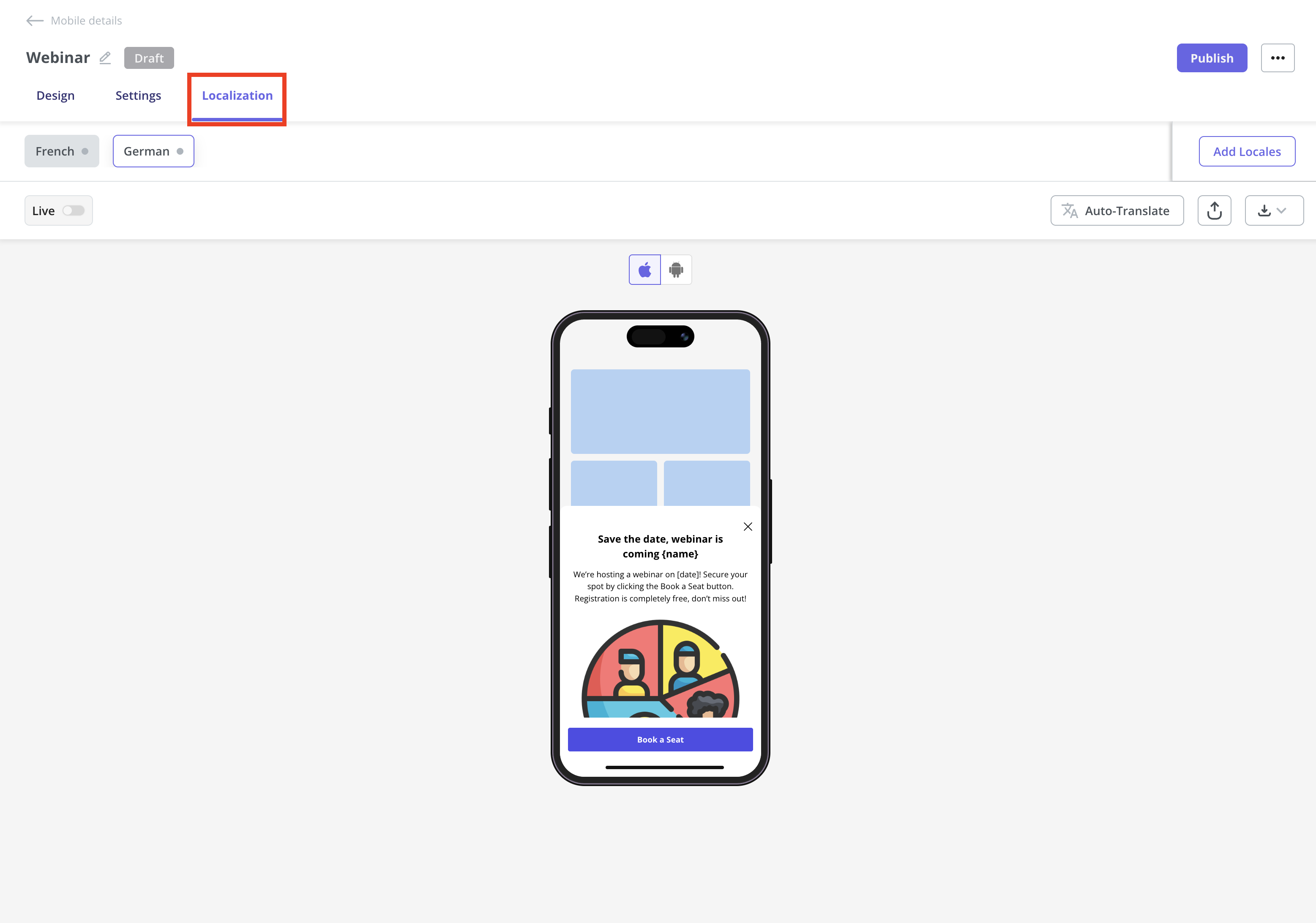 **Mobile localization** only works when you **pass** the `locale_code`attribute. Make sure you're setting up localization for both web and mobile using the locale code, since the browser language won’t automatically work on mobile.
.png?fit=max&auto=format&n=eKuoNPh2qVInx2ej&q=85&s=379e4ee3f2c739d805866c59bf747ed0) ## Publish your slideout
Once you’ve designed your Mobile Sideout and localized the content, the next step is to configure the slideout settings and publish it to your end users.
### Trigger
Define when the slideout should appear for users. Options include:
* **Start app session:** Perfect for onboarding new users or welcoming them back with important updates as soon as they open the app.
* **Screen-Specific:** Great for feature adoption, highlight a feature or guide users when they reach a specific screen in the app.
* **Event-Occurrence:** Ideal for contextual help or upsell prompts, trigger the slideout when users complete an action like making a purchase or saving a setting.
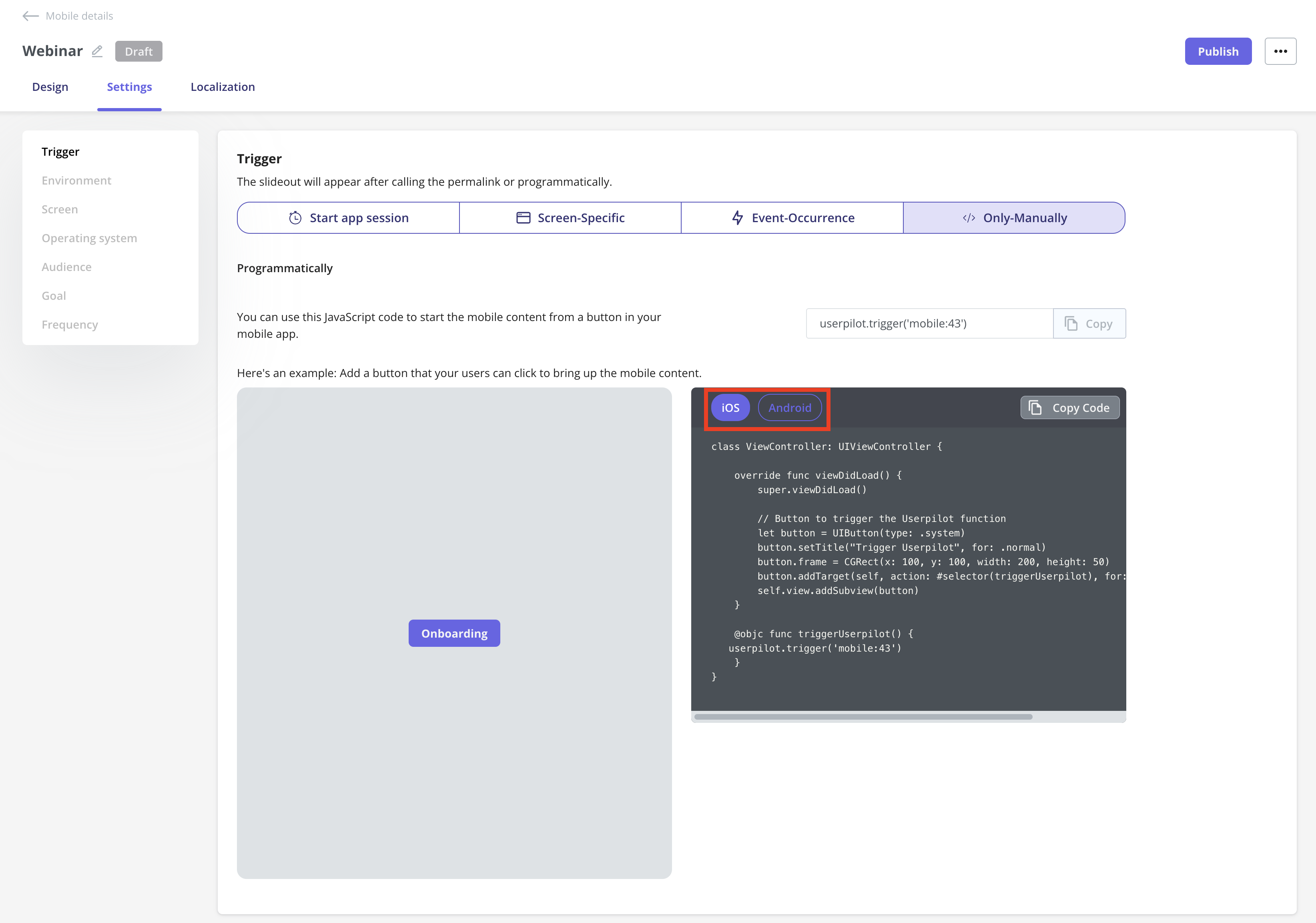
* **Only-Manually:** Best for advanced use where you want full control. For example, triggering a slideout from a custom button in the mobile app.
You can view the **Only-Manually** trigger code for both iOS and Android, and share it with your engineering team. They can integrate it into the app’s codebase to trigger the slideout whenever an end user interacts with the specific mobile app element containing the code.
## Publish your slideout
Once you’ve designed your Mobile Sideout and localized the content, the next step is to configure the slideout settings and publish it to your end users.
### Trigger
Define when the slideout should appear for users. Options include:
* **Start app session:** Perfect for onboarding new users or welcoming them back with important updates as soon as they open the app.
* **Screen-Specific:** Great for feature adoption, highlight a feature or guide users when they reach a specific screen in the app.
* **Event-Occurrence:** Ideal for contextual help or upsell prompts, trigger the slideout when users complete an action like making a purchase or saving a setting.
* **Only-Manually:** Best for advanced use where you want full control. For example, triggering a slideout from a custom button in the mobile app.
You can view the **Only-Manually** trigger code for both iOS and Android, and share it with your engineering team. They can integrate it into the app’s codebase to trigger the slideout whenever an end user interacts with the specific mobile app element containing the code.
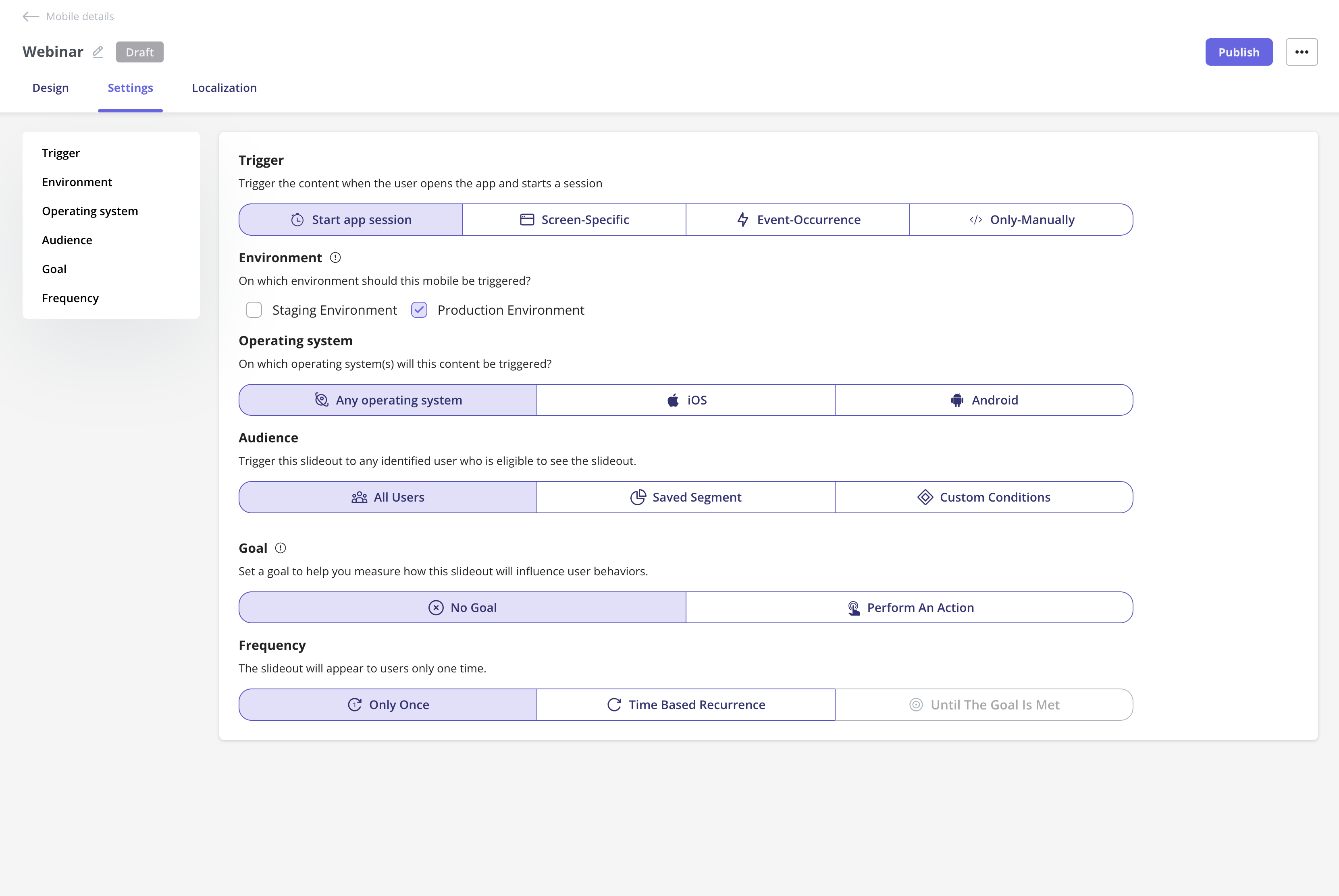
 ### Environment
Choose where this slideout should be triggered:
* **Staging Environment:** For testing and QA.
* **Production Environment:** For live, end-user experiences.
### Operating System
Select which OS your slideout will appear on:
* **Any operating system:** Both iOS and Android.
* **iOS:** Target only Apple devices.
* **Android:** Target only Android devices.
### **Audience**
Define who should see your slideout:
* **All Users:** Everyone identified user in Userpilot, and using the app.
* **Saved Segment:** A pre-defined user segment.
* **Custom Conditions:** Set specific rules to target users meeting chosen criteria.
### Goal
Set a goal to measure how the slideout influences user behavior:
* **No Goal:** No specific outcome tracked.
* **Perform an Action:** Track if users complete a key action after seeing the slideout.
### Frequency
Control how often users see the slideout:
* **Only Once:** Show a single time per user.
* **Time Based Recurrence:** Repeat after a set period.
* **Until The Goal Is Met:** Would normally repeat until the defined goal is achieved.
### Environment
Choose where this slideout should be triggered:
* **Staging Environment:** For testing and QA.
* **Production Environment:** For live, end-user experiences.
### Operating System
Select which OS your slideout will appear on:
* **Any operating system:** Both iOS and Android.
* **iOS:** Target only Apple devices.
* **Android:** Target only Android devices.
### **Audience**
Define who should see your slideout:
* **All Users:** Everyone identified user in Userpilot, and using the app.
* **Saved Segment:** A pre-defined user segment.
* **Custom Conditions:** Set specific rules to target users meeting chosen criteria.
### Goal
Set a goal to measure how the slideout influences user behavior:
* **No Goal:** No specific outcome tracked.
* **Perform an Action:** Track if users complete a key action after seeing the slideout.
### Frequency
Control how often users see the slideout:
* **Only Once:** Show a single time per user.
* **Time Based Recurrence:** Repeat after a set period.
* **Until The Goal Is Met:** Would normally repeat until the defined goal is achieved.
 ## **Schedule your slideout**
If you want to schedule your slideout to go live at a specific date and time, you can easily set that up after clicking the Publish button. Simply select the start date and time for when it should be live, and you can even choose when you’d like it to stop showing to users.
## **Schedule your slideout**
If you want to schedule your slideout to go live at a specific date and time, you can easily set that up after clicking the Publish button. Simply select the start date and time for when it should be live, and you can even choose when you’d like it to stop showing to users.
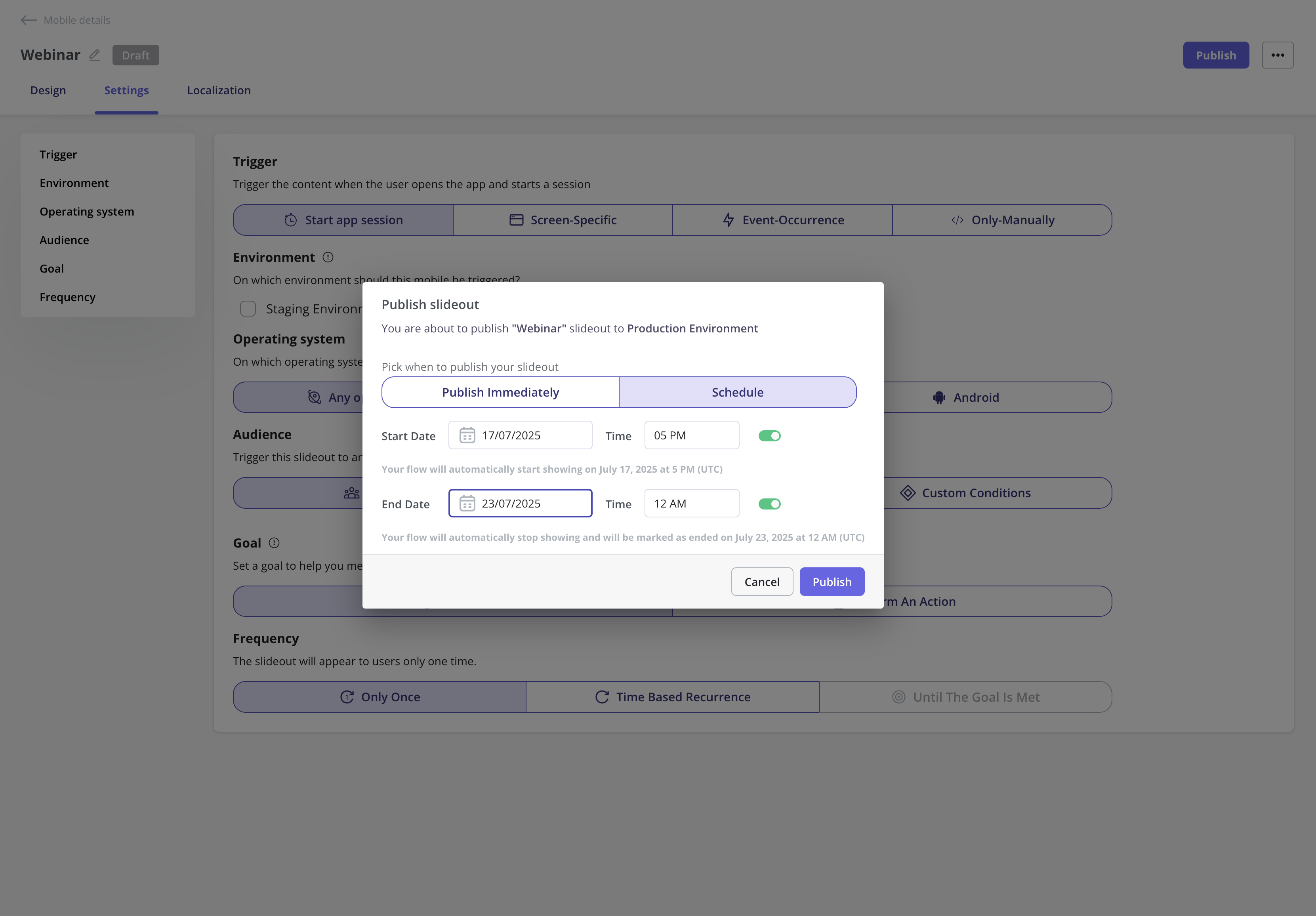 The publication time is based on your account’s time zone set in the [General](https://run.userpilot.io/settings/general) page, not the user’s local time.
And that’s it. Your Mobile Slideout is ready to publish.
The publication time is based on your account’s time zone set in the [General](https://run.userpilot.io/settings/general) page, not the user’s local time.
And that’s it. Your Mobile Slideout is ready to publish.