> ## Documentation Index
> Fetch the complete documentation index at: https://docs.userpilot.com/llms.txt
> Use this file to discover all available pages before exploring further.
# Buttons
> The Buttons feature is a powerful tool designed to enhance user interactions within your platform. It allows you to strategically place actionable elements.
## Overview
The **Buttons** feature is a powerful tool designed to enhance user interactions within your platform. It allows you to strategically place actionable elements like call-to-action buttons that guide users toward completing key actions.
## Use Cases
* **Display a "New" Label**: Highlight new features or updates.
* **Subscribe**: Prompt users to sign up for newsletters or updates.
* **Request a Demo/Register for Webinar**: Provide easy access to demos or webinars.
* **Contact Sales**: Direct users to sales for more info.
* **Download Resource**: Offer quick access to resources like eBooks.
* **Start Free Trial**: Invite users to try your platform for free.
* **Get Started**: Guide users in setting up their account or process.
* **Upgrade Now**: Encourage users to upgrade to a higher plan.
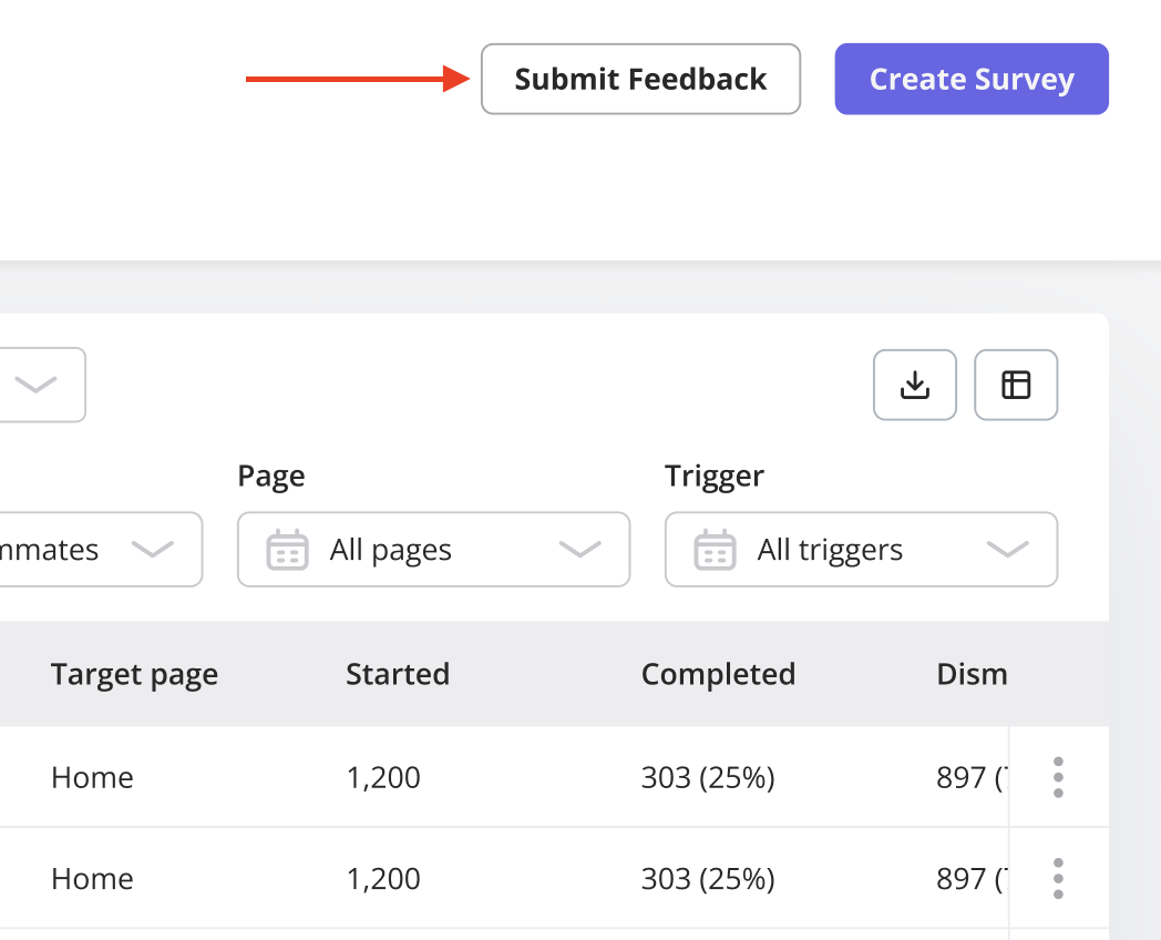 ### Creating a Button
Adding a button is simple and straightforward. Follow these steps:
1. Go to the page where you want the button to appear and open the Userpilot Chrome extension builder.
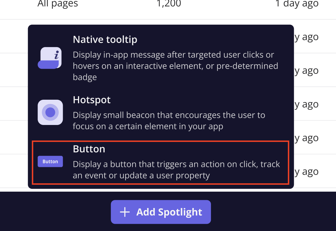
2. Click on **"Start here"**, then select **Create a Spotlight > Create a Button.**
3. Choose the button design and name it accordingly. Explore further settings to customize as needed.
### Creating a Button
Adding a button is simple and straightforward. Follow these steps:
1. Go to the page where you want the button to appear and open the Userpilot Chrome extension builder.
2. Click on **"Start here"**, then select **Create a Spotlight > Create a Button.**
3. Choose the button design and name it accordingly. Explore further settings to customize as needed.
 ### Button Types
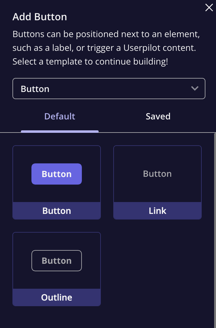
Userpilot offers several button types to suit different design preferences:
* **Primary Button**: A filled background button that stands out.
* **Outline Button**: A button with a border but no fill.
* **Text Link**: A button that functions like a simple link with text.
### Button Types
Userpilot offers several button types to suit different design preferences:
* **Primary Button**: A filled background button that stands out.
* **Outline Button**: A button with a border but no fill.
* **Text Link**: A button that functions like a simple link with text.
 ### Actions
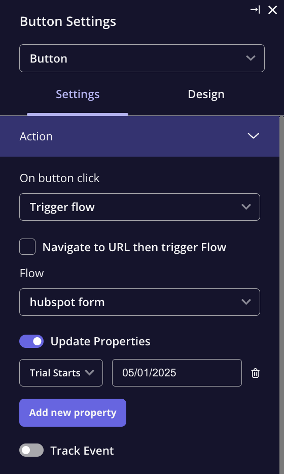
Define what happens when the button is clicked. Available actions include:
* **Do Nothing**: The button remains interactive but triggers no action.
* **Go to URL**: Directs the user to a specified URL.
* **Trigger Flow**: Initiates a Userpilot flow.
* **Trigger Survey**: Opens a survey upon click.
* **Trigger JavaScript**: Executes a custom JavaScript function.
* You can also configure the button to update a user property or track events, similar to the flow action settings.
### Actions
Define what happens when the button is clicked. Available actions include:
* **Do Nothing**: The button remains interactive but triggers no action.
* **Go to URL**: Directs the user to a specified URL.
* **Trigger Flow**: Initiates a Userpilot flow.
* **Trigger Survey**: Opens a survey upon click.
* **Trigger JavaScript**: Executes a custom JavaScript function.
* You can also configure the button to update a user property or track events, similar to the flow action settings.
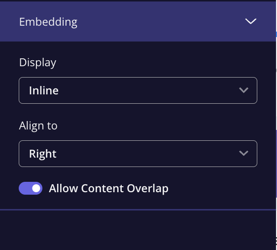
 ### Embedding Options
Buttons can be placed within the app in the following ways:
* **Overlay**: The button appears as a floating element above the target content.
* **Inline**: The button is inserted directly within the application’s HTML, appearing as part of the page content.
* **Allow Content Overlap Toggle**:
* **Disabled**: The button pushes content to make space for the spotlight.
* **Enabled**: The button overlays the content without expanding it.
### Embedding Options
Buttons can be placed within the app in the following ways:
* **Overlay**: The button appears as a floating element above the target content.
* **Inline**: The button is inserted directly within the application’s HTML, appearing as part of the page content.
* **Allow Content Overlap Toggle**:
* **Disabled**: The button pushes content to make space for the spotlight.
* **Enabled**: The button overlays the content without expanding it.
 ### Frequency
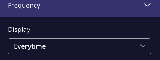
Once you've created and edited your button, you can select the frequency of the button in the 'Frequency' tab. You will find two options:
* **Once**: This will trigger the button one time only, and it will be dismissed once the user interacts with it.
* **Everytime**: The button will always appear in your web app.
### Frequency
Once you've created and edited your button, you can select the frequency of the button in the 'Frequency' tab. You will find two options:
* **Once**: This will trigger the button one time only, and it will be dismissed once the user interacts with it.
* **Everytime**: The button will always appear in your web app.
 ### Design Tab
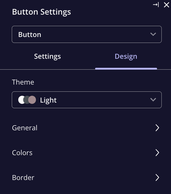
The Design tab allows for customization of the button’s visual elements, such as color, size, and borders. Key settings include:
* **General and Color Settings**: Adjust the button’s overall color and text style.
* **Border Settings**: Customize the button’s border width, color, and shadow effects.
### Design Tab
The Design tab allows for customization of the button’s visual elements, such as color, size, and borders. Key settings include:
* **General and Color Settings**: Adjust the button’s overall color and text style.
* **Border Settings**: Customize the button’s border width, color, and shadow effects.
 ### FAQs
Yes! You can place multiple buttons on the same page in different positions or throughout the user journey.
If you choose the "Do Nothing" action, the button will still appear clickable, but it will not trigger any behavior when clicked. It's useful if you just want to provide a visual cue or placeholder.
The **Overlay** button floats on top of content, and is typically used for pop-up messages or CTAs that should be visible on top of existing elements. **Inline** buttons, on the other hand, are placed directly within the content, seamlessly integrating with the page layout.
[**For any questions or concerns please reach out to support@userpilot.com**](mailto:support@userpilot.com)
### FAQs
Yes! You can place multiple buttons on the same page in different positions or throughout the user journey.
If you choose the "Do Nothing" action, the button will still appear clickable, but it will not trigger any behavior when clicked. It's useful if you just want to provide a visual cue or placeholder.
The **Overlay** button floats on top of content, and is typically used for pop-up messages or CTAs that should be visible on top of existing elements. **Inline** buttons, on the other hand, are placed directly within the content, seamlessly integrating with the page layout.
[**For any questions or concerns please reach out to support@userpilot.com**](mailto:support@userpilot.com)