> ## Documentation Index
> Fetch the complete documentation index at: https://docs.userpilot.com/llms.txt
> Use this file to discover all available pages before exploring further.
# Native Tooltips
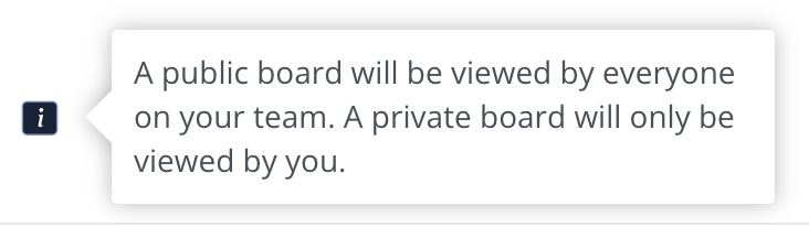
> Native Tooltips are interactive in-app messages that appear when users hover over or click on an element.
## Overview
Native Tooltips are interactive in-app messages that appear when users hover over or click on an element. These tooltips provide contextual help without disrupting the user experience, offering on-demand explanations that guide users through your platform.
## Use Cases
* Add quick, on-demand descriptions for core features.
* Provide subtle guidance to improve app navigation.
* Offer assistance when users need it to improve retention.
* Trigger tooltips based on user behavior to boost understanding.
 ## Creating Native Tooltips
Creating a Native Tooltip in Userpilot is simple! Just follow these steps:
1. **Open the Userpilot Chrome extension** and go to the page where you want to create the tooltip.
2. Click on **“Start Here”** and select **"Create a Spotlight"**.
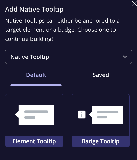
3. Choose **"Native Tooltip"** from the options and name your tooltip.
4. Select the theme, and choose whether the tooltip will show from a badge or a specific element.
5. Position the Native Tooltip by selecting the target element you want to trigger the tooltip on.
## Creating Native Tooltips
Creating a Native Tooltip in Userpilot is simple! Just follow these steps:
1. **Open the Userpilot Chrome extension** and go to the page where you want to create the tooltip.
2. Click on **“Start Here”** and select **"Create a Spotlight"**.
3. Choose **"Native Tooltip"** from the options and name your tooltip.
4. Select the theme, and choose whether the tooltip will show from a badge or a specific element.
5. Position the Native Tooltip by selecting the target element you want to trigger the tooltip on.
 ### Native Tooltip Settings & Design Panel
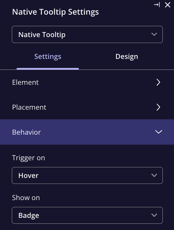
The settings and design panel allow you to control how your Native Tooltip behaves, including its placement, trigger actions, and design.
**Settings Options**
* **Element**: Choose or manually detect the element you want the tooltip to appear on.
* **Placement**: Adjust where the tooltip will appear relative to the selected element.
* **Behavior**: Choose whether the tooltip triggers on **hover** or **click**.
* **Show on**: Select if the tooltip appears when interacting with a badge or element.
### Native Tooltip Settings & Design Panel
The settings and design panel allow you to control how your Native Tooltip behaves, including its placement, trigger actions, and design.
**Settings Options**
* **Element**: Choose or manually detect the element you want the tooltip to appear on.
* **Placement**: Adjust where the tooltip will appear relative to the selected element.
* **Behavior**: Choose whether the tooltip triggers on **hover** or **click**.
* **Show on**: Select if the tooltip appears when interacting with a badge or element.
 **Embedding Options**
* **Overlay**: The tooltip floats above the page, fixed in place, but can cause layout issues, especially on different screen sizes.
* **Inline**: The tooltip is embedded within the app's layout, providing a smoother, more native feel.
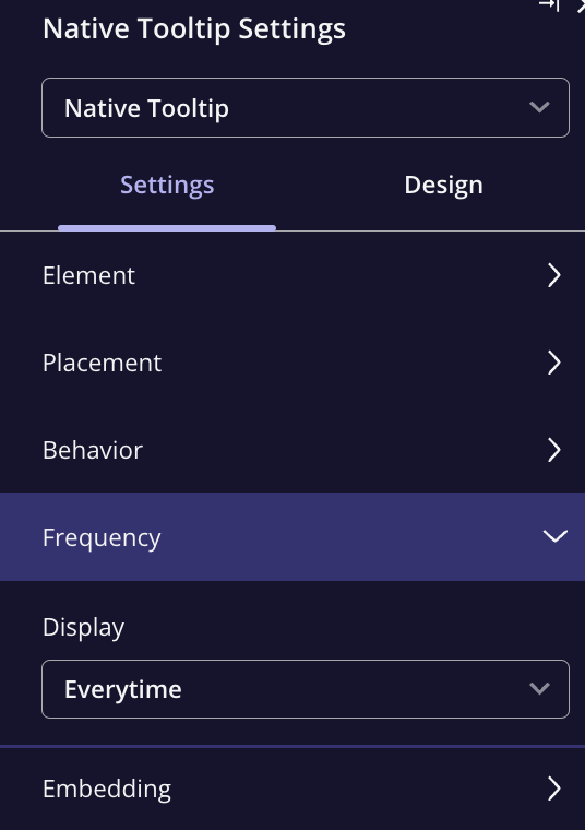
**Frequency**
Choose how often the tooltip should appear
* **Once**: The tooltip appears once and is dismissed after interaction.
* **Every time**: The tooltip will always appear every time a user interacts with the element.
**Embedding Options**
* **Overlay**: The tooltip floats above the page, fixed in place, but can cause layout issues, especially on different screen sizes.
* **Inline**: The tooltip is embedded within the app's layout, providing a smoother, more native feel.
**Frequency**
Choose how often the tooltip should appear
* **Once**: The tooltip appears once and is dismissed after interaction.
* **Every time**: The tooltip will always appear every time a user interacts with the element.
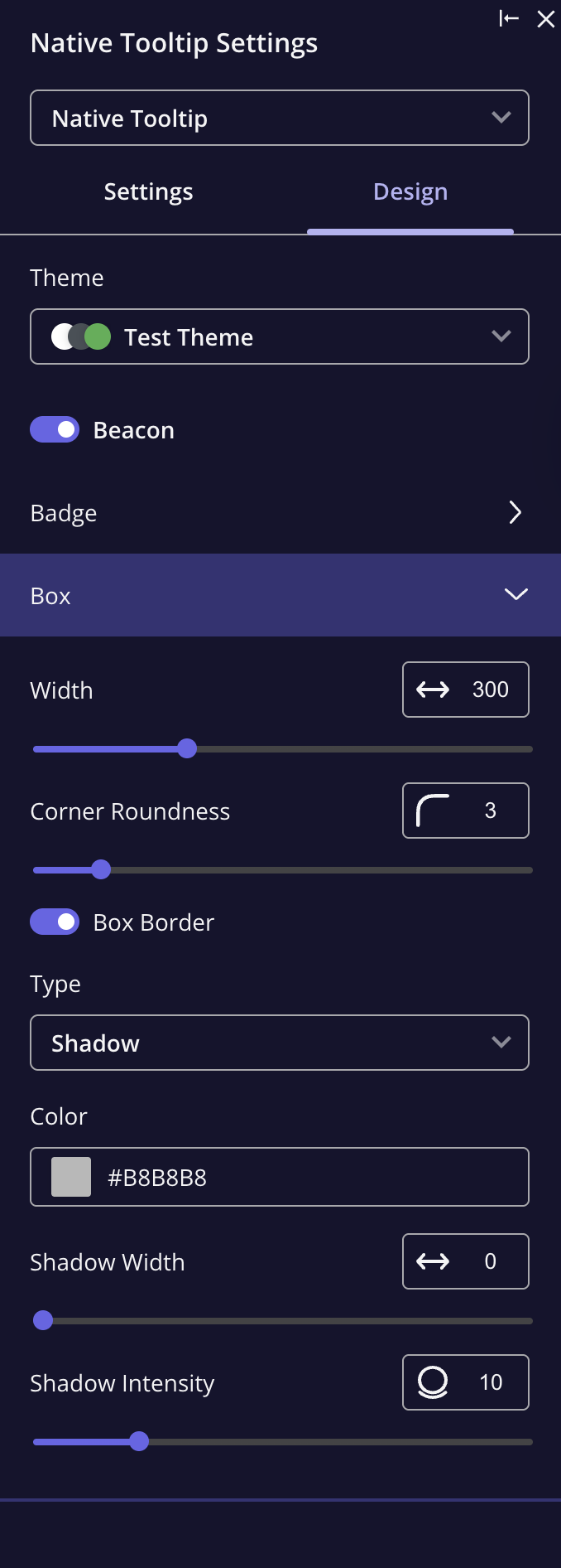
 **Design Options**
* **Badge**: Customize the appearance of the tooltip's badge if using one (i.e., an icon or text).
* **Box Settings**: Adjust the width, border, and padding to fit your desired look.
**Design Options**
* **Badge**: Customize the appearance of the tooltip's badge if using one (i.e., an icon or text).
* **Box Settings**: Adjust the width, border, and padding to fit your desired look.
 ### FAQs
If the message is too long, try breaking it up into multiple tooltips to give more room for text. Also, when adding a long text to the tooltips, **a scroll bar** will appear.
[**For any questions or concerns please reach out to support@userpilot.com**](mailto:support@userpilot.com)
### FAQs
If the message is too long, try breaking it up into multiple tooltips to give more room for text. Also, when adding a long text to the tooltips, **a scroll bar** will appear.
[**For any questions or concerns please reach out to support@userpilot.com**](mailto:support@userpilot.com)