> ## Documentation Index
> Fetch the complete documentation index at: https://docs.userpilot.com/llms.txt
> Use this file to discover all available pages before exploring further.
# Funnels
> Visualize and analyze how users move through key steps, identify drop-off points, and measure conversion rates to optimize user journeys.
Funnel Reports are only available for Growth and Enterprise plans
Funnels in Userpilot help you visualize and analyze how users move through key steps in your product or workflow. By tracking conversions from one step to the next, you can identify where users drop off, compare conversion rates between segments, understand behavior patterns, and optimize the experience to improve adoption, engagement, and retention.
## **Use Cases**
* **Identify drop-off points** – See where users abandon onboarding, signup, or other key processes.
* **Measure time to completion** – Track how long it takes users to complete specific actions.
* **Evaluate in-app experiences** – Analyze how Userpilot flows and checklists impact conversion rates.
* **Detect journey friction** – Identify steps in user journeys that do not lead to desired outcomes.
## Getting Started with Funnels
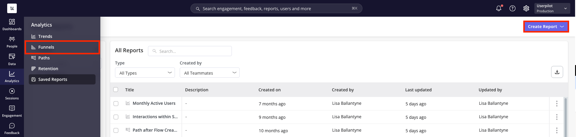
To get started with creating a Funnel, navigate to the Funnels page from the navigation bar or through the 'Create Report' button within the Saved Reports page.
 ### Building your Funnel Report
1. Firstly, choose whether you'd like to analyze the data on a **user or company level**.
### Building your Funnel Report
1. Firstly, choose whether you'd like to analyze the data on a **user or company level**.
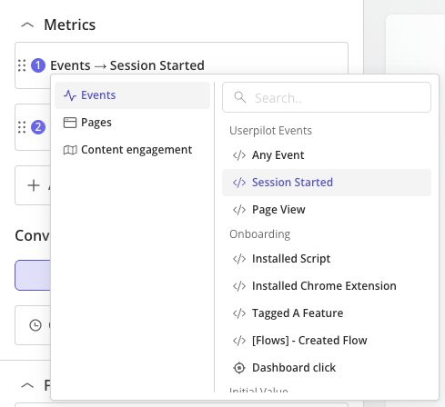
 2. Next, **define the metrics** you'd like to include as steps within your report. These are the core elements that make up your funnel report and can be chosen from three categories:
* **Events:** Show data based on occurrence of your labeled events, tracked events, custom events or feature tags.
* **Pages:** Show data based on views of your tagged pages.
* **Mobile screens:** Show data based on views of your tagged mobile screens.
* **Content Engagement:** Show data based on interactions with your Userpilot content
2. Next, **define the metrics** you'd like to include as steps within your report. These are the core elements that make up your funnel report and can be chosen from three categories:
* **Events:** Show data based on occurrence of your labeled events, tracked events, custom events or feature tags.
* **Pages:** Show data based on views of your tagged pages.
* **Mobile screens:** Show data based on views of your tagged mobile screens.
* **Content Engagement:** Show data based on interactions with your Userpilot content
 3. Once you've specified the metrics for each step, specify how you'd like each of these metrics to be measured *(Coming soon)*:
* **Unique users:** track only one funnel journey per user. This represents the first time the user performs Step 1 in the time period selected.
* **Total count:** track all funnel journeys for each user. Users can re-enter the funnel multiple times throughout the selected time period and each time will be accounted for within the data.
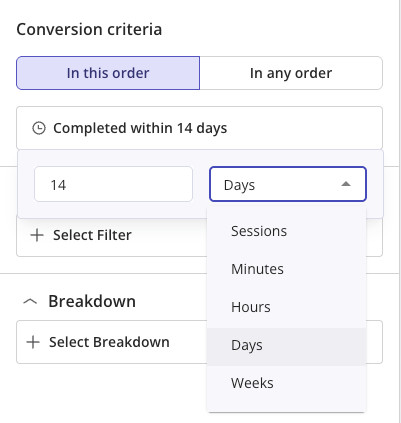
4. Select your **Conversion Criteria** by choosing how the steps must be completed:
* **In this order** – Steps must be completed sequentially, ideal for journeys where order matters.
* **In any order** – Steps can be completed in any sequence, suitable for non-linear journeys.
Then, define the **timeframe or number of sessions** within which the steps must be completed for a user to be considered converted.
3. Once you've specified the metrics for each step, specify how you'd like each of these metrics to be measured *(Coming soon)*:
* **Unique users:** track only one funnel journey per user. This represents the first time the user performs Step 1 in the time period selected.
* **Total count:** track all funnel journeys for each user. Users can re-enter the funnel multiple times throughout the selected time period and each time will be accounted for within the data.
4. Select your **Conversion Criteria** by choosing how the steps must be completed:
* **In this order** – Steps must be completed sequentially, ideal for journeys where order matters.
* **In any order** – Steps can be completed in any sequence, suitable for non-linear journeys.
Then, define the **timeframe or number of sessions** within which the steps must be completed for a user to be considered converted.
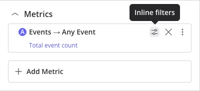
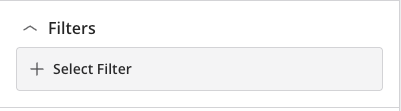
 5. **Filter your data** to focus only on the most relevant information. You can apply filters at two levels:
* **Inline filters:** Apply to a single metric, narrowing data only for that specific metric. Supports filtering by Event Properties, User Properties, Company Properties, and Segments.
5. **Filter your data** to focus only on the most relevant information. You can apply filters at two levels:
* **Inline filters:** Apply to a single metric, narrowing data only for that specific metric. Supports filtering by Event Properties, User Properties, Company Properties, and Segments.
 * **Global filters:** Apply across the entire report, affecting all metrics. Supports filtering by User Properties, Company Properties, and Segments (not Event Properties).
 6. **Breakdown your data** by an event property, user property, company property or segment to compare how different groups of users compare side-by-side (e.g. plan type, region, device type).
There is a limit of 10 steps that can be added to a Funnel report.
### Analyzing your Results
Click 'Run Query' and choose the right data presentation options for your needs.
1. Within the header, specify the following:
* **a. Chart period:** choose a time period from the default options (e.g. past 7 days, past 30 days, etc.) or specify a custom date range
* **b. Comparative period:** choose to 'compare previous period' which will show comparative data from the same time period directly previous to that shown, or specify a custom period
* **c. Platform:** focus on data from all platforms or choose to filter to only web or mobile data
* **d. Data point period:** specify whether each data point should represent a day, week or month *(Note: this is only applicable in some chart views)*
* **e. View of data:** choose between a split view or focus solely on the chart or table data
6. **Breakdown your data** by an event property, user property, company property or segment to compare how different groups of users compare side-by-side (e.g. plan type, region, device type).
There is a limit of 10 steps that can be added to a Funnel report.
### Analyzing your Results
Click 'Run Query' and choose the right data presentation options for your needs.
1. Within the header, specify the following:
* **a. Chart period:** choose a time period from the default options (e.g. past 7 days, past 30 days, etc.) or specify a custom date range
* **b. Comparative period:** choose to 'compare previous period' which will show comparative data from the same time period directly previous to that shown, or specify a custom period
* **c. Platform:** focus on data from all platforms or choose to filter to only web or mobile data
* **d. Data point period:** specify whether each data point should represent a day, week or month *(Note: this is only applicable in some chart views)*
* **e. View of data:** choose between a split view or focus solely on the chart or table data
 2. Choose the **chart type** from the following options:
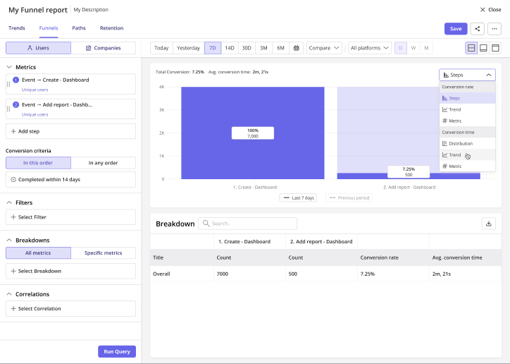 'Conversion rate' chart types: shows number of users who convert through the steps of the funnel
* **Steps:** Visualizes the number of users/companies at each funnel step, highlighting drop-offs
* **Trend:** Shows how the overall conversion rate changes over time
* **Metric:** Displays a single value representing the overall conversion rate
'Conversion Time' chart types: shows the time taken for users to move through the steps of the funnel
* **Distribution:** Displays how long users take to complete the funnel, showing spread or variance
* **Trend:** Shows changes in average conversion time over time
* **Metric:** Displays a single value summarizing the average or median overall time to convert (toggle between them using the chevron dropdown)
**Total Conversion Rate** = (Total no. of conversions in last step / Total no. of entries to the funnel) x 100.
**Average Conversion Time** = Sum of time taken for all conversions to complete funnel / Total number of conversions.
**Median Conversion Time** = The middle value of all individual conversion times when sorted from shortest to longest.
## Advanced Features
### 1. Multiple metrics
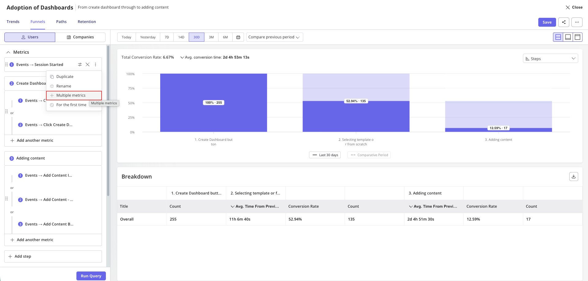
When defining metrics for each step, selecting **More Metrics** from the **More Actions** menu lets you add multiple metrics to a single step. This makes it easy to compare conversion rates from different starting points or event variations within the same funnel.
'Conversion rate' chart types: shows number of users who convert through the steps of the funnel
* **Steps:** Visualizes the number of users/companies at each funnel step, highlighting drop-offs
* **Trend:** Shows how the overall conversion rate changes over time
* **Metric:** Displays a single value representing the overall conversion rate
'Conversion Time' chart types: shows the time taken for users to move through the steps of the funnel
* **Distribution:** Displays how long users take to complete the funnel, showing spread or variance
* **Trend:** Shows changes in average conversion time over time
* **Metric:** Displays a single value summarizing the average or median overall time to convert (toggle between them using the chevron dropdown)
**Total Conversion Rate** = (Total no. of conversions in last step / Total no. of entries to the funnel) x 100.
**Average Conversion Time** = Sum of time taken for all conversions to complete funnel / Total number of conversions.
**Median Conversion Time** = The middle value of all individual conversion times when sorted from shortest to longest.
## Advanced Features
### 1. Multiple metrics
When defining metrics for each step, selecting **More Metrics** from the **More Actions** menu lets you add multiple metrics to a single step. This makes it easy to compare conversion rates from different starting points or event variations within the same funnel.
 ### 2. Breakdowns - Bucketing
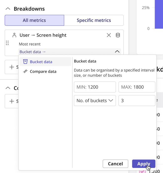
When breaking down a Funnel report by a numeric property, **bucketing** lets you group continuous values into ranges or intervals. This option is available under **"Manipulate Data"** for the selected breakdown property. Bucketing helps reveal patterns across different segments, such as users by age ranges, revenue tiers, or session counts.
* **Max and Min Value:** Define the smallest (e.g., `<100`) and largest (e.g., `>2000`) bucket values.
* **Interval Size:** Set the size of each bucket (e.g., `200`).
* **Number of Buckets:** Specify how many buckets the dataset should be divided into (e.g., `10`).
### 2. Breakdowns - Bucketing
When breaking down a Funnel report by a numeric property, **bucketing** lets you group continuous values into ranges or intervals. This option is available under **"Manipulate Data"** for the selected breakdown property. Bucketing helps reveal patterns across different segments, such as users by age ranges, revenue tiers, or session counts.
* **Max and Min Value:** Define the smallest (e.g., `<100`) and largest (e.g., `>2000`) bucket values.
* **Interval Size:** Set the size of each bucket (e.g., `200`).
* **Number of Buckets:** Specify how many buckets the dataset should be divided into (e.g., `10`).
 ### 3. Breakdowns - Baseline Comparatives
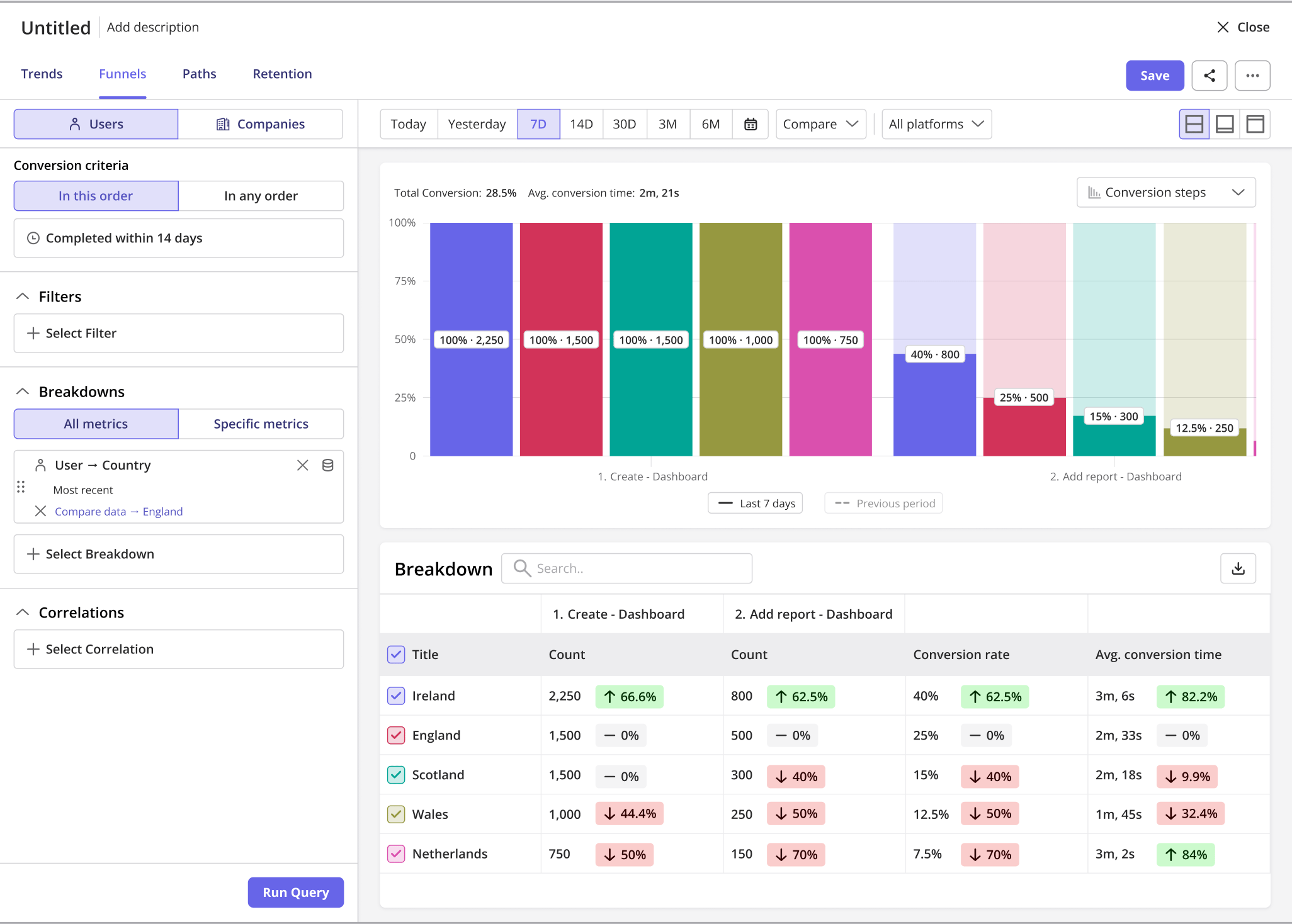
When applying a breakdown property, you can choose to compare each data value against a specific property value or against the overall dataset. This option is available under **"Manipulate Data"** for the selected breakdown property, allowing you to see relative performance or differences between segments.
**Example:** If you break down by **Country** and choose to compare data to **England**, the report will show how each country performs relative to England for that metric.
### 3. Breakdowns - Baseline Comparatives
When applying a breakdown property, you can choose to compare each data value against a specific property value or against the overall dataset. This option is available under **"Manipulate Data"** for the selected breakdown property, allowing you to see relative performance or differences between segments.
**Example:** If you break down by **Country** and choose to compare data to **England**, the report will show how each country performs relative to England for that metric.
 [For any questions or concerns please reach out to **support@userpilot.com**](mailto:support@userpilot.com)