Documentation Index
Fetch the complete documentation index at: https://docs.userpilot.com/llms.txt
Use this file to discover all available pages before exploring further.
This integration is included within the Enterprise plan and is available as an Add On for Growth plans.
Use Cases
- Enrich HubSpot contact records with product usage data - Sync Userpilot properties into HubSpot so marketing, sales, and CS teams can make data-driven decisions based on actual in-app behavior.
- Trigger HubSpot workflows based on real user actions - When a user completes an onboarding checklist, engages with a feature, or hits an activation milestone, automatically launch targeted HubSpot workflows like onboarding sequences, trial nudges, renewal reminders, or educational email drips.
- Personalize in-app experiences using HubSpot lists - Use intelligent segments built in HubSpot (e.g., lifecycle stage, MQL/SQL status, plan type, churn-risk list) to tailor Userpilot’s in-app flows and campaigns to specific audiences.
- Align Product, Marketing, and Customer Success around a single customer view - Combine behavioral data from Userpilot with CRM and marketing data in HubSpot to improve lifecycle messaging, surface expansion opportunities, and enable more accurate health scoring.
Getting started with Hubspot Integration
To begin setting up your HubSpot integration, navigate to the Integrations page from the Settings icon in the navigation header and click on the HubSpot integration tile..png?fit=max&auto=format&n=RXnwhApvF9mYIlqb&q=85&s=aba289b669ef07a35efd7c84197083d0)
.png?fit=max&auto=format&n=W39gKa5-RUMAd38A&q=85&s=f77e2341fa60490616decd97e6306200)
1. Connection overview
Toggle “Send and receive staging data only” if you’d like to test your integration setup before syncing any production data. This option is helpful when validating your field mappings or testing workflows without affecting live users.2. Mapping setup
Accurate mapping ensures Userpilot users and companies sync correctly with the right HubSpot objects.- Select the HubSpot objects you want to map Userpilot Users and Companies to. (Note: Some HubSpot objects do not support receiving activity data from Userpilot.)
.png?fit=max&auto=format&n=RXnwhApvF9mYIlqb&q=85&s=24f327cac957765630f86f8f65a4de54)
- Choose the corresponding Userpilot property and HubSpot field used to match records between both systems. These values must be identical in both platforms for proper mapping. Recommended: Use email whenever possible, as it provides the most reliable match for user-level data.
3. Hubspot to Userpilot
Select the user and company properties from HubSpot that you want to sync into Userpilot. These properties will automatically update in Userpilot every 5 minutes, ensuring your in-app targeting and segmentation always reflect the latest CRM data. Once the sync is active, you can view the imported properties:- On the Users or Companies dashboards
- Within the Data Management area, under the relevant property category
.png?fit=max&auto=format&n=RXnwhApvF9mYIlqb&q=85&s=75f88cade43afafa04fbd81f8fba6dac)
4. Userpilot to Hubspot
Userpilot can send a variety of user, company, and activity data into HubSpot to enrich CRM records, trigger workflows, and maintain a unified view of user behavior. Data is sent according to the type of property or event. Custom Properties - Choose the user and company custom properties that you would like to send from Userpilot to HubSpot for CRM enrichment. These mapped properties will update every 5 minutes and only properties that have changed since the previous sync will be sent—ensuring efficient, up-to-date record management inside HubSpot. Auto & Measured Properties - Choose the user and company auto properties that you would like to send from Userpilot to Hubspot. These properties will be updated on a daily basis and will show data from the specified ‘Measured period’ chosen.Measured Properties: Time Spent on Application
Measured properties like time spent on application are stored as integers representing the total number of seconds. Example:9000 seconds = 150 minutes = 2.5 hours
Conversions:
- Minutes:
seconds ÷ 60 - Hours:
seconds ÷ 3600 - Days:
seconds ÷ 86400
Date and DateTime Data Types
Date Type:- Format:
YYYY-MM-DD(e.g.,"2024-01-15") - HubSpot property type:
"date"
- Format:
YYYY-MM-DDTHH:mm:ssZ(e.g.,"2024-01-15T10:30:00Z") - HubSpot property type:
"datetime"
signup_date (Date), last_seen (DateTime), created_at (DateTime)
Userpilot activity - Streams Userpilot user activity to HubSpot instantly as they occur. Perfect for tracking engagement, triggering workflows, and maintaining real-time visibility into user and company behavior across both platforms. Depending on how you want the data to be used in HubSpot, Userpilot activity can be sent as either timeline events or custom events.
- Timeline events appear in the HubSpot activity timeline and provide a chronological view of user actions. They’re best for visibility and context—helping sales, marketing, and CS teams understand what a user did and when.
- Custom events are structured events designed for reporting and automation. They’re ideal for deeper analytics, funnel analysis, and triggering precise workflows based on specific product behaviors.
- Feature tags: Event has occurred
- Tracked Events: Event has occurred
- Labeled Events: Event has occurred
- Tagged Pages: Page has been viewed
- Checklists: Seen, Completed, Dismissed
- Flows: Seen, Completed, Dismissed
- Mobile content: Seen, Completed, Dismissed
- NPS: Ask Later, Feedback
- Surveys: Seen, Submitted, Dismissed
- Forms: Submitted
.png?fit=max&auto=format&n=RXnwhApvF9mYIlqb&q=85&s=28ad016a91a873e2fee21c324ff0055c)
5. Review and Test
Before going live, review your HubSpot integration setup carefully. Testing the sync allows you to see how selected users will be mapped in the integration and call out if the mapping has failed. This gives you a clear idea of what will happen before running the full sync for all your users. Once validated, you can enable full production sync.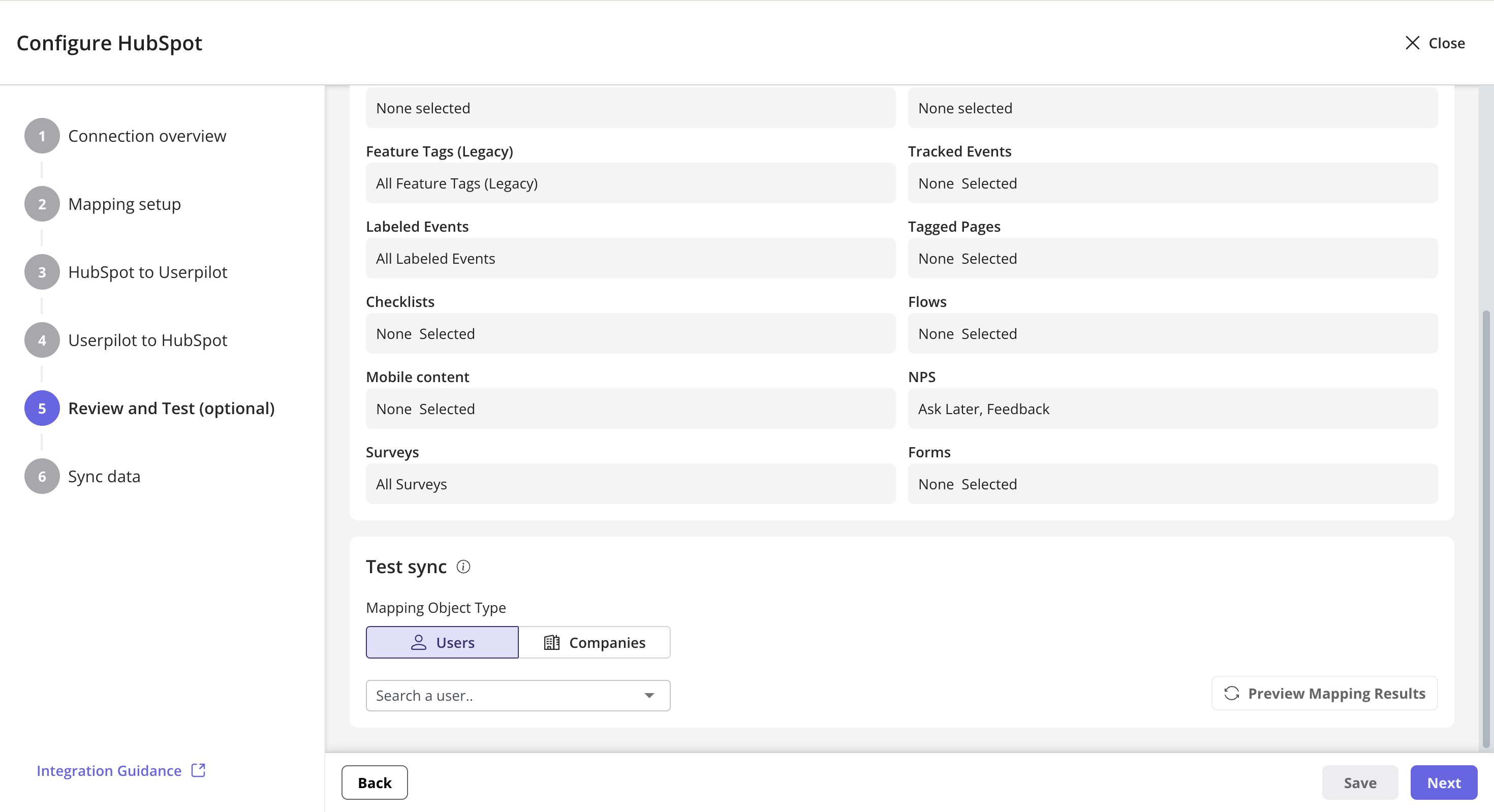
Testing sync will use the form fields in the set-up and provide a read only preview state - nothing will be changed or synced.
6. Sync Data
You can manually trigger a sync at any time to immediately update HubSpot with the latest Userpilot data. This is useful for testing, resolving discrepancies, or pushing urgent updates. Additionally, you can enable sync notifications to receive email alerts if a sync fails or encounters an error. This ensures you are promptly aware of any issues and can take action to maintain accurate, up-to-date CRM data.View Events in HubSpot
Once you click on save, you will start to see the events appear under the “Activity” tab for a contact or company..png?fit=max&auto=format&n=RXnwhApvF9mYIlqb&q=85&s=79cd8a7f39df4bac1d79efbc5a80a6a5)
FAQs
Does the Userpilot-HubSpot integration sync past events or only new ones?
Does the Userpilot-HubSpot integration sync past events or only new ones?
The integration does not sync past events—only new events are sent to HubSpot after the sync is enabled.
Do I need to re-run the sync to sync new contacts/companies?
Do I need to re-run the sync to sync new contacts/companies?
No, manual sync is only needed for the inbound manual sync of fully populated users/contacts. After that, data syncs in real time.
How does real-time syncing work?
How does real-time syncing work?
Userpilot automatically syncs data in these cases:
- A user triggers an event selected in the integration settings.
- A new contact is created in HubSpot.
- A mapped contact property is updated in HubSpot.
If I fix the map value for certain resources, do I need to run the mapping again?
If I fix the map value for certain resources, do I need to run the mapping again?
No, if you are on version 2 of the integration, you do not need to re-run the mapping. Our poll strategy will automatically detect changes to the mapping values and will map the external resource to your internal resource automatically.Example: If you initially mapped a Userpilot user to a HubSpot contact using an email address, and later that contact’s email is updated in HubSpot, the integration will automatically detect this change during the next poll cycle and update the mapping accordingly—no manual re-mapping required.