Search
In this section, you’ll configure the search functionality to specify which resources Userpilot should include in search results. Here, you can determine whether Userpilot should search through help articles from the “Help” tab, home modules from the “Home” tab, and news posts from the “News” tab. Additionally, you can customize the search text, no-result page text, and button text.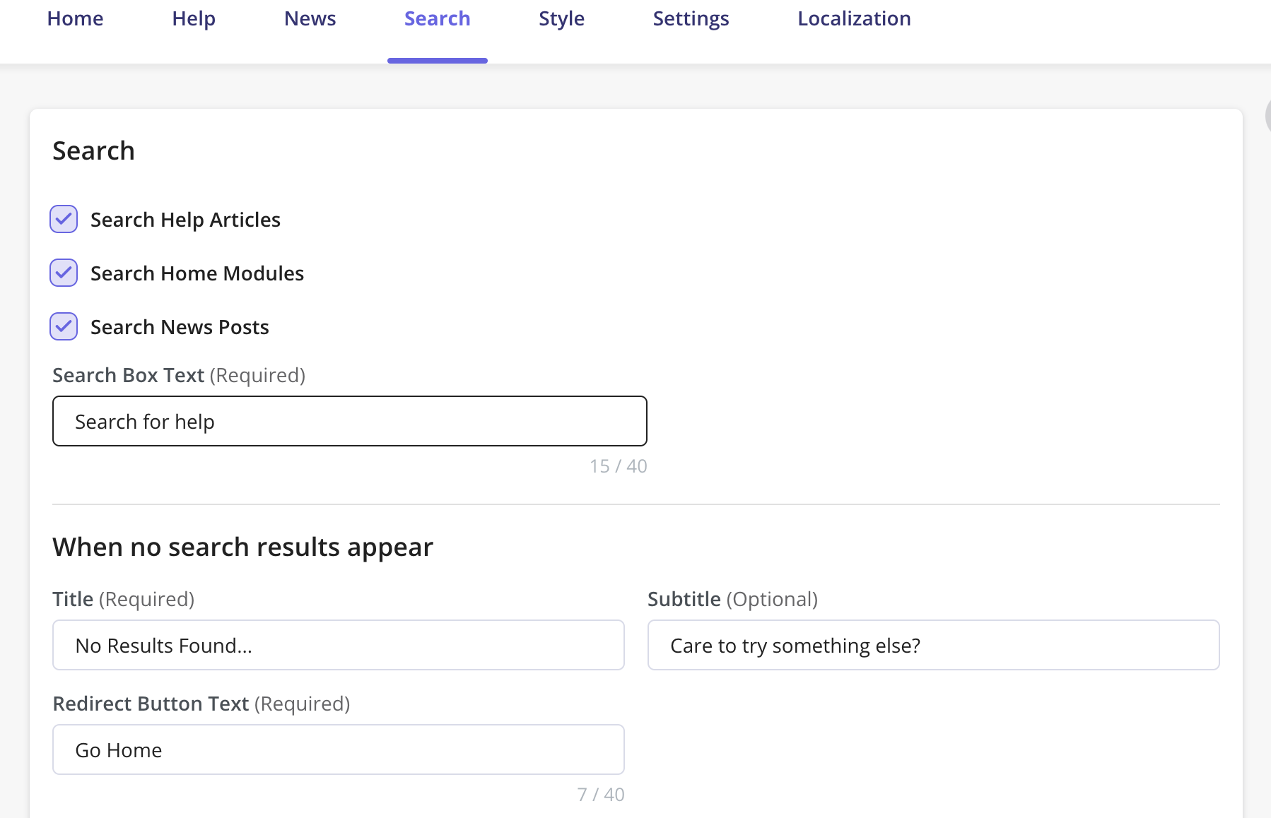
Style
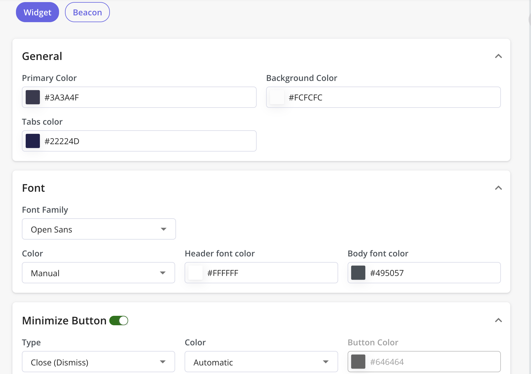
Introducing the Style tab – your go-to for customizing the appearance of both the beacon and widget in the Resource Center. From colors to fonts, this tab offers easy-to-use tools to make your center stand out. Let’s explore how you can enhance its look to better connect with your audience. This tab will be split into two distinct sections: Widget and Beacon. This division aims to streamline the configuration process and enhance usability.Widget
- Customize the appearance of your Resource Center widget with ease.
Modify elements such as widget colors, type and color of the font, and minimize button settings.
Main design
- Primary Color - which is the color of the top header section
- Background Color - the background color of the content section
- Icon Color - the color of the widget icon
- Carets Color - the color of the side arrows that appear in each module
Text Settings
- Font Family - you can add your own font as long as it is a google font
- Font Color
- Note: Select the Color option to be “Manual” in order to edit the text color.
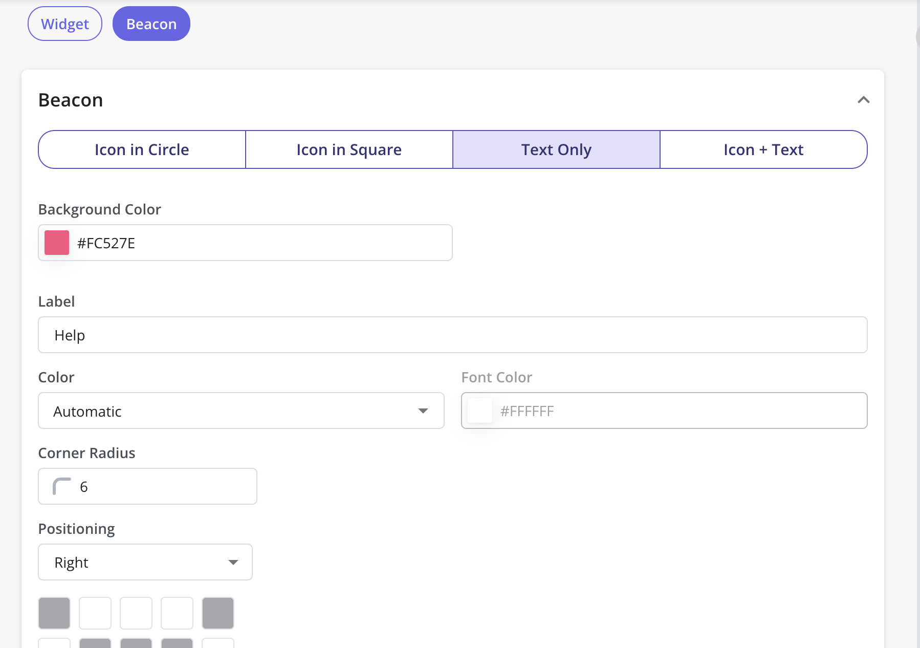
Beacon
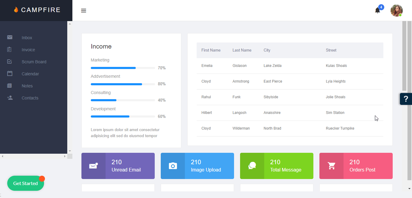
The Beacon is the button your end-users will click to open the Resource Center widget. After you’ve created the Resource Center, you can:- Modify the Beacon background-color
- Choose the Beacon type
- Add your Beacon text
- Modify the text color
- Choose the position and text for the Beacon
- Modify the beacon’s color, icon, and position directly from this tab.
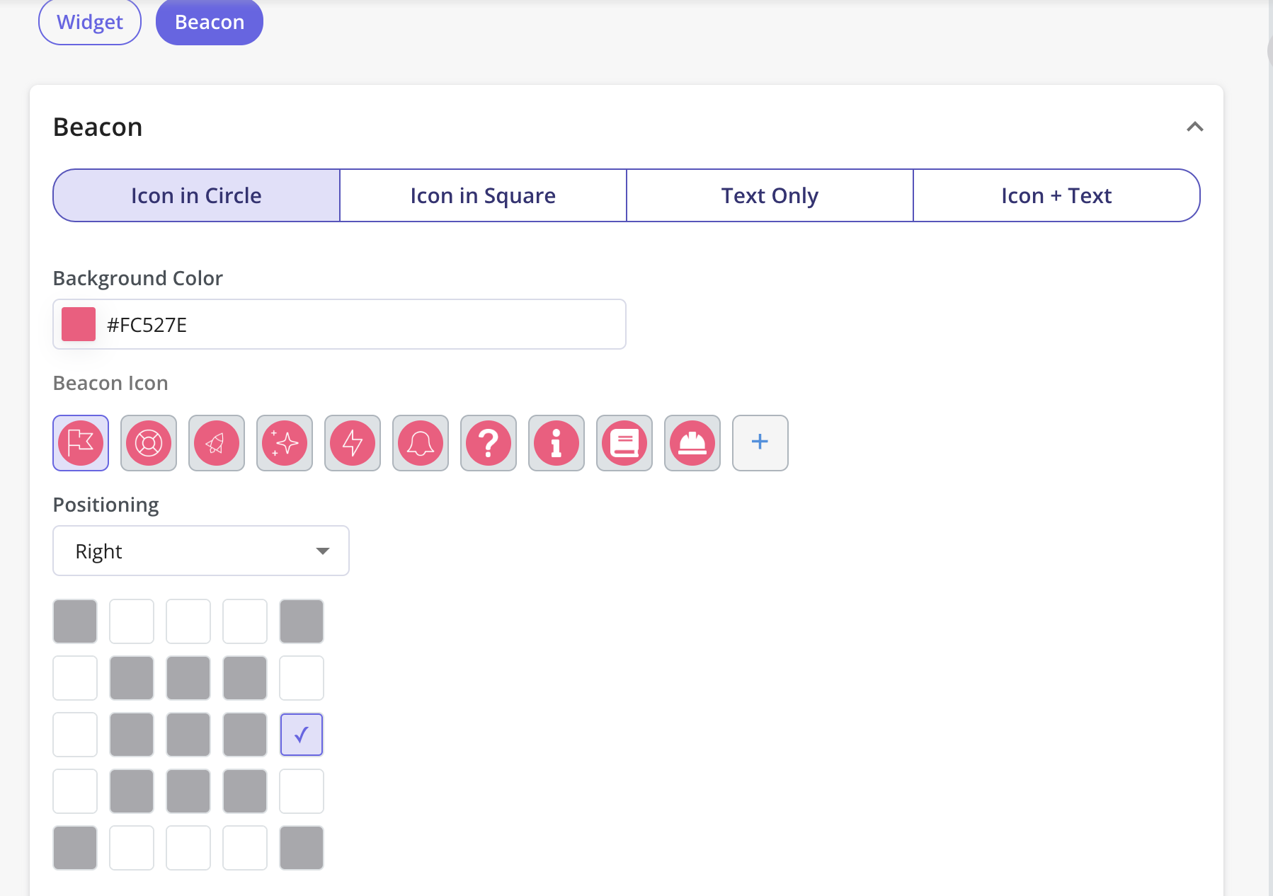
- The “Corner Radius” field in the Style tab controls the roundness of the beacon’s corners.
Settings tab
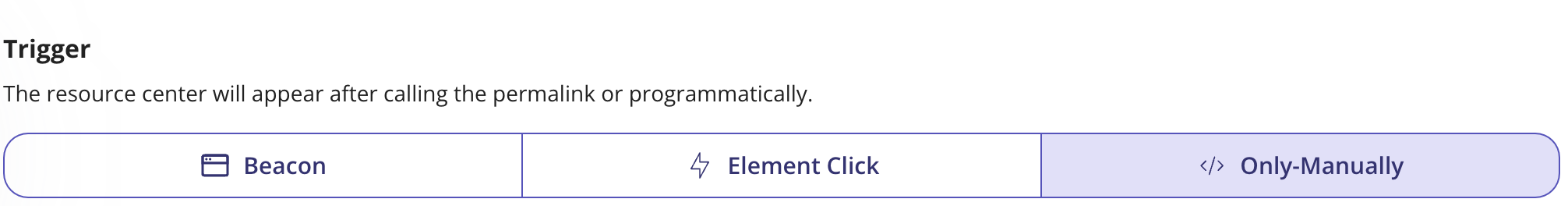
Resource Center Triggering
This section of the Settings tab will describe the set of options that can be used to trigger the Resource Center within your application. These options will define how will the Resource Center widget be launched. Options:1. Beacon
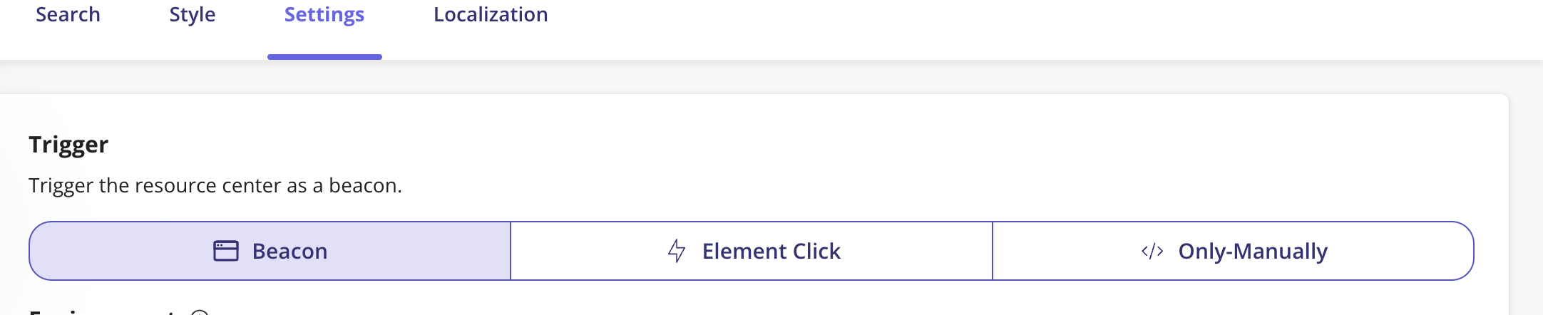
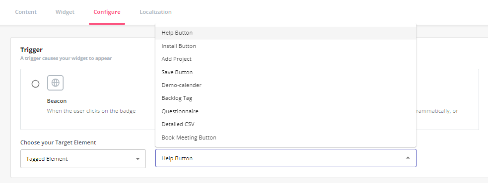
2. Element Click
If you would like to trigger the Resource Center when the user clicks on a specific element in your web app for the widget to be shown. Once selected, you can specify the CSS selector for the target element in Userpilot.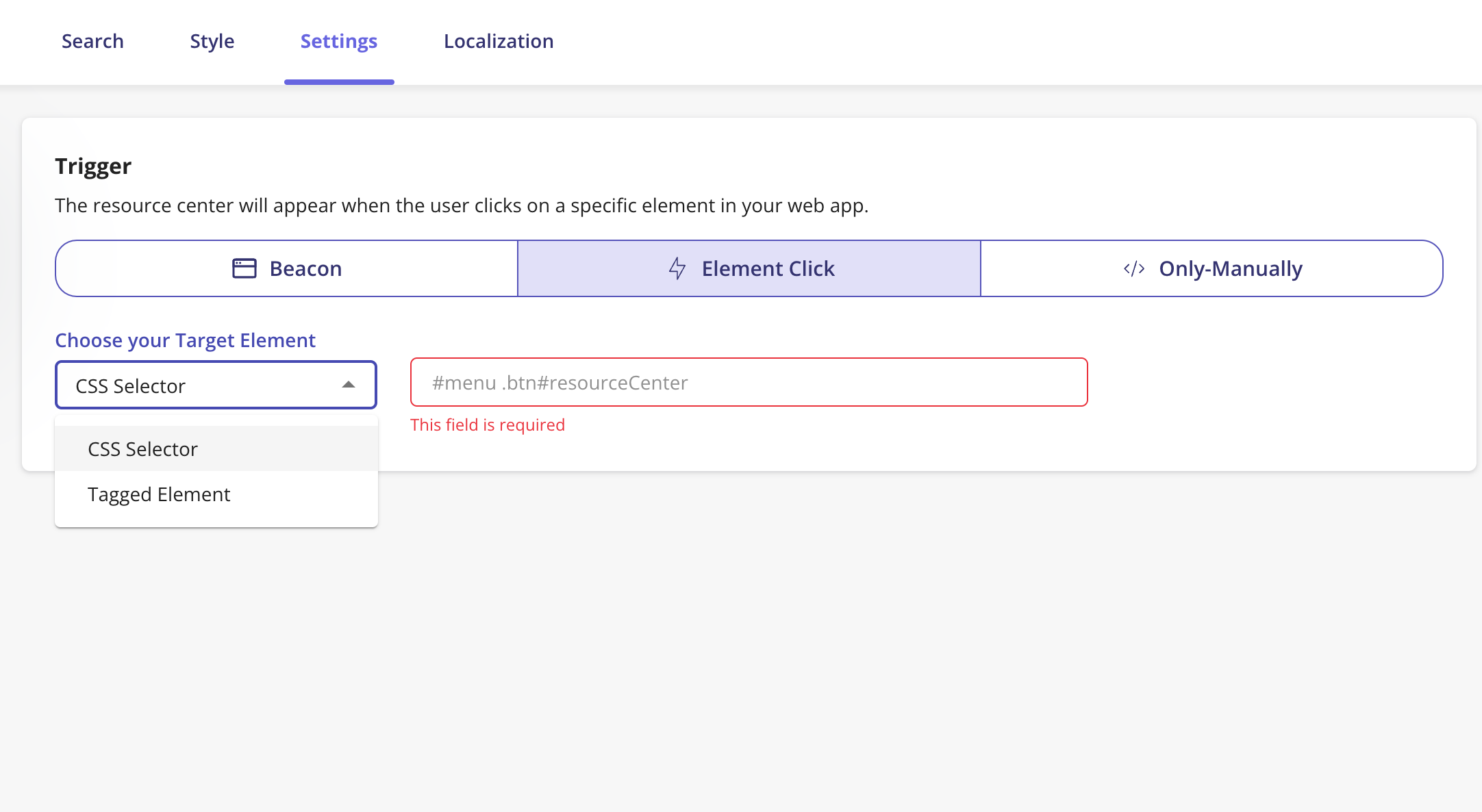

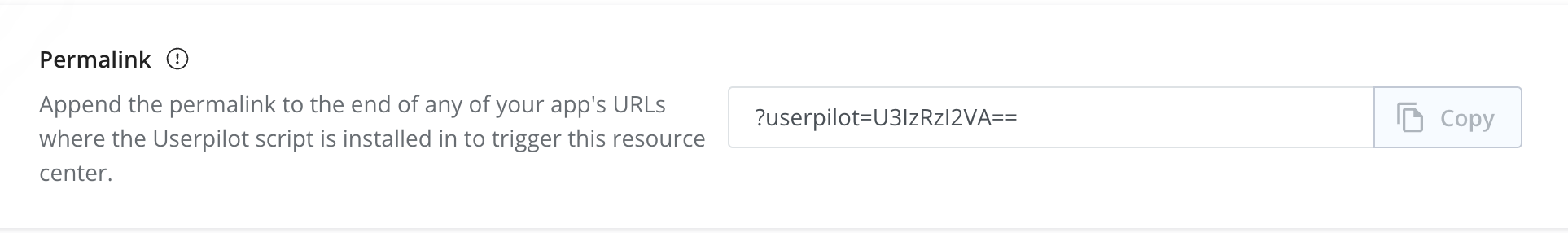
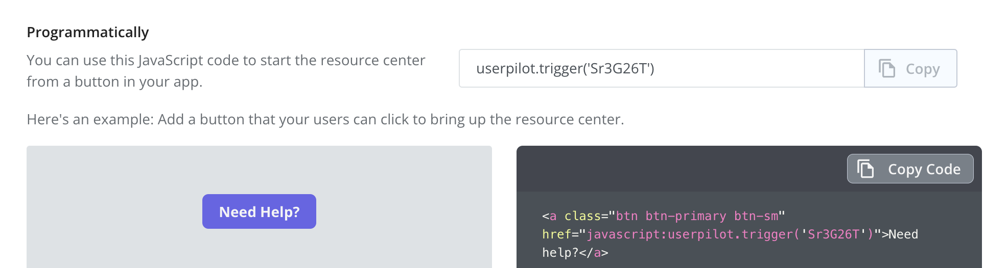
3. Only Manually
There is more than way to trigger the Resource Center manually, it can be achieved using the permalink, programmatically, or via Userpilot content.