Overview
The overview tab provides general analytics for all of your checklists, allowing you to monitor live performance and determine the effectiveness of your checklists.Checklist Overview
This section will show a table with a list of all the checklists you’ve created, as well as data about each one’s settings.Checklist overview table
- Checklist Settings: Status (Draft, live, live with unpublished changes and archived), target users, and target page.
- Checklist Analytics: Shown, completed, dismissed, and last clicked.
- Checklist Creation Details: Published time, created time, created by, last updated, and updated by.
Overview table filters
You’ll also be able to search for certain checklists or filter them based on their status and teammates.- Search: Free text search to find checklists by title to quickly locate a specific checklist.
- Date Range: Filter the Started, Completed, and Dismissed columns in the table based on the selected date range to analyze performance over time.
- Status: Filter by checklist status such as All status, Draft, Live, Pending, and Archived, to manage and review checklists at different stages.
- Segment: Filter by the user segment targeted by the checklist to focus on specific audience groups you have created.
- Created by: Filter checklists by the teammate who created them to track ownership and collaboration.
- Page: Filter by the page where the checklist is displayed to review targeting and placement.
- Trigger: Filter by the event or rule that triggers the checklist to understand when and how users see it.

Action menu
Click the three dots in the Actions column to view, edit, adjust settings, archive, publish, or manage other checklist options.- View: Preview the checklist as it will appear to users to verify its content and design.
- Edit: Open the checklist editor to modify content, steps, or targeting settings.
- Settings: Adjust advanced options such as triggers, segments, or targeting rules for the checklist.
- References: See where the checklist is used or linked within your project to manage dependencies.
- Duplicate: Create a copy of the checklist to reuse or adapt for other scenarios (disabled in this screenshot).
- Archive: Remove the checklist from active use while keeping it stored for future reference.
- Publish: Make the checklist live and visible to users based on its targeting and trigger rules.

Export overview table
Export the checklist data as a CSV file to share with your team, review performance, and analyze user engagement. The file will be sent to the email registered with your Userpilot account.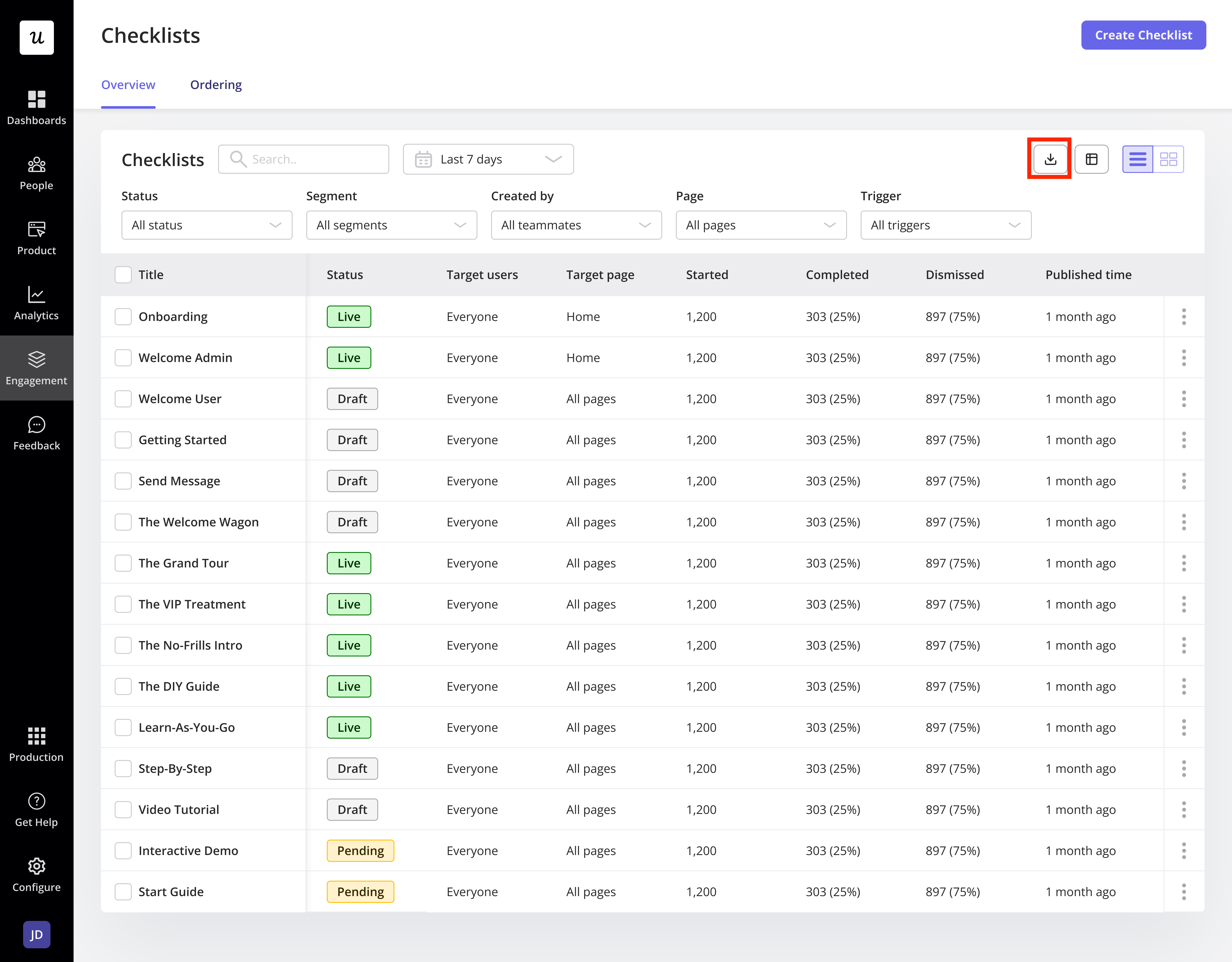
Keep in mind that exporting won’t follow your current filters or column arrangement. Userpilot will send all the checklist data, no matter how you have it set up on your table.
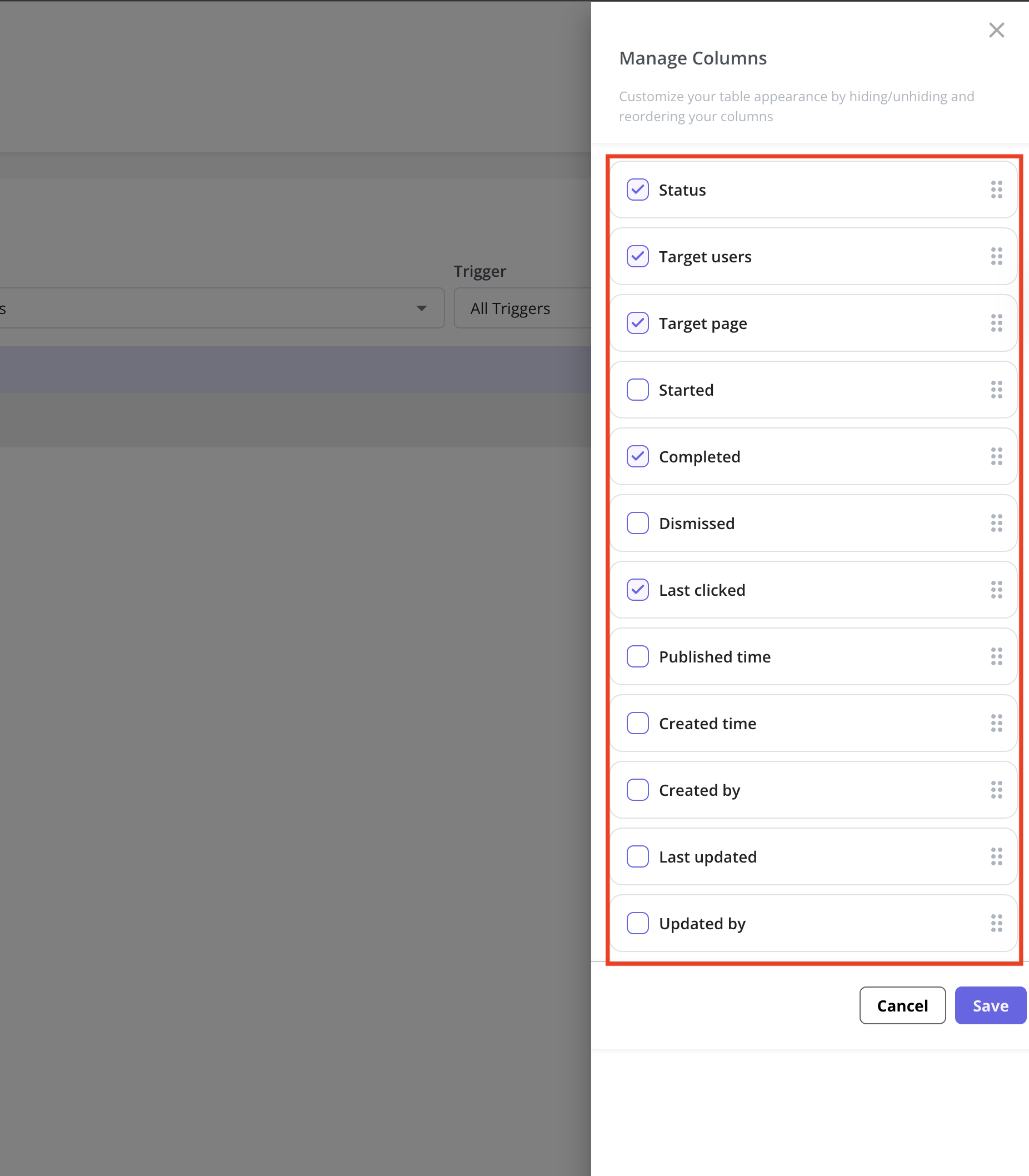
Manage columns
Use the manage columns feature to customize your table view based on your preferences. Easily select and reorder the columns that are most relevant to your work with a simple drag-and-drop experience in the side panel.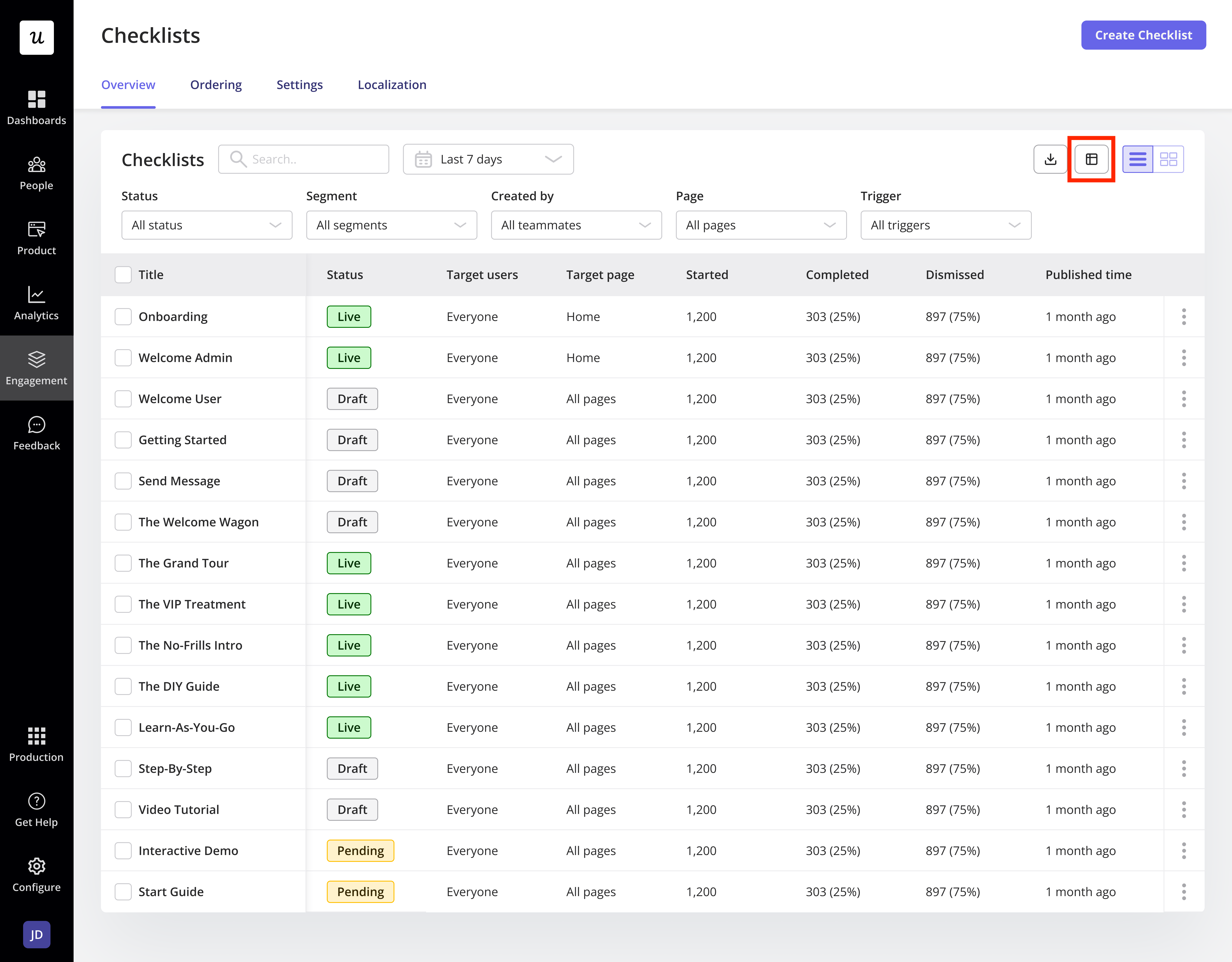
Change the checklist overview view
You can switch between table view and card view to choose the layout that best suits how you want to see your checklists.
Checklist Ordering
In the ordering tab, you can prioritize your checklists by placing them in sequential order, allowing you to choose which checklist will be displayed first when two or more checklists compete to appear in your app at the same time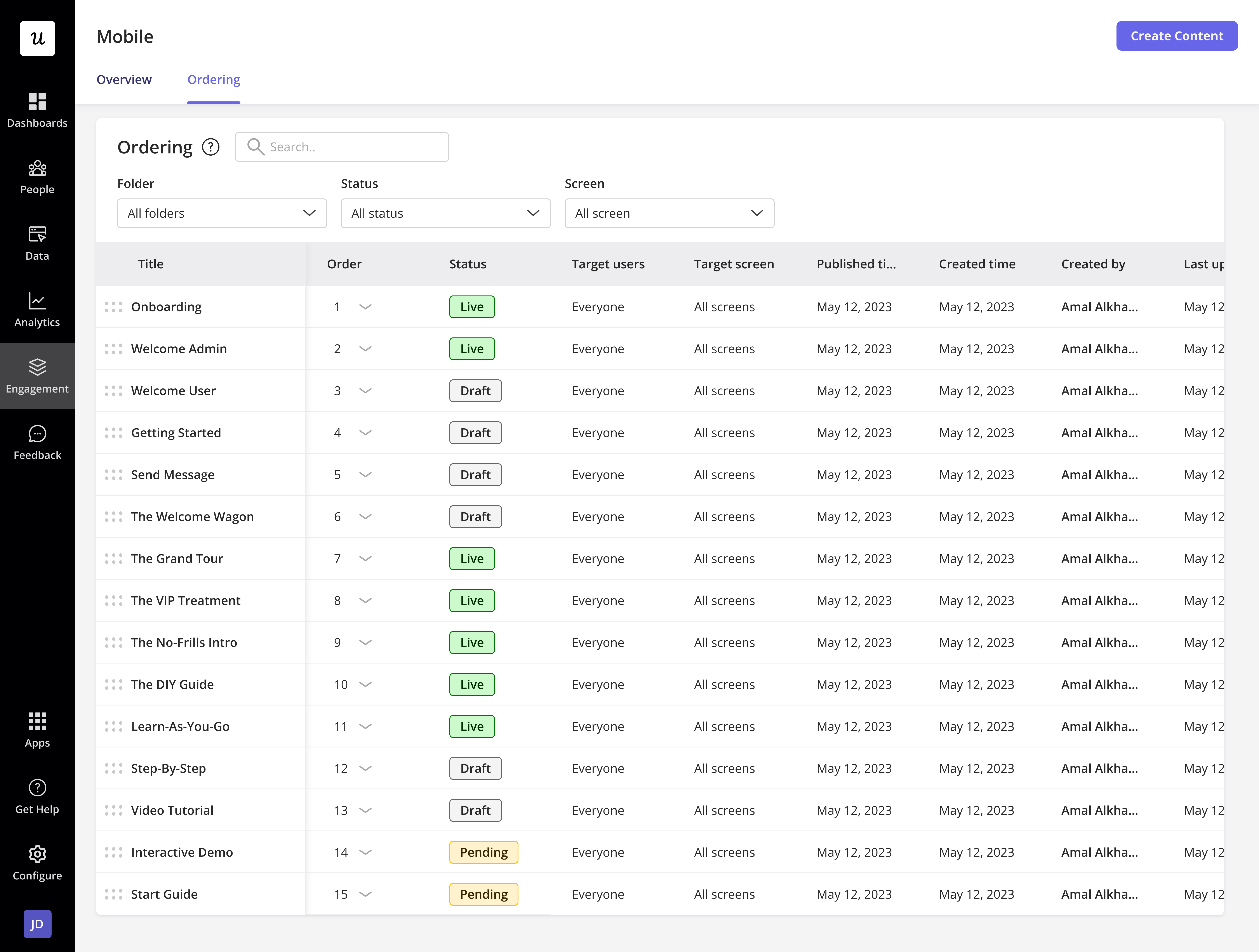
Checklist ordering behavior
- You can rearrange the checklist by editing the number.
- Checklists that require user action (e.g. a custom event) to occur will still be shown once that action occurs later. However, at this time, if other checklists are also available to start on the same page, these will show first.
- Checklists that are created more recently will be added to the end of the list and prioritized lower than older checklists.
- Once a checklist has a status of “Archived”, it will no longer appear within the ordering list.
- Once a checklist is set to be triggered manually or via a link, it will no longer appear within the ordering list.
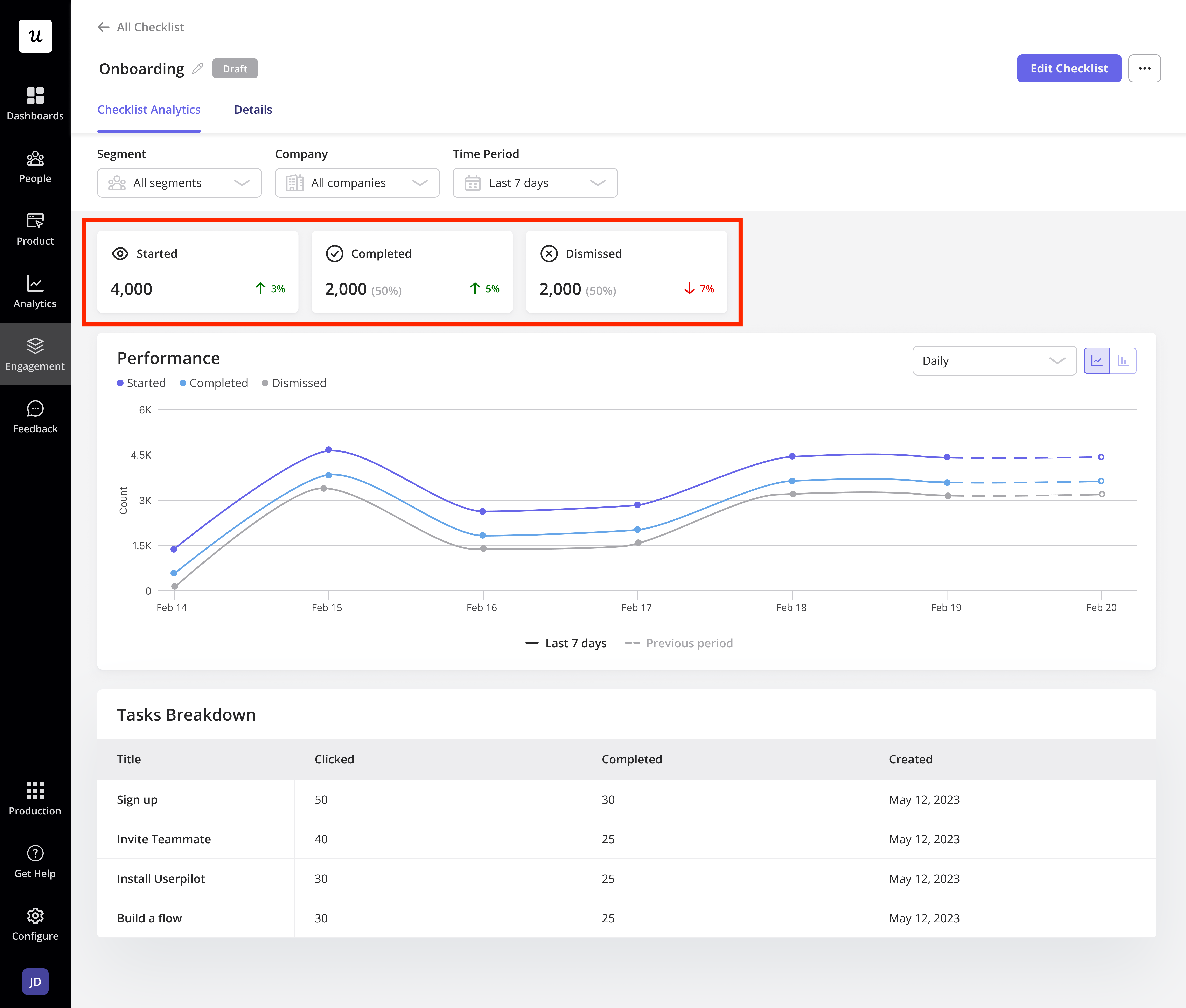
Checklist Analytics
By clicking on the desired checklist title from the overview or ordering tab, and you’ll go to a page with more details and stats for that specific checklist. To begin, you can filter the analytics to drill down to a certain segment and timeframe, allowing you to get metrics relevant to that segment and timeframe.- Segments: You can view how checklists perform within different segments, so you can compare your checklists here by choosing only a particular segment to display.
- Time period: You may also evaluate how your checklists are performing over time and compare the performance of several checklists during a specific time period.
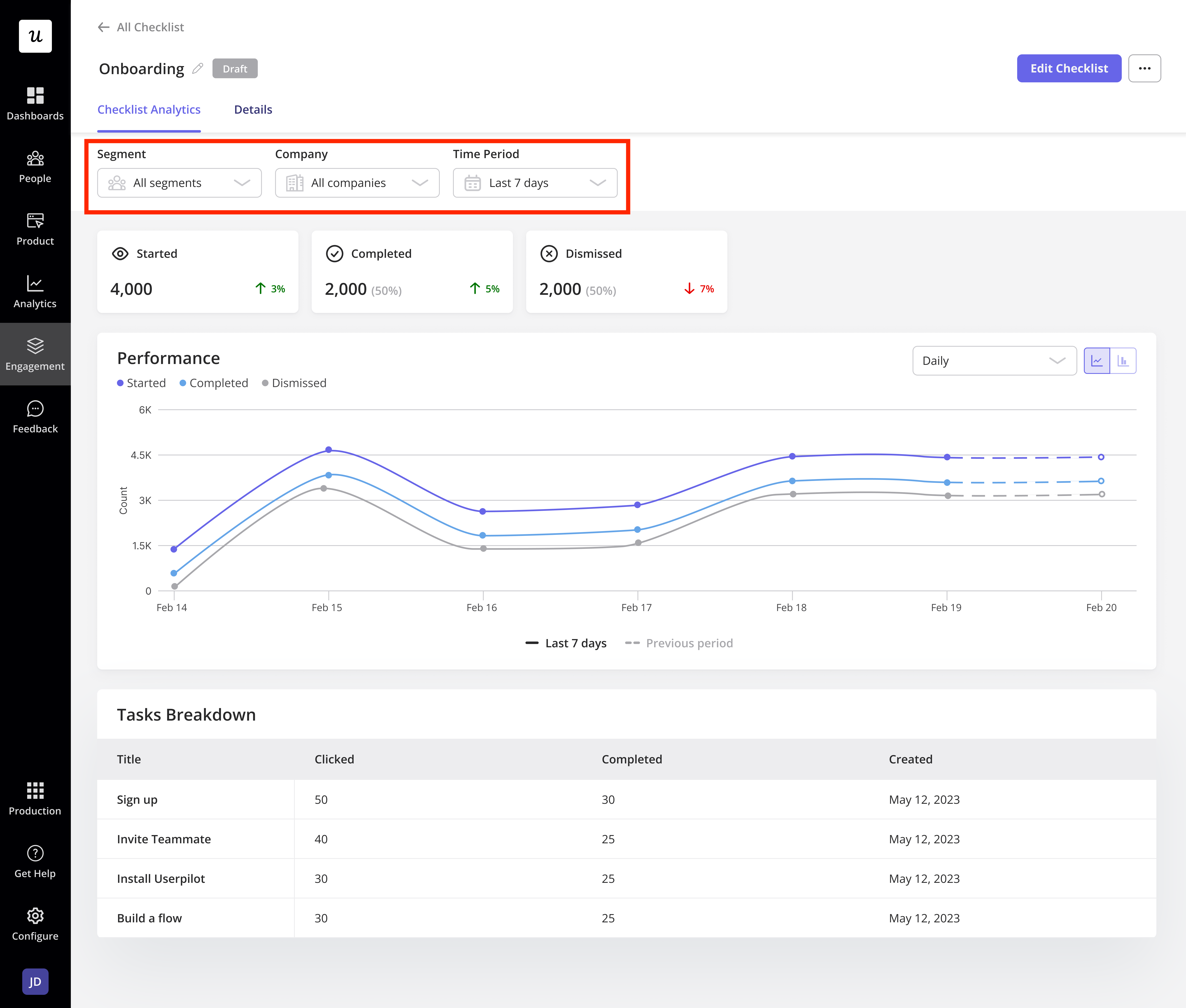
- Started: The number of times the Checklist has been viewed since it was first loaded.
- Completed: The total number of users who saw and completed all of the tasks.
- Dismissed: The number of times a user dismissed a checklist before finishing all of the tasks on it.