What is web accessibility?
Web accessibility means designing and building digital content, such as websites, web apps, and mobile apps, so that people of all abilities, including those with visual, auditory, motor, or cognitive impairments, can perceive, understand, navigate, and interact with it. It’s not just about compliance; accessible design improves usability for everyone, from older adults to keyboard-only users. At Userpilot, our engineering team started by reviewing WCAG and identifying areas to improve accessibility in our in-app messages.Which web content accessibility guidelines apply?
The Web Content Accessibility Guidelines (WCAG) provide the global standards for this. They’re built on four key principles:- Perceivable: Content must be visible or audible; for example, images should include alt text.
- Operable: All interface elements should work via keyboard and other input methods.
- Understandable: Content and navigation should be clear, with the page language defined in the code.
- Robust: Code should follow web standards to work across browsers and assistive tools.
How Userpilot supports accessibility
Userpilot currently aligns with key WCAG 2.1 Level AA principles by offering essential accessibility features in in-app messages. These include:- Keyboard navigation
- Screen reader support
- Color contrast
Multi-language accessibility - Userpilot automatically sets the language attribute on HTML elements, enabling screen readers to detect the correct language and read text with accurate pronunciation and context.
Screen reader support
Screen readers are tools that help people with visual impairments understand what’s on a webpage by reading the content out loud. To make this work smoothly, we make sure all text is easy to read and navigate, and we use ARIA labels and Alt text to describe what each element does or what state it’s in. Combined with solid keyboard navigation, full support for screen readers ensures everyone can easily access and interact with our in-app messages.
Color contrast
Userpilot encourages maintaining high color contrast between text and backgrounds and avoiding color as the sole indicator of meaning (e.g., success vs. error). In your in-app messages, ensure contrast ratios follow WCAG 2.1 standards, 4.5:1 for normal text and 3:1 for large text. Since Userpilot allows full control over fonts and colors through its Themes, you can easily adjust styles to meet these accessibility requirements.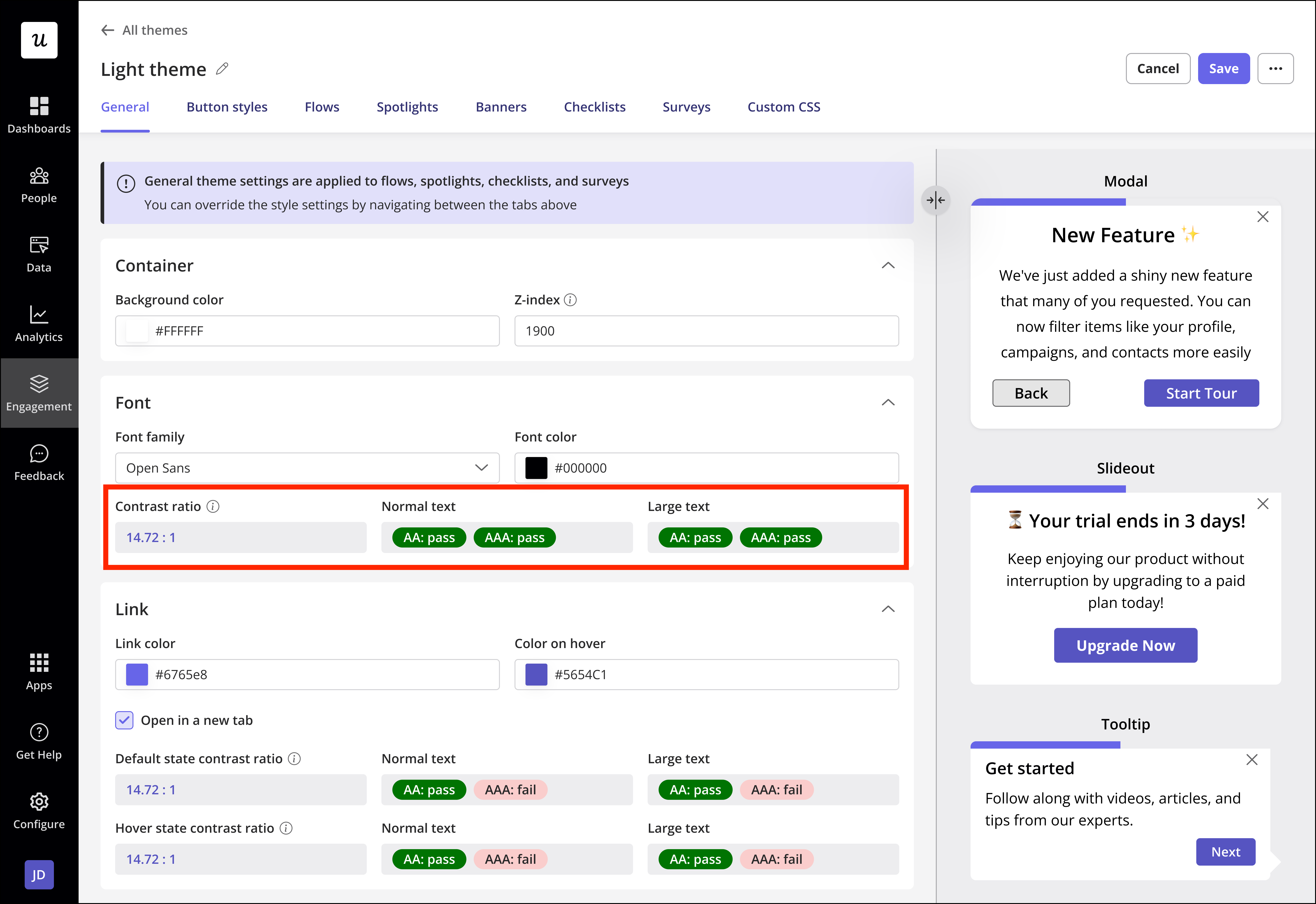
Accessibility features built into Userpilot
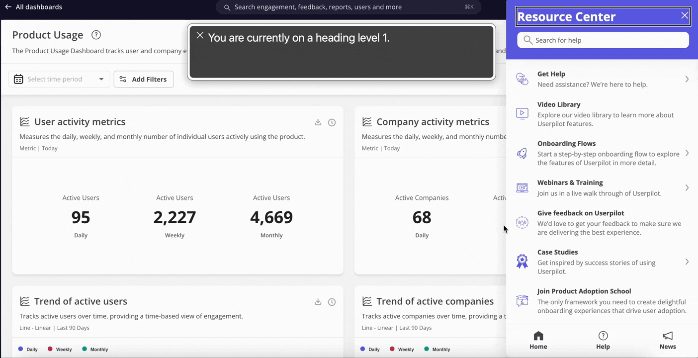
All Userpilot content automatically includes key accessibility features, no setup needed. These enhancements make your in-app messages easier to navigate and more inclusive for everyone.Semantic headings
Userpilot uses proper heading structures (like H2, H3, and paragraph tags) to create logical reading content elements. Screen readers rely on this hierarchy to help users move through content smoothly and understand its structure.ARIA Labels
ARIA (Accessible Rich Internet Applications) labels are automatically applied to describe each element’s purpose. This helps users who rely on assistive technologies, such as screen readers, better understand what each element does.Roles
The right HTML roles (for example, role=“button” or role=“dialog”) are included by default so assistive tools can accurately interpret and announce how each element behaves.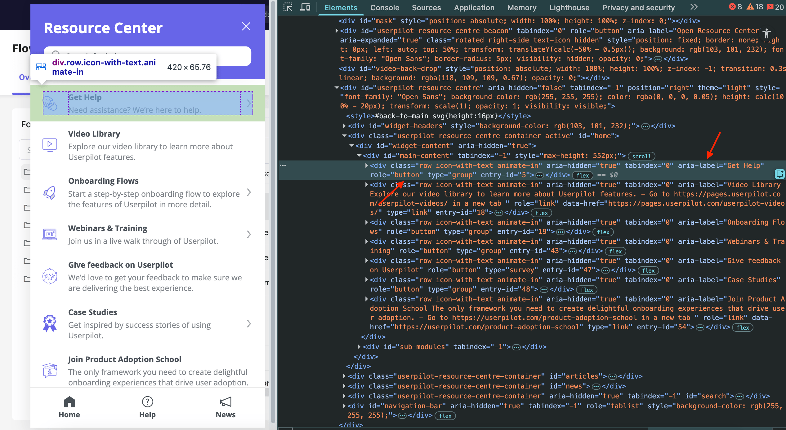
In-app messages that support accessibility in Userpilot
Userpilot’s accessibility features apply across all in-app experience types, ensuring inclusivity throughout the user journey. Accessibility is supported in:- Flows
- Spotlights
- Embeds (Cards and Banners)
- Checklists
- Resource Center
- NPS
- Surveys
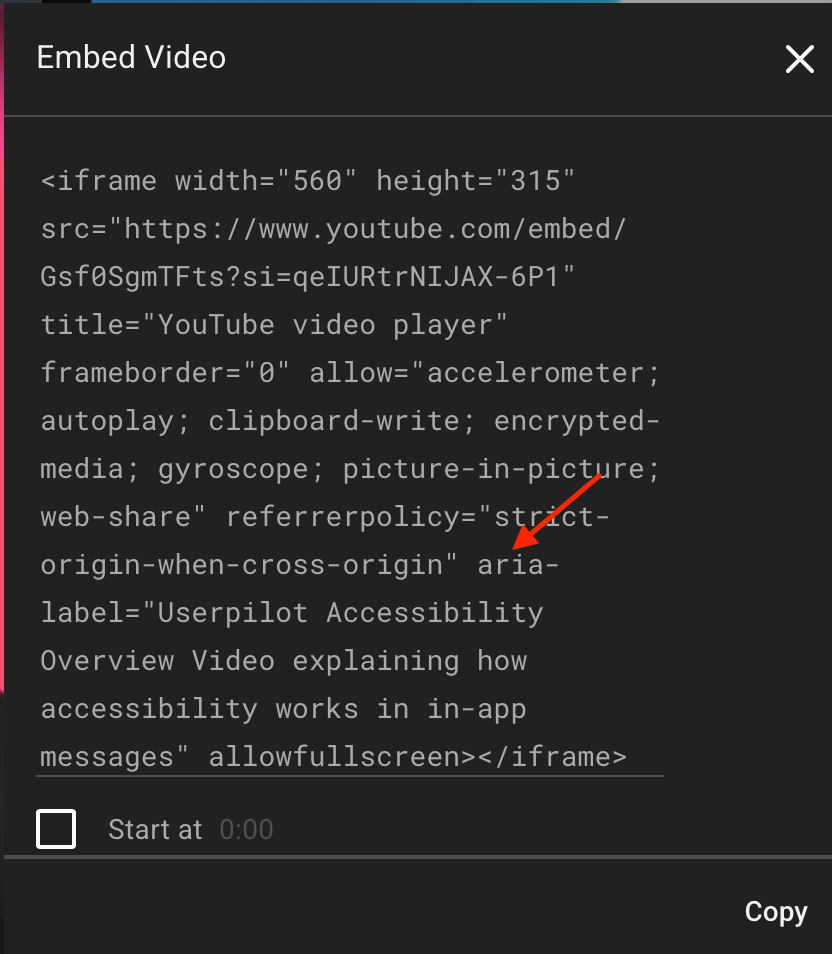
- To make videos accessible in Flows, Checklists, or the Resource Center, add
aria-labelto the embed code and include a brief video description for screen readers.
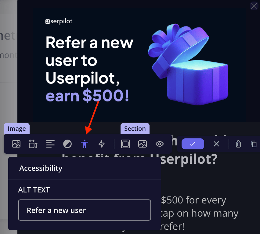
- For images in Flows or Resource Center posts, click the accessibility icon and add a short description to make the image readable by screen readers.
Keyboard navigation
Keyboard navigation plays a crucial role in making your in-app messages accessible. Many users with visual or auditory impairments rely on their keyboards along with screen readers to explore content and interact with elements. You can test this yourself by enabling your device’s built-in screen reader and navigating through your in-app experiences using the standard keyboard shortcuts. As you move through each element, you’ll hear how focus shifts across the interface and how every item is announced aloud.- Tab → Move forward through interactive elements (links, buttons, inputs, etc.)
- Shift + Tab → Move backward through elements
- Enter/Spacebar → Activate the selected element (like clicking a button or link)
- Arrow keys → Navigate within components such as dropdown menus, radio buttons, sliders, or tabs
- Esc (Escape) → Close modals, tooltips, or dropdowns
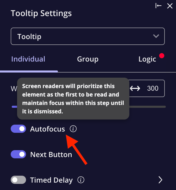
For tooltip and driven action steps, enabling the autofocus option helps users navigate smoothly with the keyboard by clearly indicating the active element.