Documentation Index
Fetch the complete documentation index at: https://docs.userpilot.com/llms.txt
Use this file to discover all available pages before exploring further.
Overview
Spotlights are interactive in-app messages that appear within your web app. They provide a seamless way to boost user engagement by offering on-demand contextual help and announcements, without needing any extra coding or engineering support. Spotlights can be used to enhance user understanding and create effective communication across your platform.Use Cases
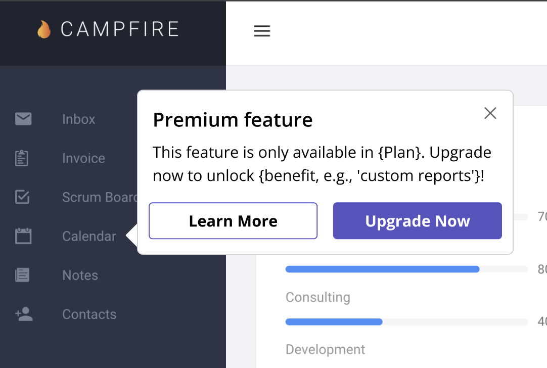
- Native Tooltips can clarify app elements when users hover over or click on specific areas, offering helpful context.
- Native Tooltips can highlight new features or updates in your app, ensuring users notice them.
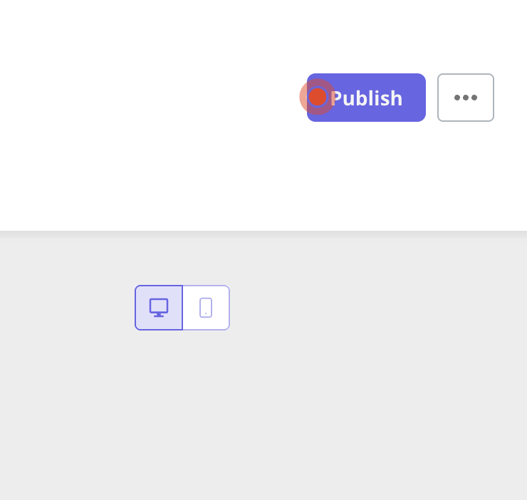
- Hotspots are small visual cues that guide users’ attention to specific parts of your app.
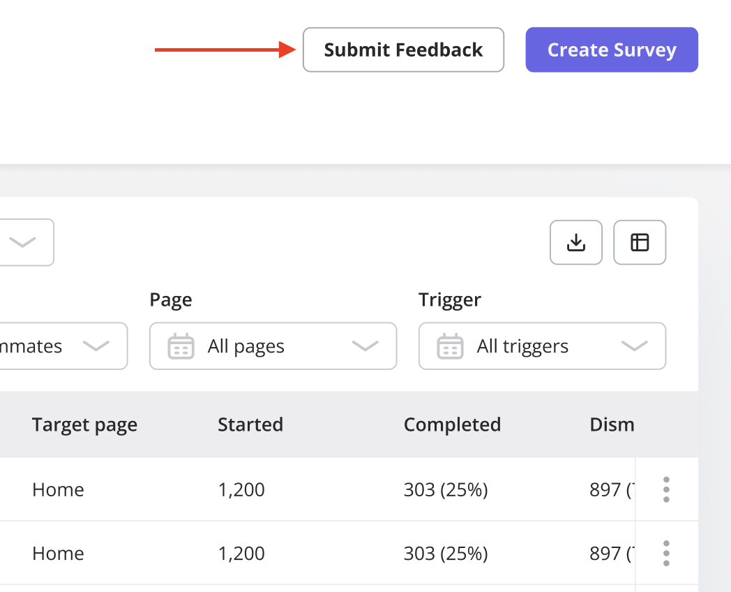
- Use Buttons to capture user attention. Adding a “New” label can make newly released features stand out.
Types of Spotlights in Userpilot
Native Tooltips
These in-app messages appear when users hover over or click on specific interactive elements or pre-determined badges. They’re ideal for providing quick, contextual help or guidance without disrupting the user’s experience.
Hotspots
Hotspots are small beacons that draw users’ attention to key elements within your app. These are great for encouraging users to explore specific features.
Buttons
Buttons drive users to take specific actions, whether it’s signing up for a demo, upgrading a plan, or learning more about a feature. Buttons are a key interactive element within Spotlights, and their design and placement can significantly influence user behavior.
Best Practices for Creating Spotlights
1. Define a Clear Purpose
Before creating a spotlight, ensure that it has a specific goal, such as providing clarification, prompting an action, or announcing an event. Spotlights should always serve a purpose and deliver relevant information.2. Target the Right Audience
Leverage segmentation to ensure that spotlights are shown to the right users at the right time. By customizing your messaging based on user data, you’ll create a more personalized experience that resonates with your audience.FAQs
Can I create a button for an unclickable element?
Can I create a button for an unclickable element?
What's the difference between Native Tooltips and Hotspots?
What's the difference between Native Tooltips and Hotspots?
Native Tooltips provide contextual help when users hover or click on an element, offering insights or guidance. Hotspots, on the other hand, are visual cues that direct users’ attention to specific areas in your app without requiring interaction.