Use cases
- Track user growth and engagement – Measure DAUs, WAUs, and MAUs over time to understand adoption and retention.
- Analyze feature adoption – Compare the performance of key features and how various user segments interact with them.
- Measure the impact of in-app experiences – Evaluate how flows, checklists, or product changes affect user behavior.
- Build and monitor custom metrics – Create formulas, track KPIs like conversions, and visualize performance with charts.
- Segment and break down data – Drill into results by user / company properties (e.g., region, device, or plan type) or segments for deeper insights.
Getting started with Trends
To get started with creating a Trend, navigate to the Trends page from the navigation bar or through the ‘Create Report’ button within the Saved Reports page.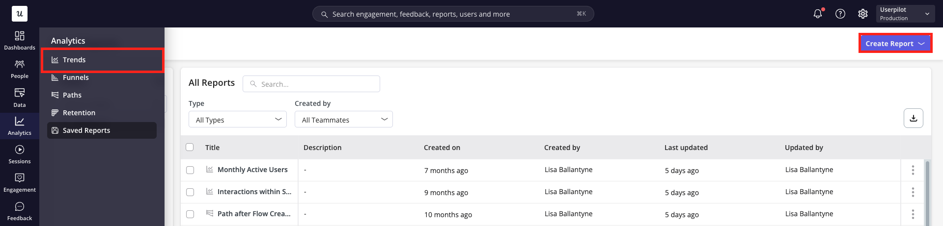
Building your Trend Report
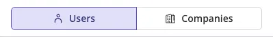
- Firstly, choose whether you’d like to analyse the data on a user or company level.
- Next, define the metrics you’d like to analyse within your report. These are the core elements that make up your trend report and can be chosen from four categories: a. Events: Show data based on occurrence of your labeled events, tracked events, custom events or feature tags. b. Pages: Show data based on views of your tagged pages. c. Content Engagement: Show data based on interactions with your Userpilot content d. Segments (Coming soon): Show data based on the users / companies who belong to a specific segment.
.png?fit=max&auto=format&n=j6BdSiRiF3SCgUJf&q=85&s=587812a6a975b9d9b56eb3fa8d18348f)
There is a limit of 25 metrics that can be added to a Trend report
- Once you’ve specified the metrics you’d like to analyze, specify how you’d like each of these metrics to be measured:
- Total event count: the total number of times the metric has occurred within the given period
- Unique users / companies: the number of users or companies who performed the metric within the given period
- Total sessions: the number of sessions in which the metric has occurred within the given period
- Active users: dependent on the active user option chosen, the number of users who performed the metric within the previous day (DAU), week (WAU) or month (MAU) relative to the data point
- Count per user: the distribution of metric activity per individual user
- Maximum: the highest number of times a single user performed the metric within the data point
- Minimum: the lowest number of times a user performed the metric within the data point period (excluding users who did not perform the metric)
- Average: the mean number of times users performed the event within the data point period
- Median: the middle value when all users are sorted by event count
- 90th, 95th or 99th percentile: the value below which 90%, 95% or 99% of users fall
- Aggregate property: summarize a numeric property based on users / companies who performed the specified metric
- Average: the mean property value of all users who performed the metric within the data point period
- Sum: the property values from all users who performed the metric within the data point period added together
- Distinct count: the number of unique values of the property
- Median: the middle value when all property values are sorted
- Maximum: the highest property value
- Minimum: the lowest property value
- Filter your data to focus only on the most relevant information. Metrics can be filtered by:
- Event Properties (for inline filters only)
- User Properties (for user-level data only)
- Company Properties
- Segments
- Event Frequency - Include only users or companies who performed an event at least x times within the full period or per data point
- Page Frequency - Include only users or companies who viewed a page at least x times within the full period or per data point Additionally, you can apply filters at two levels:
- Inline filters: Apply to a single metric, narrowing data only for that specific metric.
.png?fit=max&auto=format&n=j6BdSiRiF3SCgUJf&q=85&s=c6236fe6bf5505d92ebd4c4b828e9cb8 "Image(3) Pn")
- Global filters: Apply across the entire report, affecting all metrics.
 Pn")
- Inline filters: Apply to a single metric, narrowing data only for that specific metric.
- Breakdown your data by an event property, user property, company property or segment to compare how different groups of users compare side-by-side (e.g. plan type, region, device type).
 Pn")
Property value timing
When filtering by a user or company property, choose how the property value is evaluated: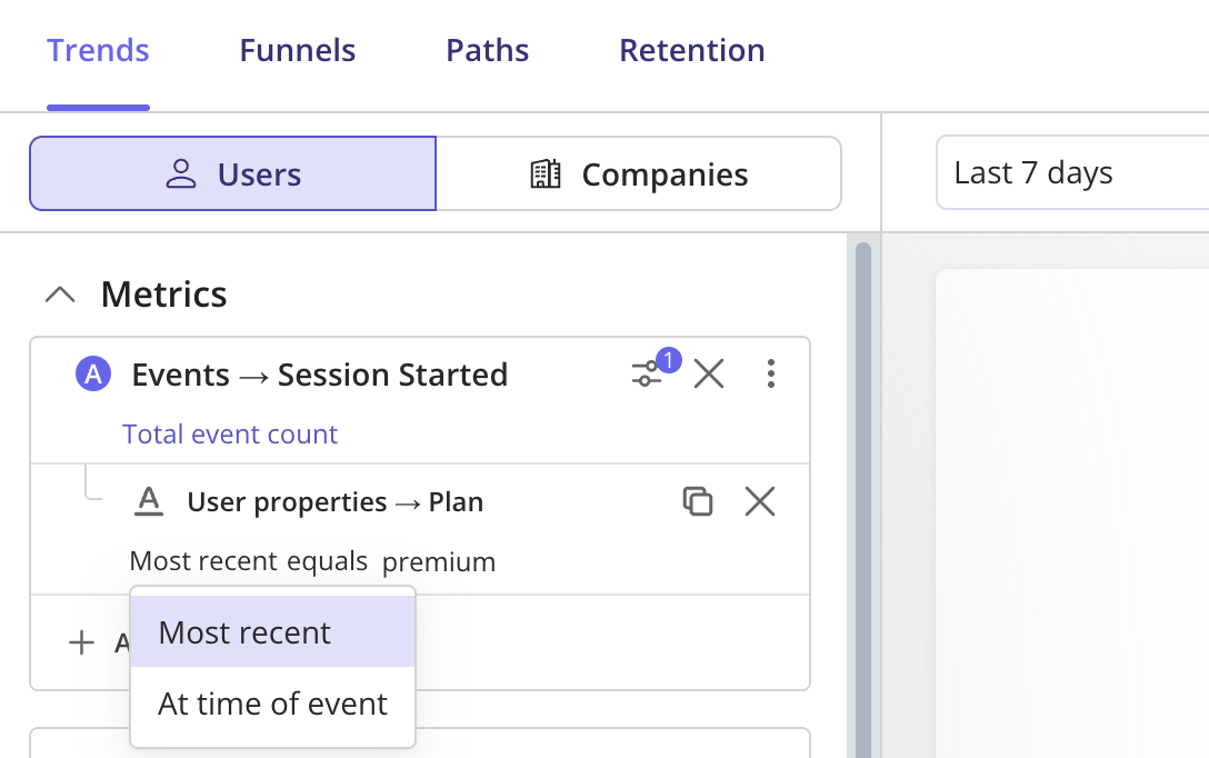
When filtering by a user or company property, choose how the property value is evaluated:
- Most recent (default) - uses the current value of the property, applied across all of the user’s or company’s historical events.
- At the time of event - uses the value the property held at the moment each event occurred, preserving historical accuracy.
Session Started events by Plan = Premium. With Most recent, a user now on Premium is counted for all their past sessions, even those before they upgraded. With At the time of event, only sessions that happened while they were actually on Premium are counted.Two breakdown properties can be applied to a singular report.
Analyzing your Results
Click ‘Run Query’ and choose the right data presentation options for your needs.- Within the header, specify the: a. Chart period: choose a time period from the default options (e.g. past 7 days, past 30 days, etc.) or specify a custom date range b. Comparative period: choose to ‘compare previous period’ which will show comparative data from the same time period directly previous to that shown, or specify a custom period c. Platform: focus on data from all platforms or choose to filter to only web or mobile data d. Data point period: specify whether each data point should represent a day, week or month e. View of data: choose between a split view or focus solely on the chart or table data
.png?fit=max&auto=format&n=j6BdSiRiF3SCgUJf&q=85&s=ad7c06ef9f2b2c1eb261ea7d7e5d9a78)
- Choose the chart type from the following options:
.png?fit=max&auto=format&n=j6BdSiRiF3SCgUJf&q=85&s=2690484ff6e6ab0000d25941d71554e5)
- ‘Time Series’ chart types: shows the change in data overtime
- Line: Shows the progression of metrics over time. X-axis = time, Y-axis = metric value.
- Stacked Line: Similar to a Line chart, but stacks multiple events to compare their values overtime.
- Column: Uses vertical bars to show the progression of metrics overtime.
- Stacked column: Vertical bars stacked to display multiple events’ contribution overtime
- ‘Total Value’ chart types: aggregates values for the whole time period
- Bar: Displays the total value of an event over the entire date range.
- Stacked bar: Horizontal bars stacked to display multiple events’ contribution over time.
- Pie: Displays relative distribution of different metrics for the entire date range.
- Metric: A single numeric value per metric summarising the total for the date range.
- Scatterplot: visualises user counts for each property value to visualise distribution between metrics (Note: Only applicable when a numerical breakdown is applied.)
- ‘Time Series’ chart types: shows the change in data overtime
- Choose between a linear or cumulative view of the data
- Linear: Shows event counts or metrics within each time interval (e.g., daily, weekly, monthly). Use this to see how activity fluctuates over time.
- Cumulative: Adds up event counts or metrics over time, giving you a running total. Use this to track overall growth and long-term adoption.
.png?fit=max&auto=format&n=j6BdSiRiF3SCgUJf&q=85&s=61b1ba218c231d12a4beafb54ae3caef)
Advanced Features
1. Formulas
When selecting a metric to add to your Trend report, choose ‘Formula’ to make calculations using simple arithmetic operators, such as:- + : Add
- * : Multiply
- / : Divide
- () : Use parentheses to influence the order of operations
.png?fit=max&auto=format&n=j6BdSiRiF3SCgUJf&q=85&s=704084b66d3e30766cd2c16c54463d1f)
2. Templates
Select from the following pre-defined templates, then apply filters or breakdowns to pinpoint the data you need:- Top 10 Events
- Top 10 Pages
- Top 10 Users
- Top 10 Companies
.png?fit=max&auto=format&n=j6BdSiRiF3SCgUJf&q=85&s=a05ba2711a8edfbd491184ca2e0626bd "Image(9) Pn")
3. ‘For the First Time’ filter
Using inline Event Property filters or the metric’s More Actions menu, you can apply the ‘For the First Time’ filter. This ensures the data only includes instances when a user or company performs that metric for the very first time..png?fit=max&auto=format&n=j6BdSiRiF3SCgUJf&q=85&s=23b773df53acc48e4a0dd7d7105d6f7a)
4. Breakdowns - Bucketing
When breaking down a Trend report by a numeric property, bucketing lets you group continuous values into ranges or intervals. This option is available under “Manipulate Data” for the selected breakdown property. Bucketing helps reveal patterns across different segments, such as users by age ranges, revenue tiers, or session counts.- Max and Min Value: Define the smallest (e.g.,
<100) and largest (e.g.,>2000) bucket values. - Interval Size: Set the size of each bucket (e.g.,
200). - Number of Buckets: Specify how many buckets the dataset should be divided into (e.g.,
10).
.png?fit=max&auto=format&n=j6BdSiRiF3SCgUJf&q=85&s=026696be72e23374970695942fa8dc7b "Image(11) Pn")
5. Breakdowns - Baseline Comparatives
When applying a breakdown property, you can choose to compare each data value against a specific property value or against the overall dataset. This option is available under “Manipulate Data” for the selected breakdown property, allowing you to see relative performance or differences between segments. Example: If you break down by Country and choose to compare data to England, the report will show how each country performs relative to England for that metric..png?fit=max&auto=format&n=j6BdSiRiF3SCgUJf&q=85&s=d5764c23e3b10a5e85bb8b30ff8ca4eb)
FAQs
How can I calculate MAUs using a Trends report?
How can I calculate MAUs using a Trends report?
To get an accurate number of MAUs, select the metric ‘Session Started’ with measurement option ‘Unique Users’ chosen, as shown below. For the clearest visualisation of how your MAUs change from month to month, use the ‘Month’ data point period option and the column chart type..png?fit=max&auto=format&n=j6BdSiRiF3SCgUJf&q=85&s=a71c54f109e53726dd9b51fba691b89d)
My experience is targeted to users with a specific property value, but it's showing for other users. What should I check?
My experience is targeted to users with a specific property value, but it's showing for other users. What should I check?
You can verify the user property values which the users have had at the time of performing the event (for example, at the time of seeing a flow).
Why are billing MAUs and Product Usage / Trends MAUs different?
Why are billing MAUs and Product Usage / Trends MAUs different?
- Billing: The number of unique active users from the beginning of the month (billing cycle). It should match the number of unique users in the users dashboard if you choose custom period (1st of month till now). Please note that the MAU in billing page doesn’t update in realtime (it is updated every 10-20 mins).
- **Product Usage & Trends (MAU):**The number of unique active users in the past 30 days. It’s not based on monthly cycles.