Overview
The Design Library works as a powerful extension to the theme system, giving users more dynamic and flexible options to bring their company’s design system, crafted by the design team, into Userpilot content seamlessly. The idea is similar to how design teams organize and manage styles in Figma. Just like in Figma, where teams define and reuse components such as typography, colors, spacing and sizes, shadows, and assets, the Design Library provides a centralized place in Userpilot to set up these elements. You can create groups of styles that your team can consistently use across all Userpilot content, including the Chrome Extension, Checklists, Resource Center, NPS, and Surveys. This ensures your in-app experiences always feel cohesive and on-brand without needing to manually adjust styles every time. By setting up your Design Library, you give your entire team easy access to approved, reusable design tokens, making it faster and easier to maintain visual consistency, brand integrity, and a polished user experience at scale. With this approach, your Userpilot content isn’t just functional, it becomes a true extension of your product’s design system, mirroring the same careful planning and detail your team puts into your primary design tools.If you’re on the Enterprise plan, you’ll have access to the Design Library by default. Users on the Starter plan will need to upgrade to Enterprise or Growth to unlock this feature and start building their design library, giving them greater flexibility and control over their content styles.
Use cases
- Brand consistency: ensure all in-app messages follow approved colors, fonts, and spacing for a unified look.
- Centralized management: update design tokens in one place and apply changes across all Userpilot content.
- Team collaboration: give teams access to shared, brand-approved styles for easy, consistent creation.
- Faster creation: save time by reusing pre-defined style groups instead of manual styling every time.
- Multi-brand support: manage separate style groups for different brands, products, or regions.
- Cross-channel consistency: apply the same design tokens to Chrome Extension, Checklists, Resource Center, and NPS.
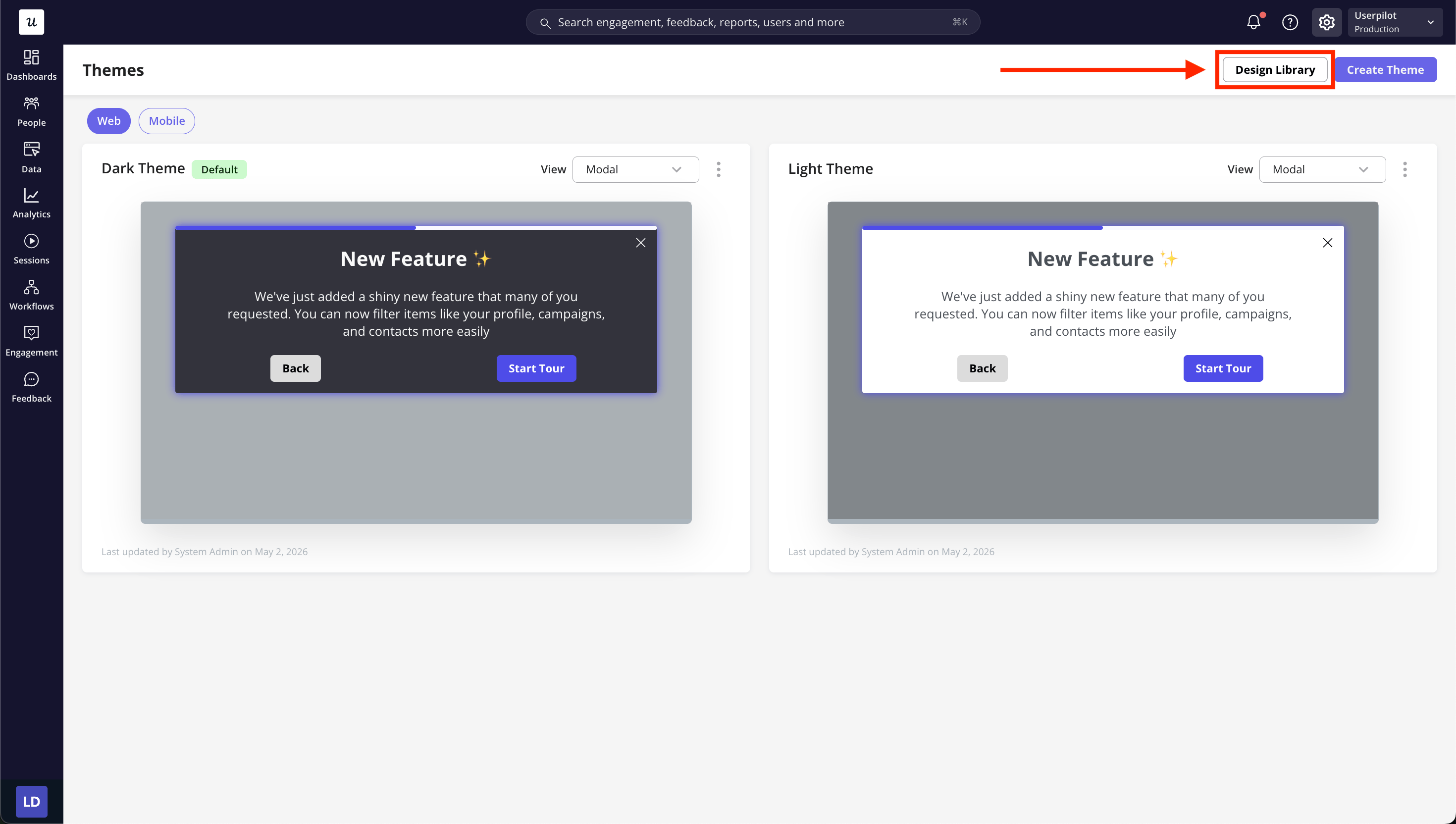
How to create a design library
The Design Library lets you organize your design tokens into Groups for easy reuse. You can create Groups for Colors, Typography, Spacing & Sizes, Shadows, and Assets. You can start creating your theme by navigating to Configure > Themes from settings icon.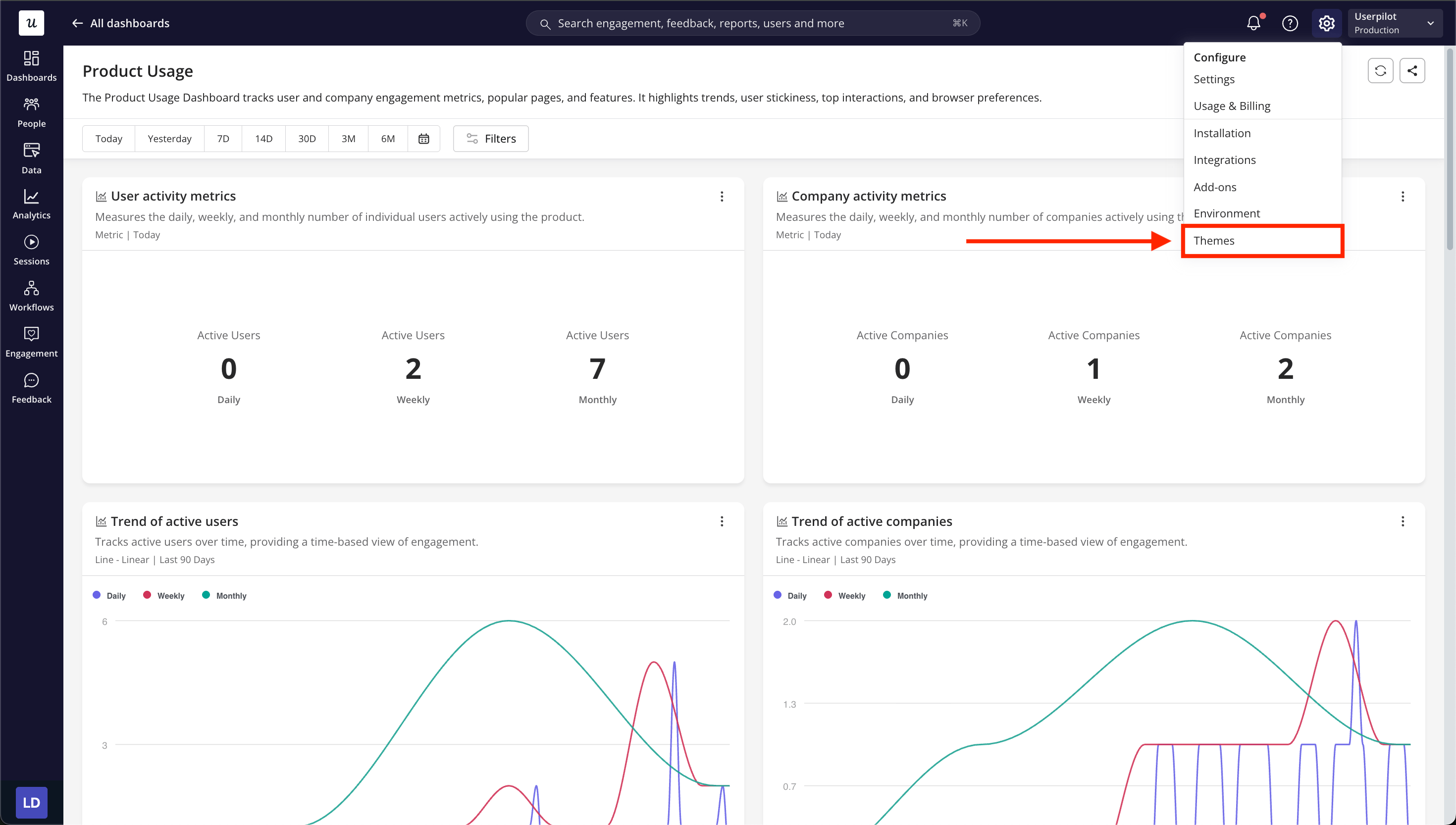
- Colors
- Typography
- Spacing & Sizes
- Shadows
- Assets
.png?fit=max&auto=format&n=6mq0DeMvNIpVRWN5&q=85&s=88a591e8cbd37d4651f119019b639dd2)
.png?fit=max&auto=format&n=6mq0DeMvNIpVRWN5&q=85&s=831ba810eeeaf76c9f08a016f69c7895)
.png?fit=max&auto=format&n=6mq0DeMvNIpVRWN5&q=85&s=32977d4a9e37d2d4e8470e2f78548d7a)
.png?fit=max&auto=format&n=6mq0DeMvNIpVRWN5&q=85&s=aaecc038d95cda86669d4887572b6275)
Design library tabs explained
Colors
- Use Groups to organize color tokens by theme (e.g. Primary, Grayscale, Status).
- Define color names and HEX values.
.png?fit=max&auto=format&n=6mq0DeMvNIpVRWN5&q=85&s=08e7d9ed254ed23da164ee394af20b2d)
Typography
- Use Groups to save font styles (e.g. Headings, Body).
- Define font family, weight, size, and line height.
.png?fit=max&auto=format&n=wmxQrQyJqRV1jwFr&q=85&s=e2757e9d2dbdf80760f9b13994a59db6)
Spacing & Sizes
- Use Groups to save spacing scales or size presets.
- Define pixel or rem values.
.png?fit=max&auto=format&n=wmxQrQyJqRV1jwFr&q=85&s=75583fe8ac5600c5c0e6272af3e747e8)
Shadows
- Use Groups to save shadow presets.
- Define offset, blur, color, and opacity.
.png?fit=max&auto=format&n=na1wejgjnIBkViY6&q=85&s=7f3413b6f44514a0d0a2c523cac56273)
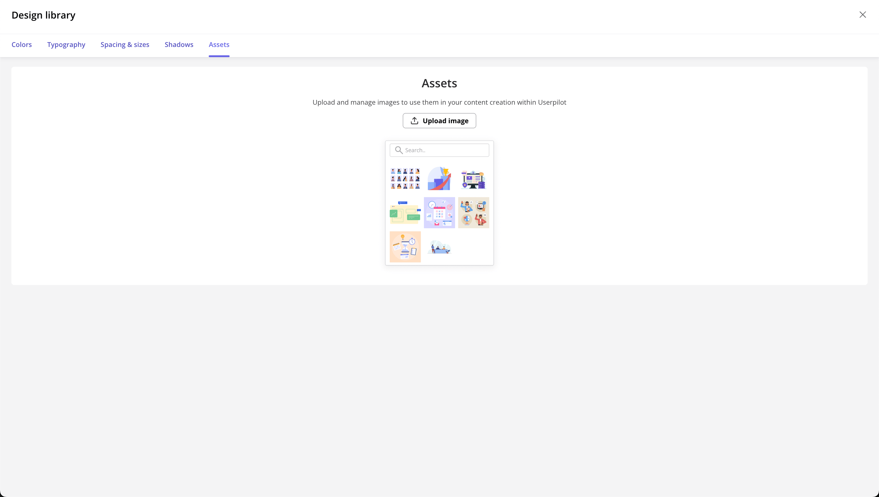
Assets
- Use Groups to organize images, logos, or icons.
- Upload and categorize assets.
.png?fit=max&auto=format&n=6mq0DeMvNIpVRWN5&q=85&s=d21555fef6283c5decde9d554005d5e6)
The design library currently supports the web app themes and content. We’ll expand its capabilities to include the mobile app theme and content next.
For any questions or concerns, please reach out to support@userpilot.com