Overview
Userpilot makes it easy to customize your mobile content theme so your mobile experiences look and feel consistent on any device. You can control colors, fonts, and button styles, ensuring your brand remains cohesive and professional across all operating systems. With these flexible styling options, you can deliver a seamless, on-brand experience without needing to manually adjust each guide for mobile users.How to create a mobile theme
You can start creating your theme by navigating to Configure > Themes from the sidebar.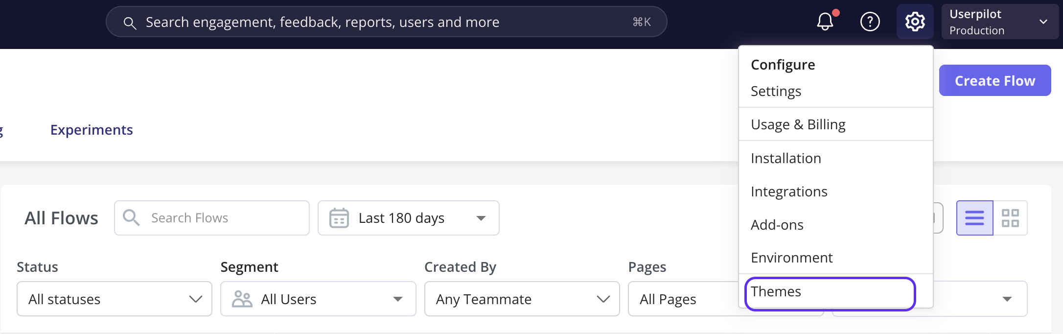

.png?fit=max&auto=format&n=wmxQrQyJqRV1jwFr&q=85&s=24d65afffac8622cff3476cb4bd3fe71)
Userpilot provides default Light and Dark themes to help you get started quickly.
.png?fit=max&auto=format&n=wmxQrQyJqRV1jwFr&q=85&s=887fda9d43e85557b080ab6d07046ac6)
Carousels and Slideouts tabs
The Carousel Theme in Userpilot lets you fully customize the appearance of your mobile carousels so they match your brand and deliver a seamless, engaging user experience on mobile devices. This ensures your onboarding and feature tours feel consistent with the rest of your app. Sections in the carousel include:- General: set the font family and content alignment to ensure text displays clearly and aligns properly on mobile screens.
- Color: choose the background color, title color, and text color to match your brand’s palette for a consistent look.
- Button: customize the background color, label color, border color, border width, and border radius to keep buttons on-brand and easy to interact with.
- Dismiss Carousel: adjust the color and icon color for the dismiss button to make exiting the carousel clear and consistent with your design.
- Progress: set the progress indicator color to align with your brand and provide users with clear visual feedback on their place in the carousel.
- Slideouts only - Backdrop: set the backdrop color and opacity to create focus by dimming the background when the slideout is active.
.png?fit=max&auto=format&n=0hCXw5eVRU6iqpYB&q=85&s=fd712ef7967a2bc6b76fe245e3181ba2)
.png?fit=max&auto=format&n=na1wejgjnIBkViY6&q=85&s=7e09494fe47b4ac342906ea9901857b4)
Surveys tab
The Mobile Survey Theme allows you to customize the look of your surveys on mobile screens, giving you control over colors, fonts, progress indicators, and backdrops so your surveys stay on-brand and easy for users to navigate.- General: set the background color, primary color, corner radius, and survey position on mobile screens to match your brand and control layout.
- Font: choose the font family and text color to ensure readability and consistent typography on mobile devices.
- Progress Bar: select the progress type and set its color to guide users visually through multi-step surveys.
- Backdrop: define the backdrop color and opacity to focus user attention by dimming the background behind your survey.
.png?fit=max&auto=format&n=na1wejgjnIBkViY6&q=85&s=15e6c8090721dbb7b3c482bc7441b8bc)
You can view your changes in both iOS and Android layouts by clicking the icons above the mobile mockup in the preview area. This lets you see exactly how your designs will look on each platform.
Font family is set by default to “System Default”, which Userpilot automatically maps to San Francisco on iOS and Roboto on Android. If you want to use your own brand font instead, you can easily upload it using the Upload Custom Font option.
General notes:
- Your Userpilot account must always have one default theme to use when creating content, but you can change it anytime.
- The default theme can’t be deleted.
- To delete the current default theme, first set another theme as the default, then you can remove the one you no longer want.
- If you’ve created content using a specific theme, you can’t delete that theme until you unlink all content by changing its theme assignments.
- You can view all content linked to a theme using the “View content using this theme” option in the theme’s action menu.
.png?fit=max&auto=format&n=0BXmctFYfQD3s2Lh&q=85&s=35785e36a717af6edd83517339cfc998)
- You can duplicate, rename, and update themes anytime.
- Click the “Save” button to keep your changes, since the theme page doesn’t autosave like other areas in Userpilot.
FAQs
Can I use the same theme for both web and mobile content?
Can I use the same theme for both web and mobile content?
No. Themes are platform-specific, the Themes page has separate Web and Mobile tabs, and a mobile theme only applies to mobile content (carousels, slideouts, surveys). You’ll need to create and customise them independently.
For any questions or concerns please reach out to support@userpilot.com