Overview
Checklists are increasingly becoming a vital tool for guiding new users toward successful activation. They serve as a structured roadmap, ensuring that users stay on track and complete the key tasks necessary to derive value from your product. By implementing checklists, you can help users navigate their journey more effectively, reduce churn, and improve product adoption. These lists can include actions like exploring features, completing a setup, or performing specific tasks within the app.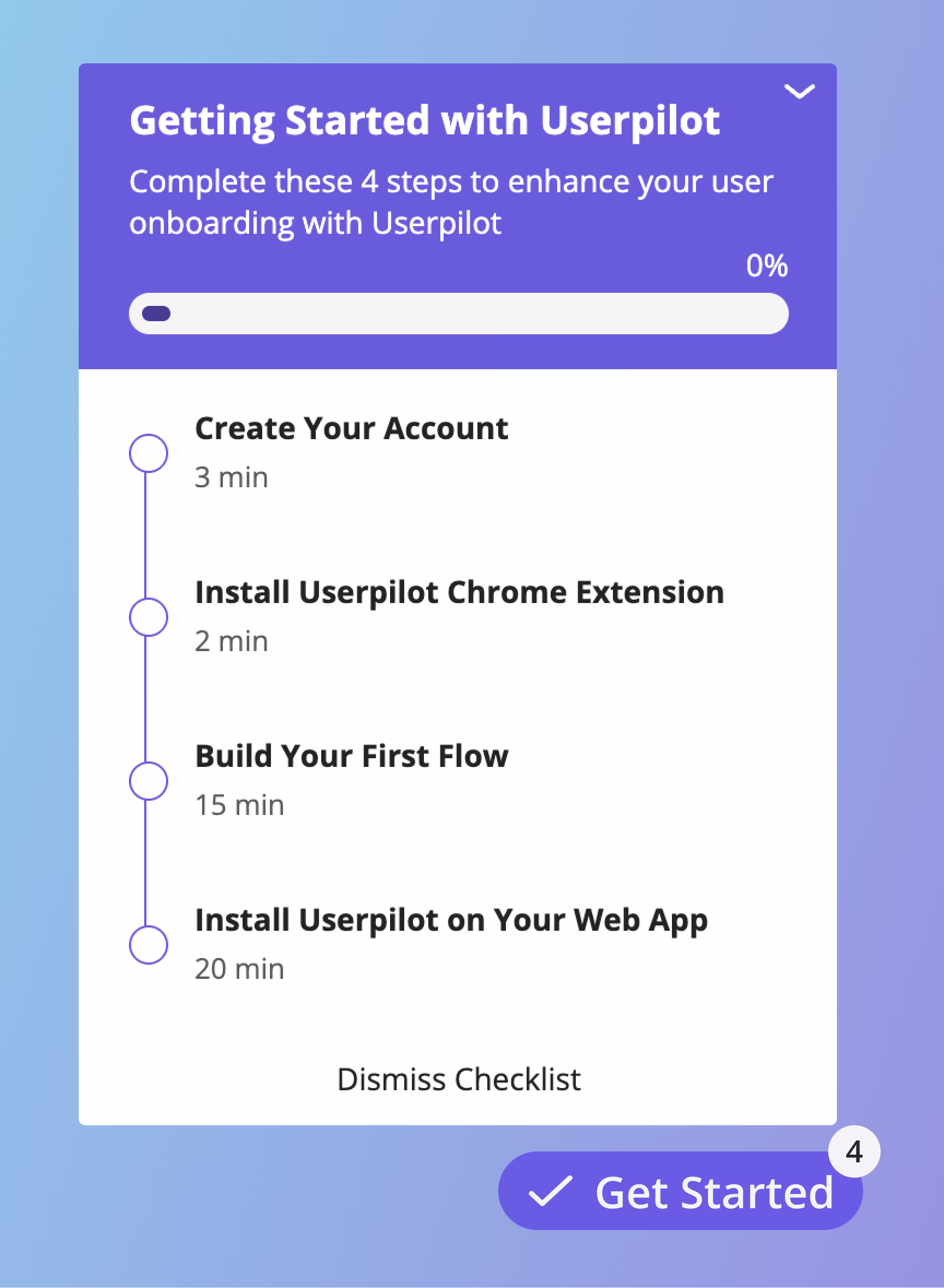
Use Cases
- Improved User Engagement: Checklists encourage users to interact more with your product by providing clear, actionable steps.
- Faster Time to Value: By guiding users through the essential steps, checklists help them achieve their goals quicker.
- Enhanced Onboarding Experience: They simplify the onboarding process, making it less overwhelming for new users.
- Increased Retention: A well-implemented checklist ensures users remain engaged and reduces the likelihood of churn.
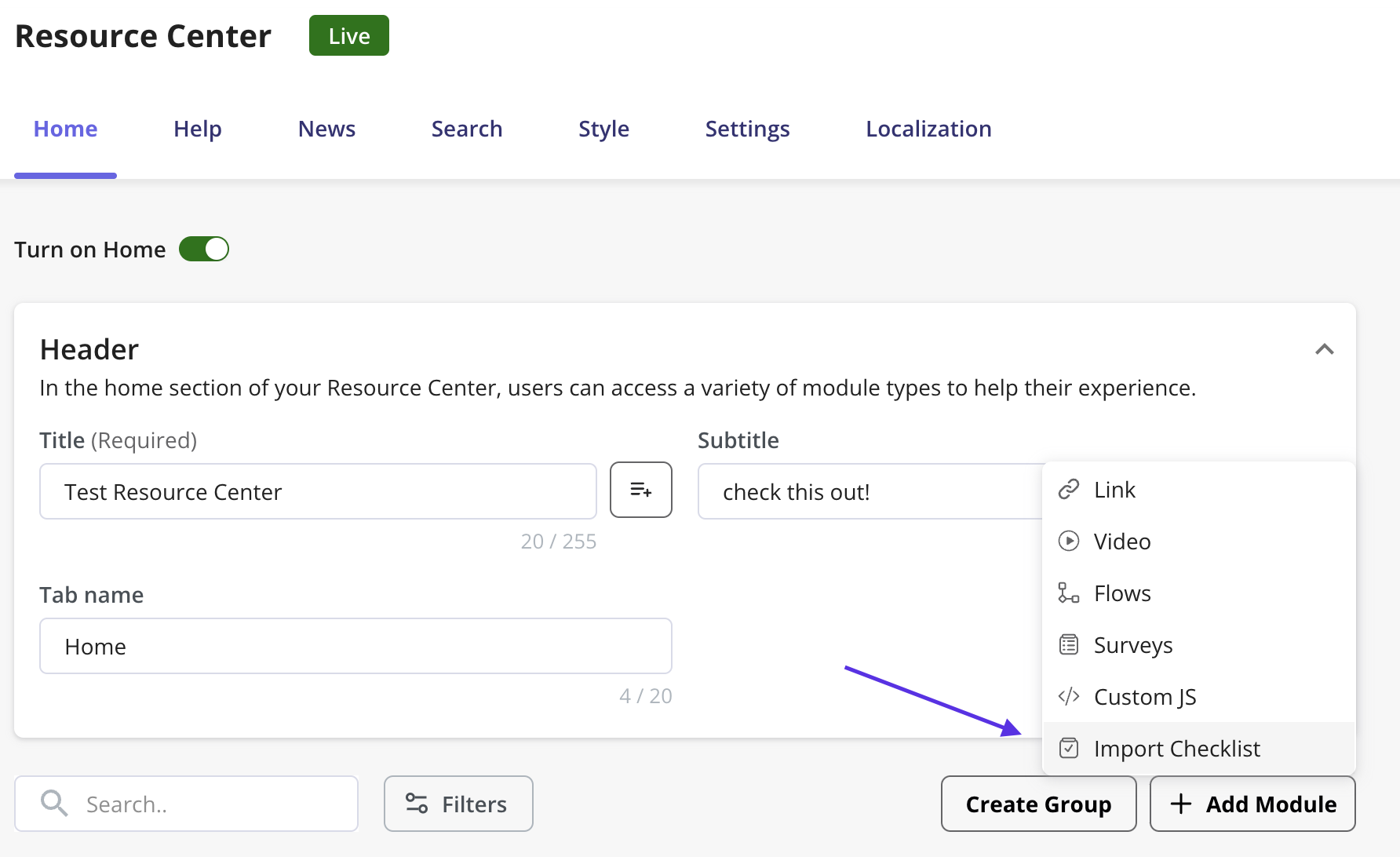
How to create a checklist
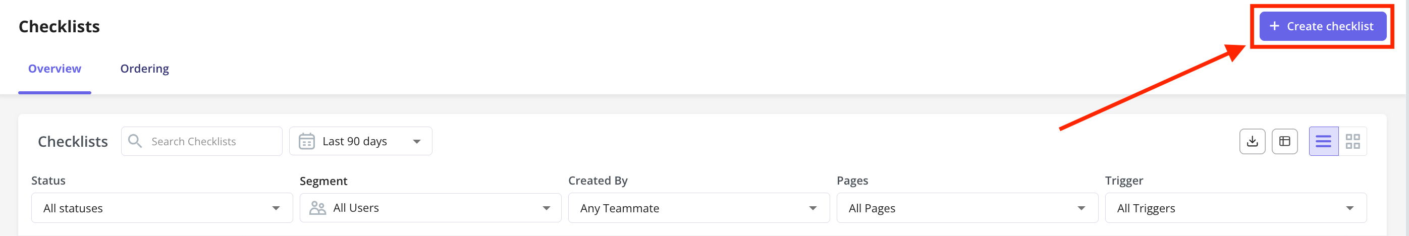
Navigate to Engagement > Checklists from the sidebar.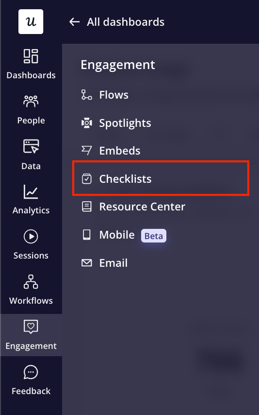
Tasks tab
The first step of creating a checklist is to add tasks to your Checklist.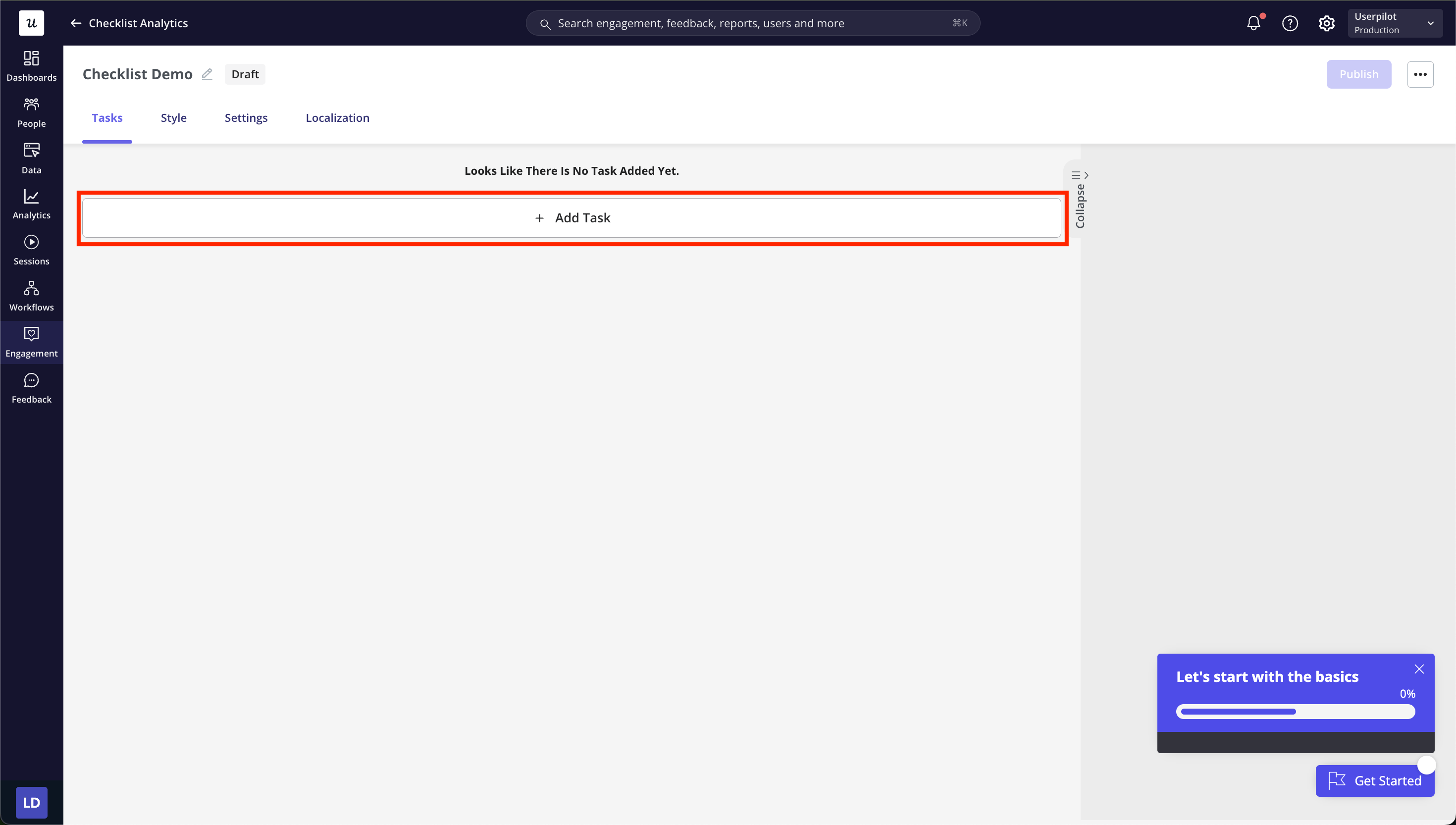
- Do Nothing: The task will automatically be marked as complete in this case, without prior action.
- Go to page: To navigate the user to a certain URL.
- Trigger a flow: To trigger a flow that you have created from a checklist task.
- Run script: To run a JavaScript function once the user clicks on the task.
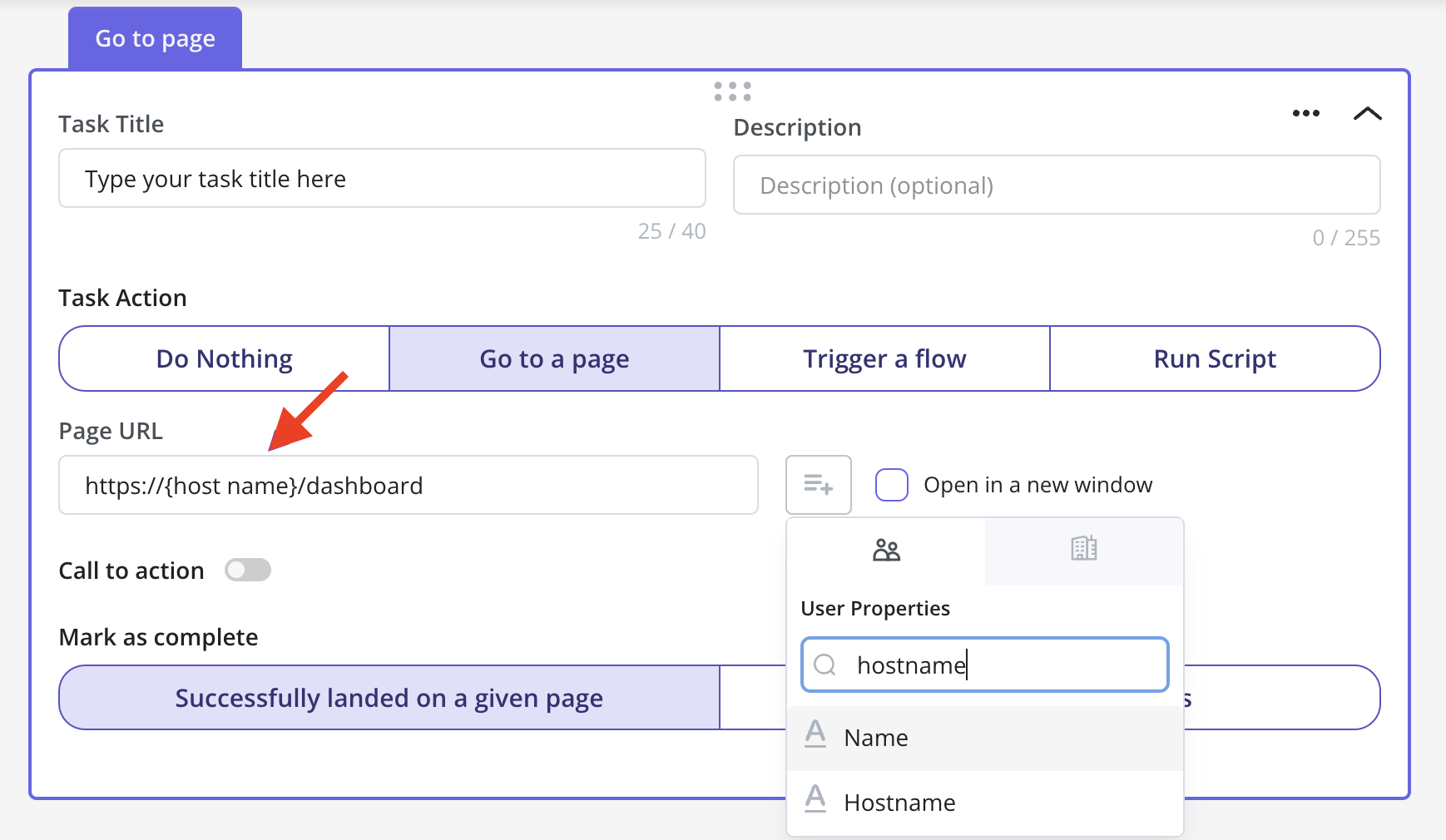
In the checklist task, you can set the task “Go to Page” or use the flow “Route to URL” to direct users to a dynamic domain by replacing the desired domain with the “hostname” property. Additionally, you can ask your development team to pass a property for any dynamic parts of the page, and then replace the dynamic part with the passed property.You can set an Action for the Task to follow through with, as well as advanced settings to use when needed. 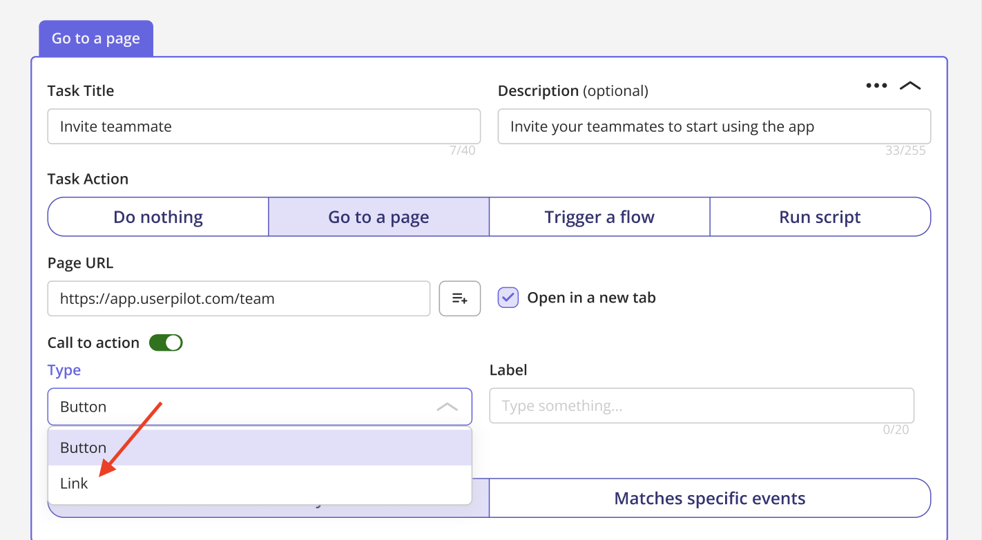
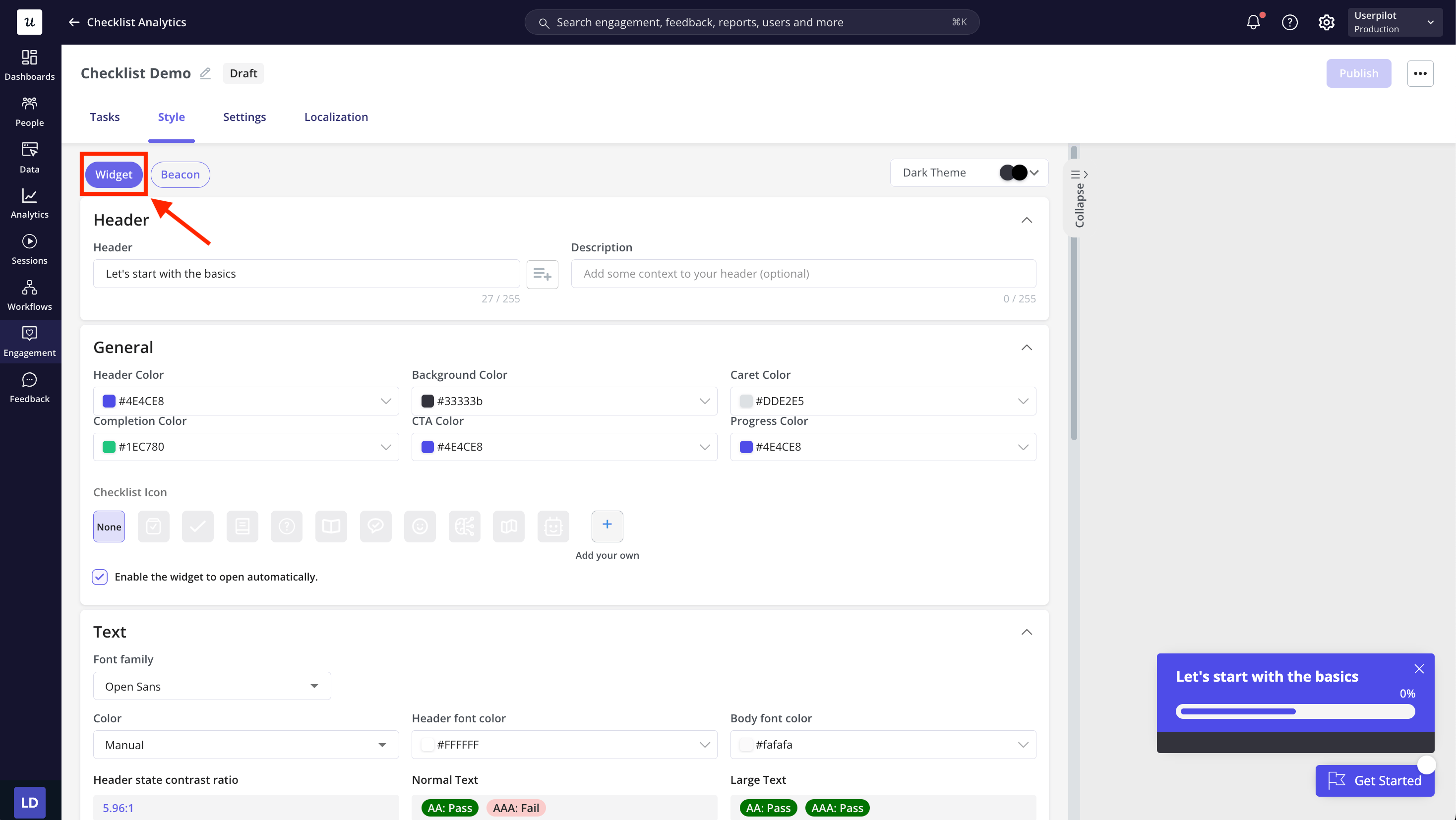
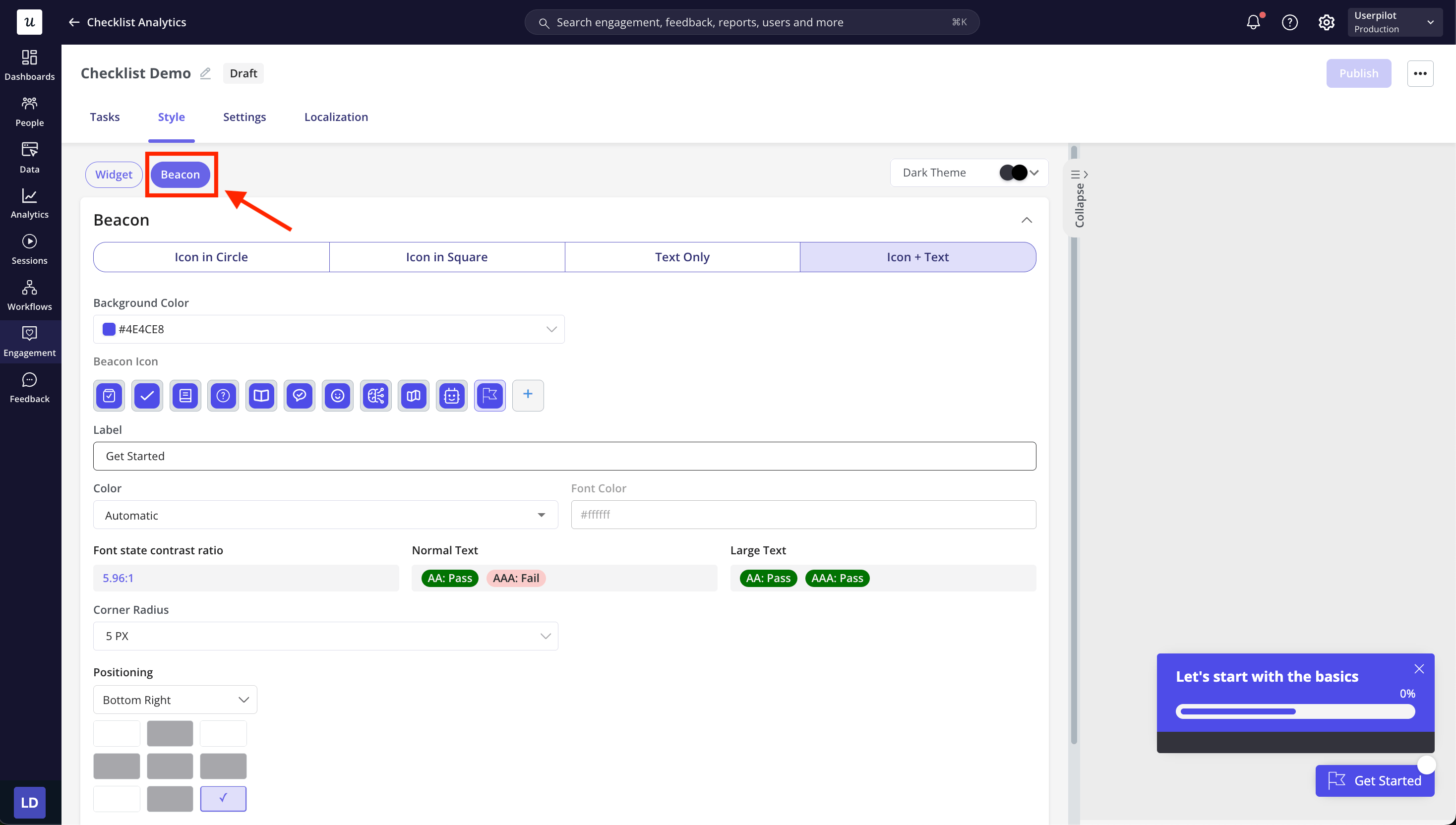
Style tab
Under the Style tab, you’ll find two sections: Widget and Beacon. Each has its own set of style settings to help you customize your checklist to suit your use case. Let’s take a closer look at each section. Widget The Widget tab lets you style the overall checklist, including task appearance, text, minimize button, dismiss behavior, and completion behavior.- Header: Start by setting up the Header of the checklist. You can also add a subtitle to provide extra information or context.
- Theme: Select from your pre-created themes and choose them from a list to quickly apply a consistent style.
- General: Customize colors, icons, and automatic opening to match your brand.
- Text: Choose the font and set the header and body text colors.
- Minimize button: Define the style and colors of the minimize button.
- Dismiss content: Customize the dismiss button text and confirmation prompts.
- Completion: Set the title, description, and button text shown when all tasks are completed.
- Icon style: Choose how the beacon appears, Icon in Circle, Icon in Square, Text Only, Icon + Text.
- Background color: Set the background color of the beacon.
- Beacon Icon: Select or upload the icon that represents your checklist when collapsed.
- Label: Add text to appear next to the icon (e.g., “Get Started”).
- Color: Choose the main color for the beacon.
- Font color: Set the color of the label text.
- Corner radius: Adjust how rounded the beacon’s corners are.
- Positioning: Choose where on the screen the beacon will appear.
- Z-index: Define layering to control how the beacon stacks over other page elements.
FAQs
How many tasks can I add per Checklist?
How many tasks can I add per Checklist?
The maximum number of tasks that you can add per Checklist is 15.
Can i trigger two Checklists simultaneously on the same page?
Can i trigger two Checklists simultaneously on the same page?
No, Currently only one checklist can be triggered on a page at a given point of time. However, you can add another checklist in a Resource Center Module for the users to access both of the Checklists at the same time.