Style Widget
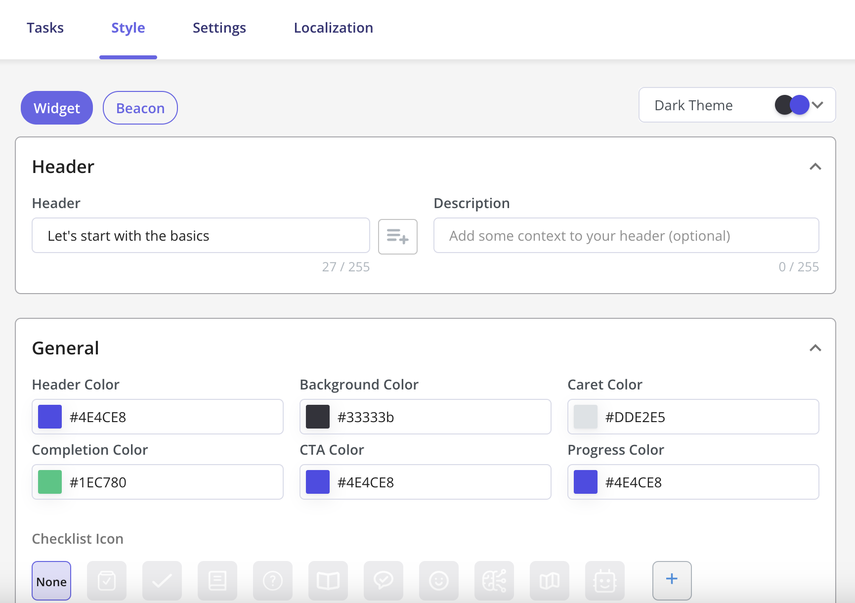
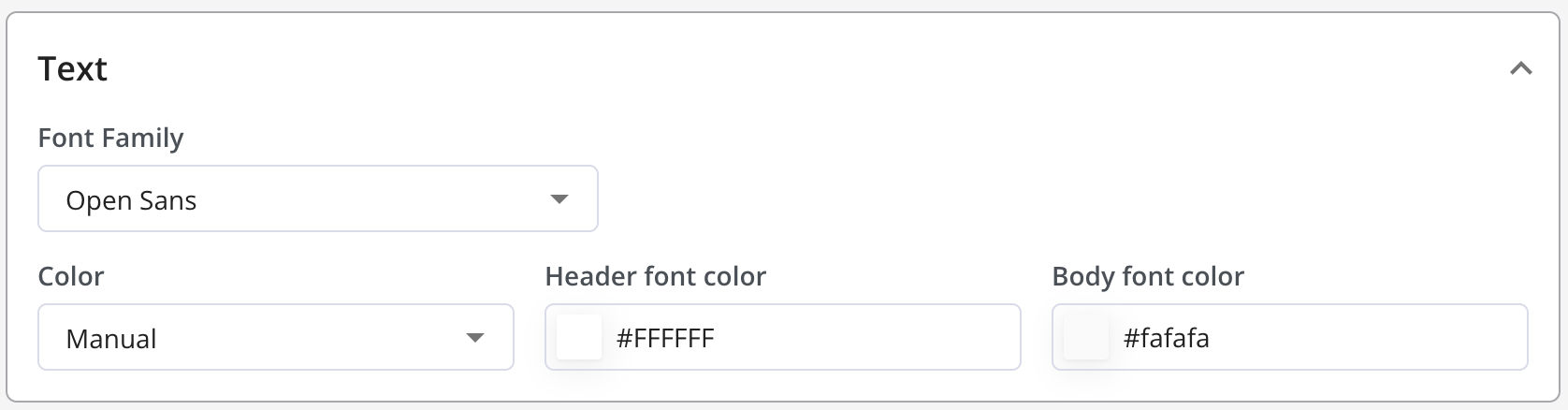
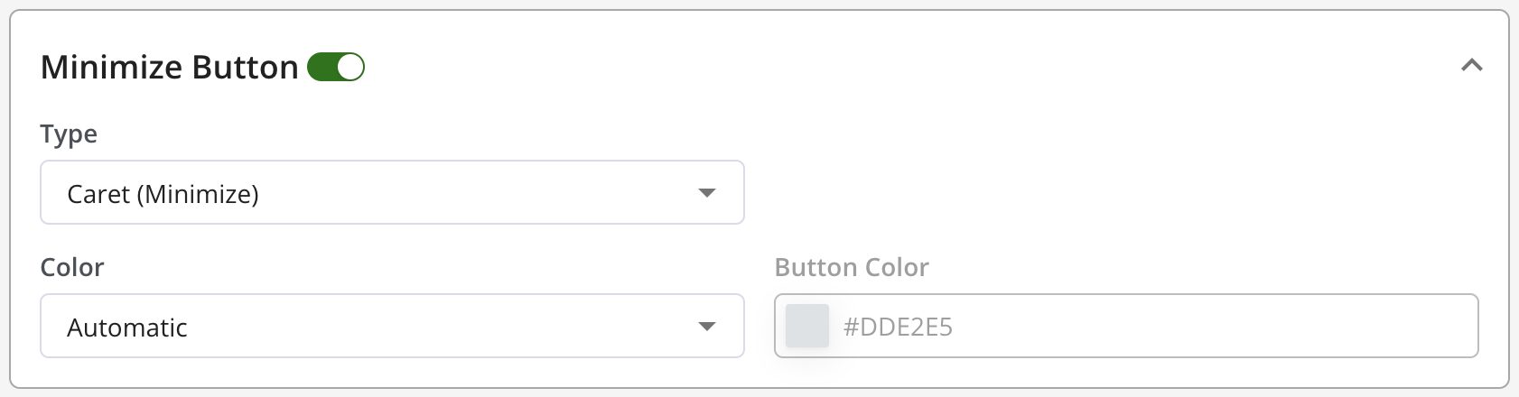
To pick out a Theme for your Checklist, go to Style. You can pick out either a Light or Dark Theme. You also have the option to create your theme.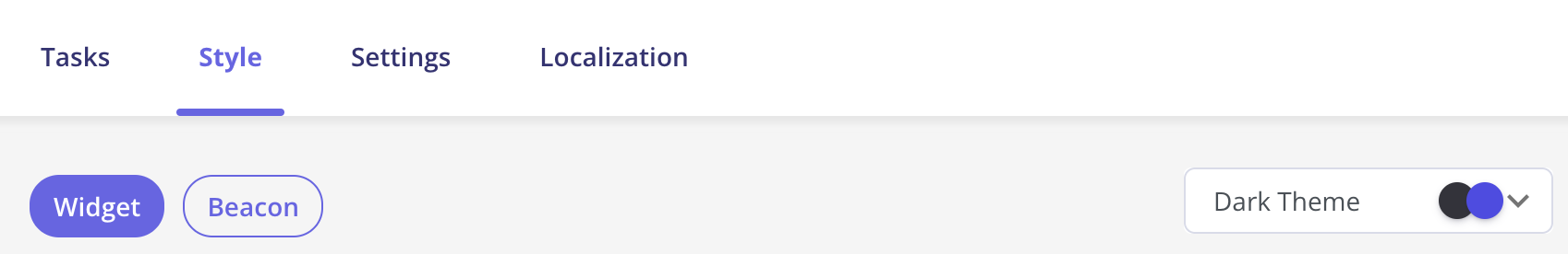
Checklist Custom CSS
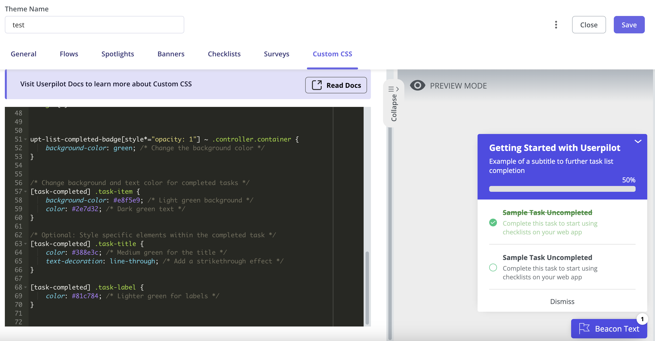
You can now customize the Checklist using Custom CSS from the themes section as per your use case.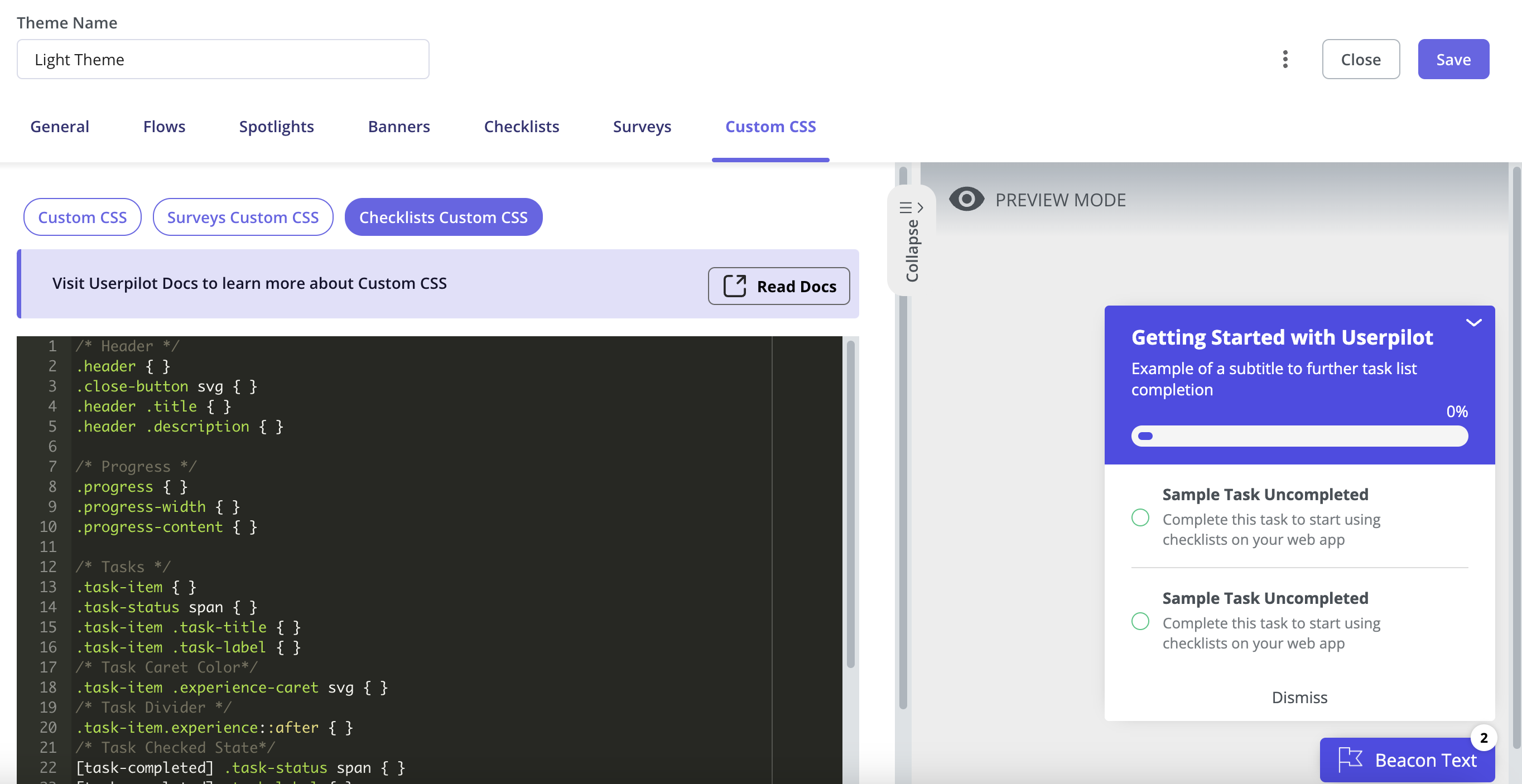
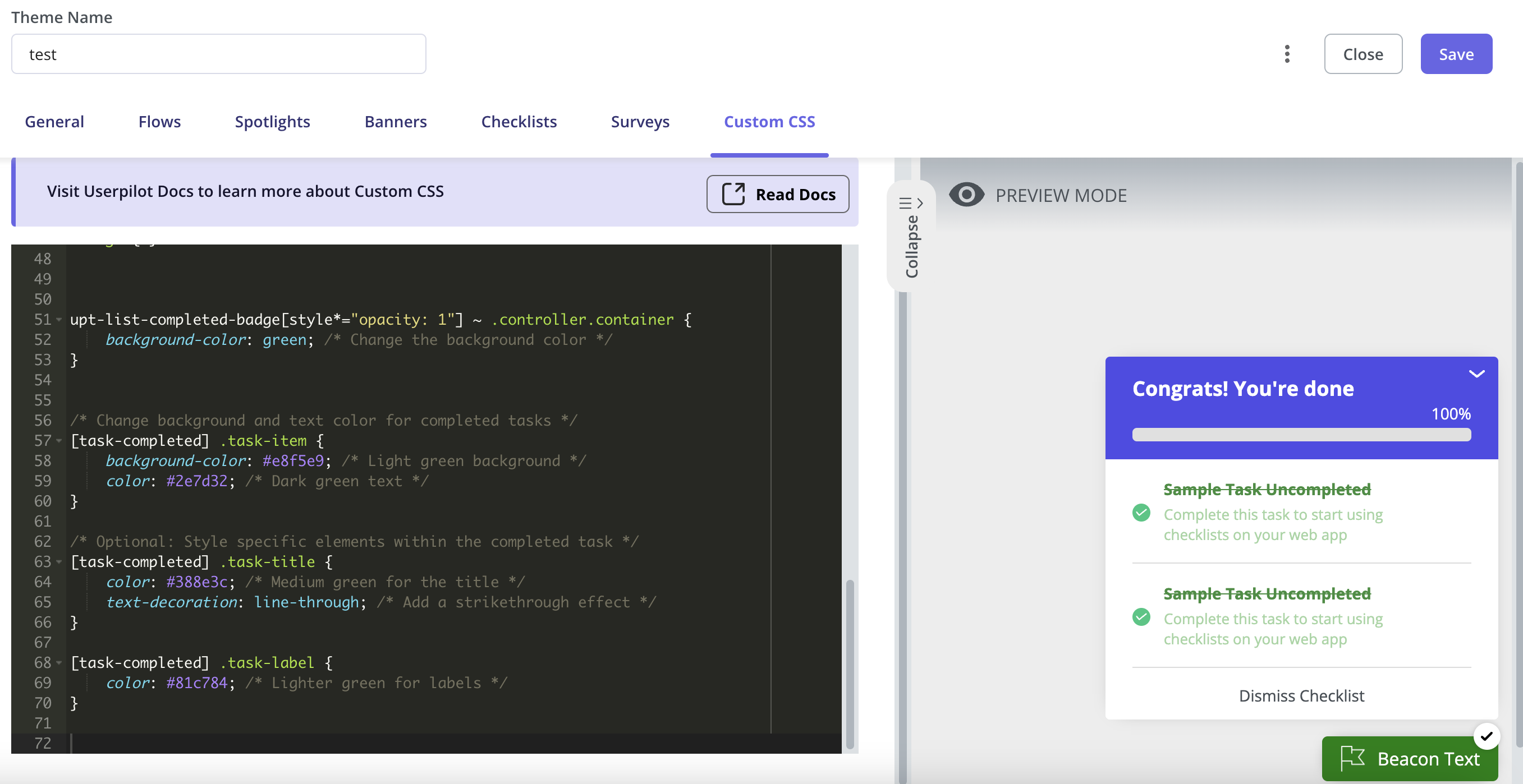
- You can change the color of a task’s title and description once it’s completed.
- You can update the Checklist beacon’s color to reflect when all tasks are completed.
- You can also customize the height and width of the beacon/widget and add some padding to the text/progress bar as per your preferences.