Overview
Card introduces a more seamless way to deliver in-app experiences by integrating them into your existing layout. Rather than floating on top of the UI (like modals or slideouts), embedded components live within the page structure, aligned with your design and user journey. Key capabilities include:- Native, inline placement within your UI
- Flexible styling to match your design system
- Smart targeting and placement rules
- Responsive behavior across layouts
- Built-in analytics to track engagement (Shown and Engaged)
Use Cases
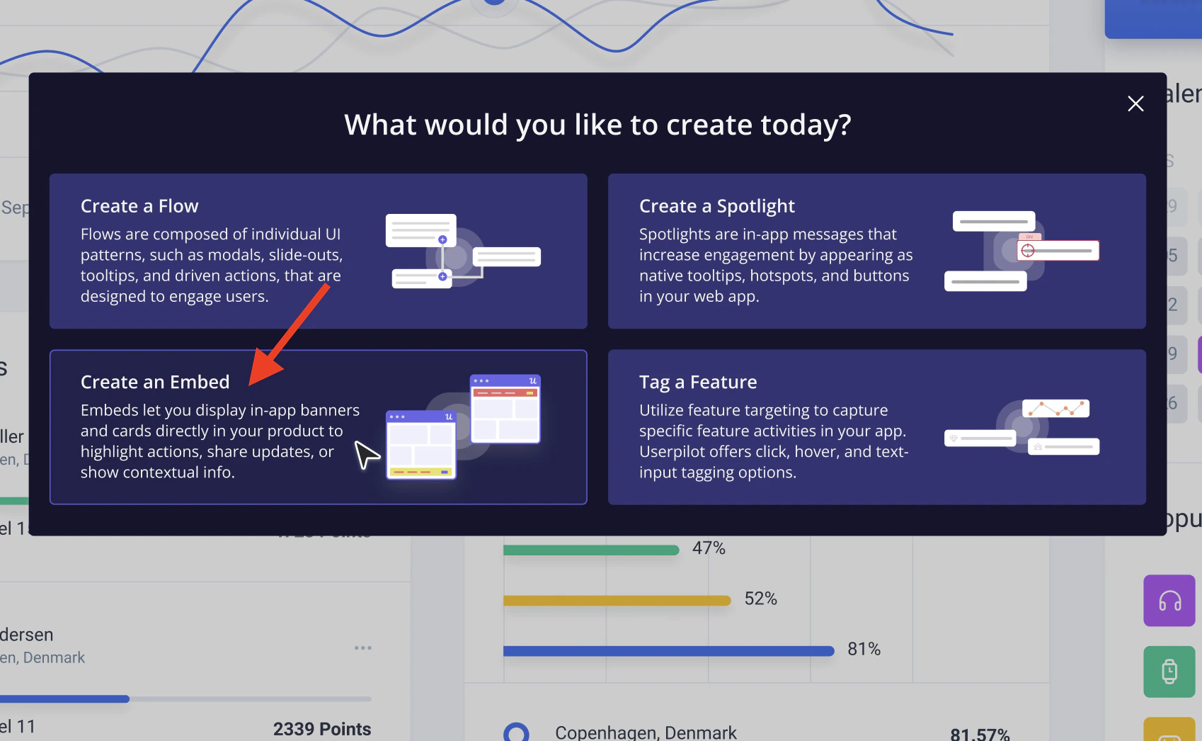
Contextual Onboarding: Guide users step-by-step within the interface instead of redirecting or interrupting them. For example, showing a Card next to a feature they need to set up. Feature Discovery: Highlight new or underused features directly inside relevant pages, right when users are most likely to engage. Product Education: Provide helpful tips, best practices, or explanations inline, reducing confusion without overwhelming the user. Persistent Guidance: Unlike temporary overlays, embeds stay visible within the UI, making them ideal for ongoing guidance or reference points. Contextual Social Proof (Testimonials): Use Embed Cards to surface short, relevant customer quotes directly within the product experience. This works best when tied to a specific feature or action, for example, showing how another customer succeeded using that exact feature. Upgrade Nudges (Expansion): Use Embed Cards to gently encourage users to upgrade when they’re close to experiencing value. For example, when a user hits a limit or tries to access a premium feature, an embedded Card can highlight the benefit of upgrading, paired with a clear CTA.Create Cards in Userpilot
- Open the Userpilot Chrome Extension and navigate to the page where you want the card to appear.
- Click “Start here” and select Embed and then Card
- Name your card and choose your preferred theme
- Once you select Card, you can add up to 4 Cards within the same Embed experience. You can:
- Place each Card on different elements across your product
- Or group multiple Cards on the same element
- Arrange them vertically (stacked) or horizontally (side-by-side)
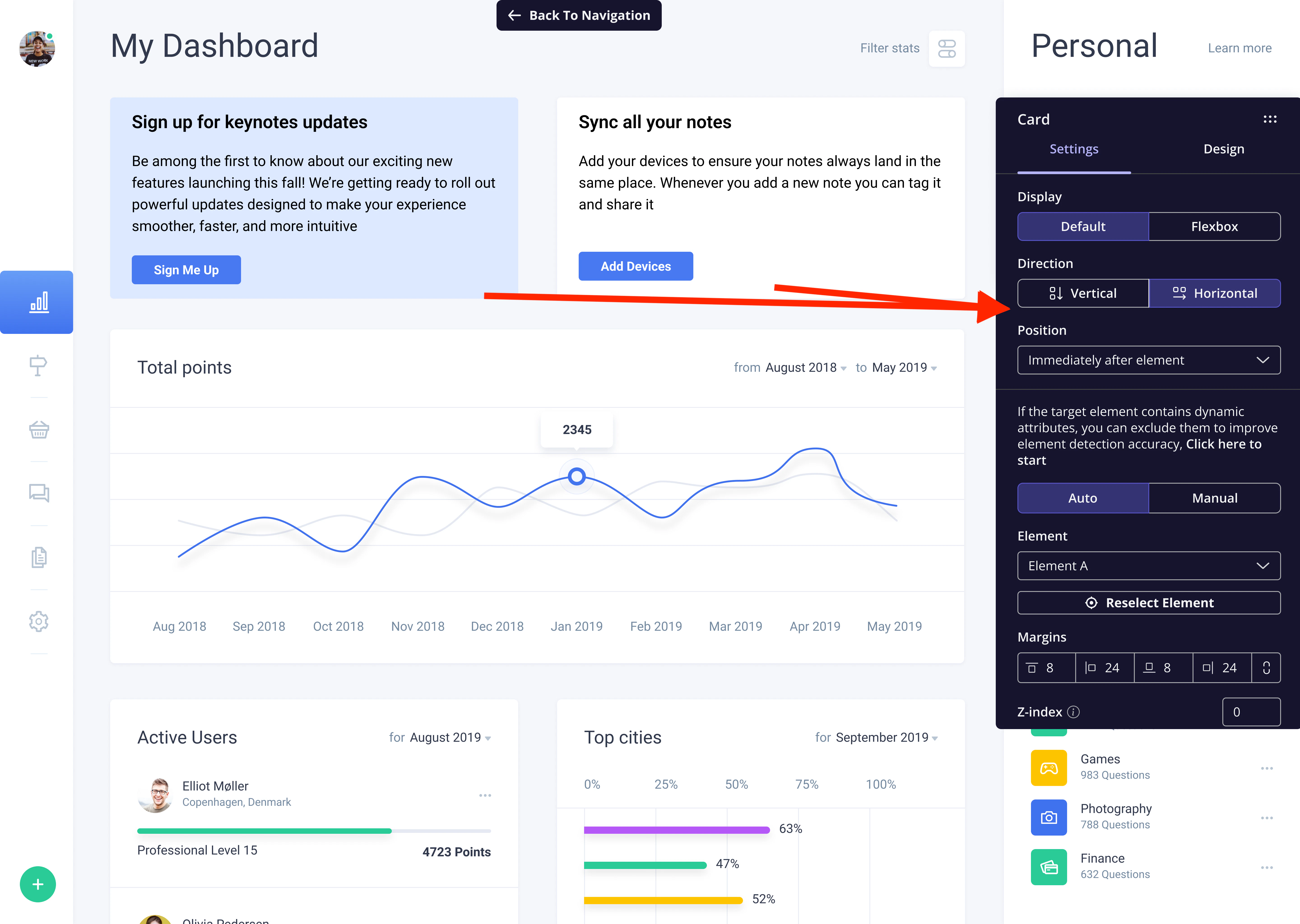
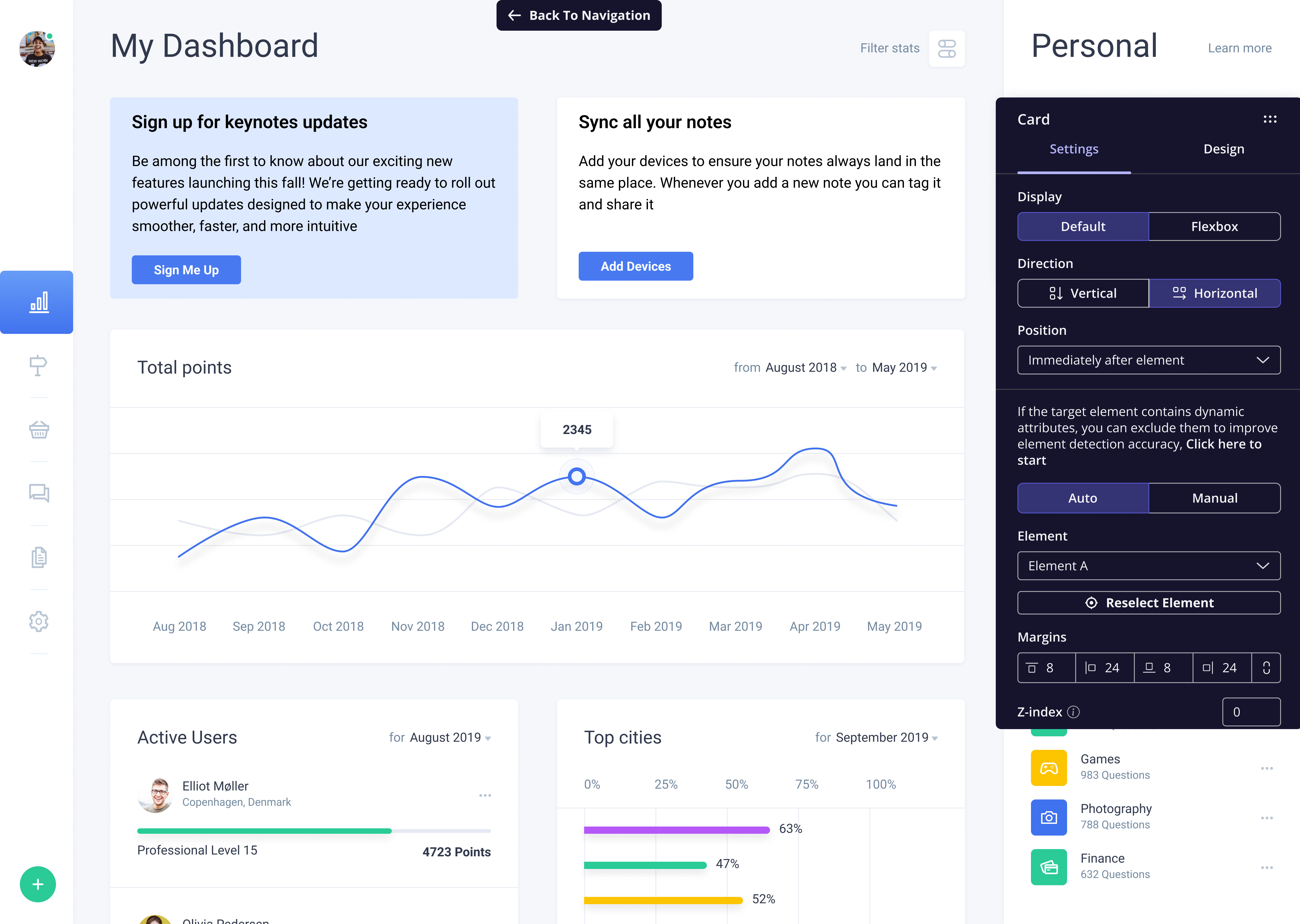
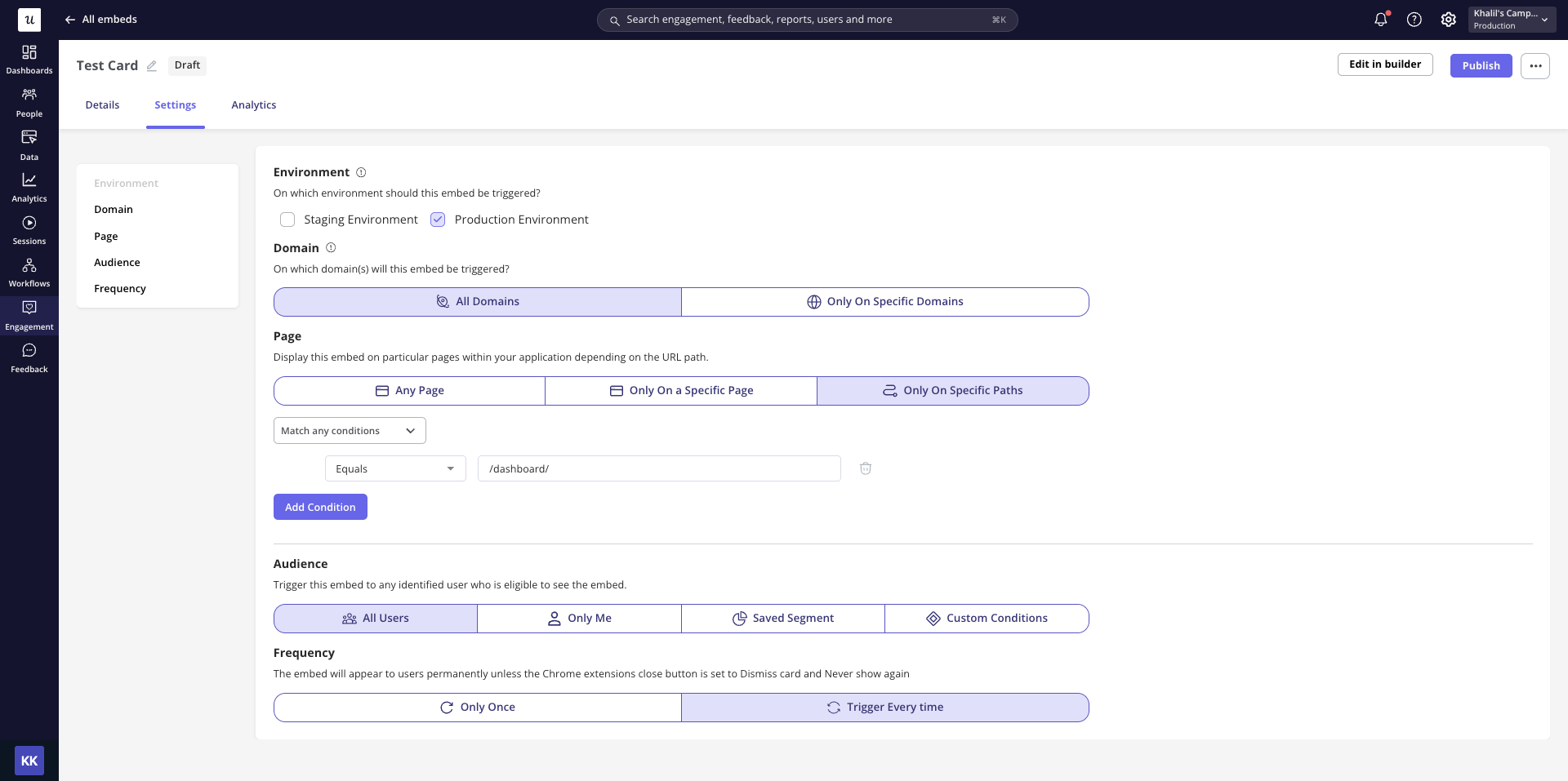
Card settings and design
Settings
- Display (Default vs Flexbox)
- Direction
- Position
- Placement
- Element
- Margin
- Z-index
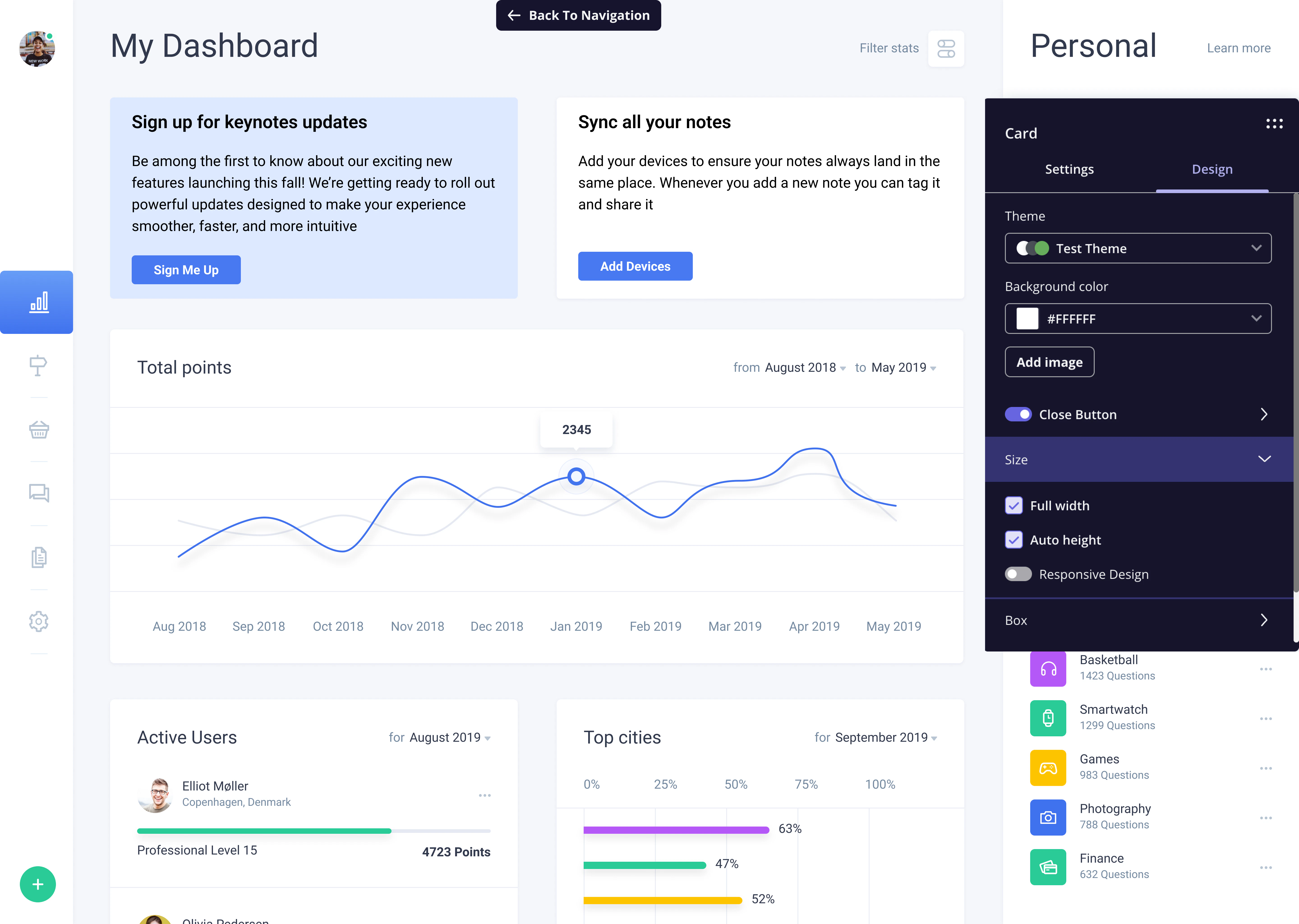
Design
Customize your Card’s look in the Design tab:- Theme: Select from different themes to change the overall design of your Card.
- Background: Choose a background color for the Card, or upload your own image to use as the background. Userpilot will then apply your selection to the entire Card.
- Close Button: Enable a close button to dismiss the Card. You can control its behavior with three options:
- Dismiss: The Card will reappear if the frequency is set to “Every time”.
- Dismiss and never show again: The Card will not trigger again.
- Dismiss and show in the next session: The Card will reappear after a new session (defined after 30 minutes of inactivity).
- Size: Size settings control how the card fits in the layout. Full width and Auto height let it match the selected element, making it feel more native, but you can uncheck them to customize the width and height manually.
- Responsive Design: ensures it adapts well across different screen sizes.
- Box Settings: Adjust the width, corner roundness, border settings, and the shadow to refine the look of your Card.
Card analytics
To review how your Cards are performing, open the embed experience and go to the Analytics tab. Global filters: Refine the data using the Segment, Company, and Time period filters. The time period supports preset ranges and compares the current period with the previous one. KPI summary: Two key metrics are shown at the top:- Unique Shown: The number of unique users who saw the experience.
- Unique Engaged: The number of unique users who engaged with it.
Currently, in Reports, embeds and Cards can only be tracked using the “has been seen” event. There are no separate “viewed” or “clicked” conditions for embeds in Reports.
For any questions or concerns, please reach out to support@userpilot.com