Overview
Mobile Carousels are multi-screen flows you can use in a variety of ways. They’re perfect for onboarding new users, highlighting your app’s key features, or announcing a new release while clearly demonstrating its value to users. Mobile Carousels are easy to build and highly customizable, all without writing any code.Use Cases
- Educate users about advanced features they may have missed.
- Drive adoption by guiding them through step-by-step setup or configuration.
- Announce new releases or updates.
- Communicate important alerts or policy changes.
Prerequisite
To start showing Mobile Carousel to your end users, you’ll need to install the Userpilot script in your mobile application. Feel free to share the installation instructions with your engineering team, or reach out to our support team at support@userpilot.com if you encounter any issues during installation.
How to create a carousel
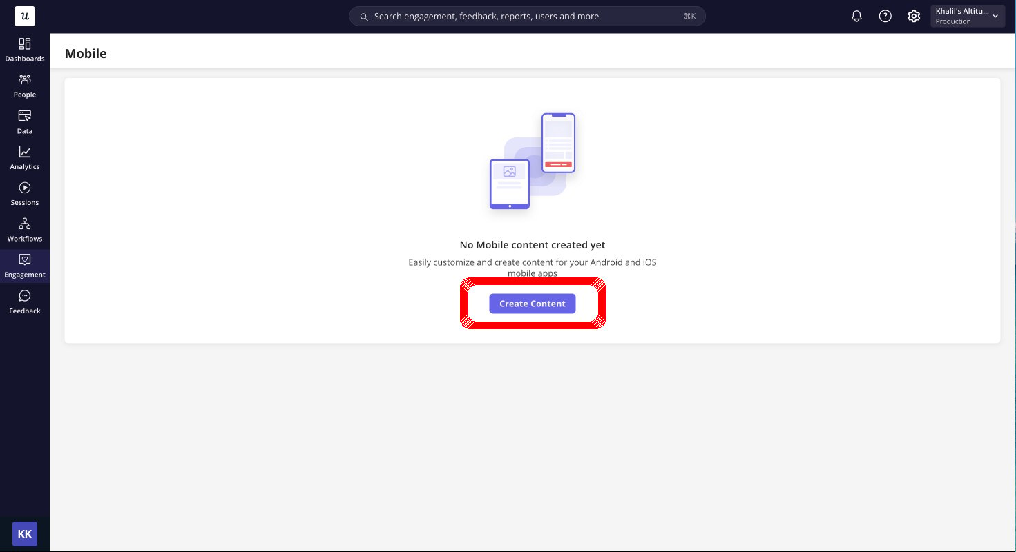
First, go to Engagement > Mobile from the navbar, and click Create Content.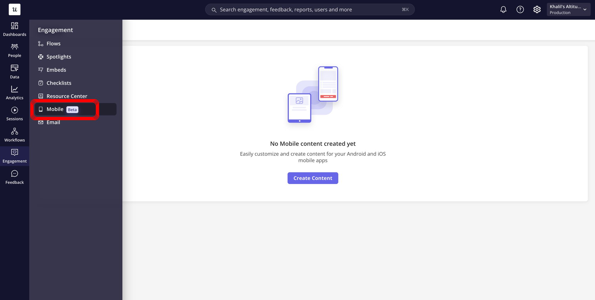
Design the carousel screens
Once you complete the first step of creating the carousel, you’ll be taken to the Design tab, where you can style the carousel screens however you like.These settings will be applied to all screens in the carousel to ensure a consistent look and feel throughout the entire flow.
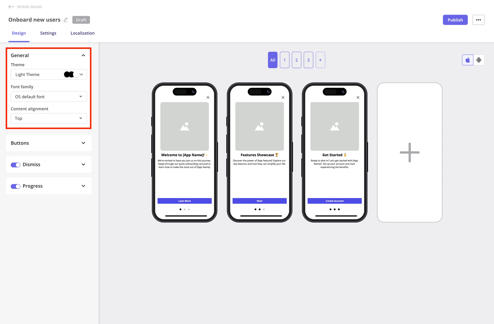
General section
- Themes: Choose between your themes for your carousel screens to match your app’s overall style and improve readability for users.
- Font family: Select the font used in your carousel screens. By default, it uses the OS’s default font to ensure a familiar, consistent experience on all devices.
- Content alignment: Set the position of your content on the screen. You can choose:
- Top: Align content to the top of the screen.
- Middle: Center content vertically for balanced layouts.
Userpilot will display the carousel text using the device’s default OS font, San Francisco on iOS and Roboto on Android, but you can use a custom font if you prefer.
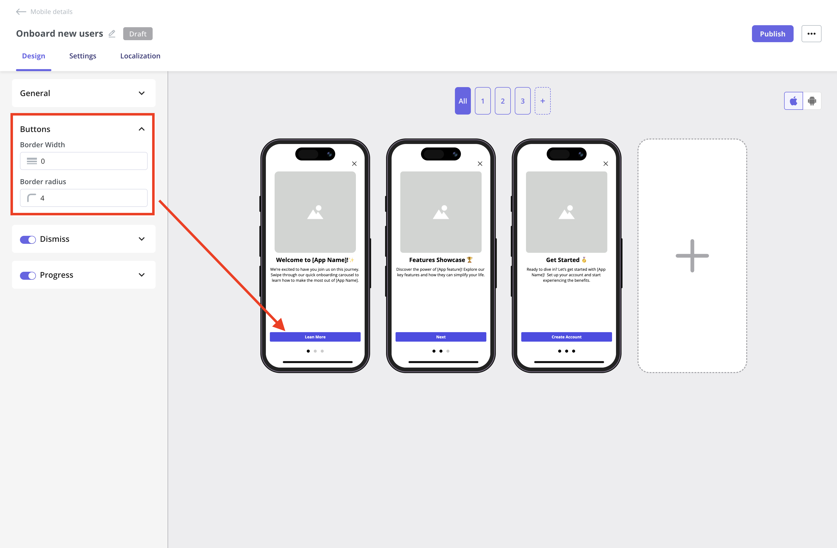
- Border Width: Controls the thickness of the button outline.
- Border Radius: Sets how rounded the button corners appear.
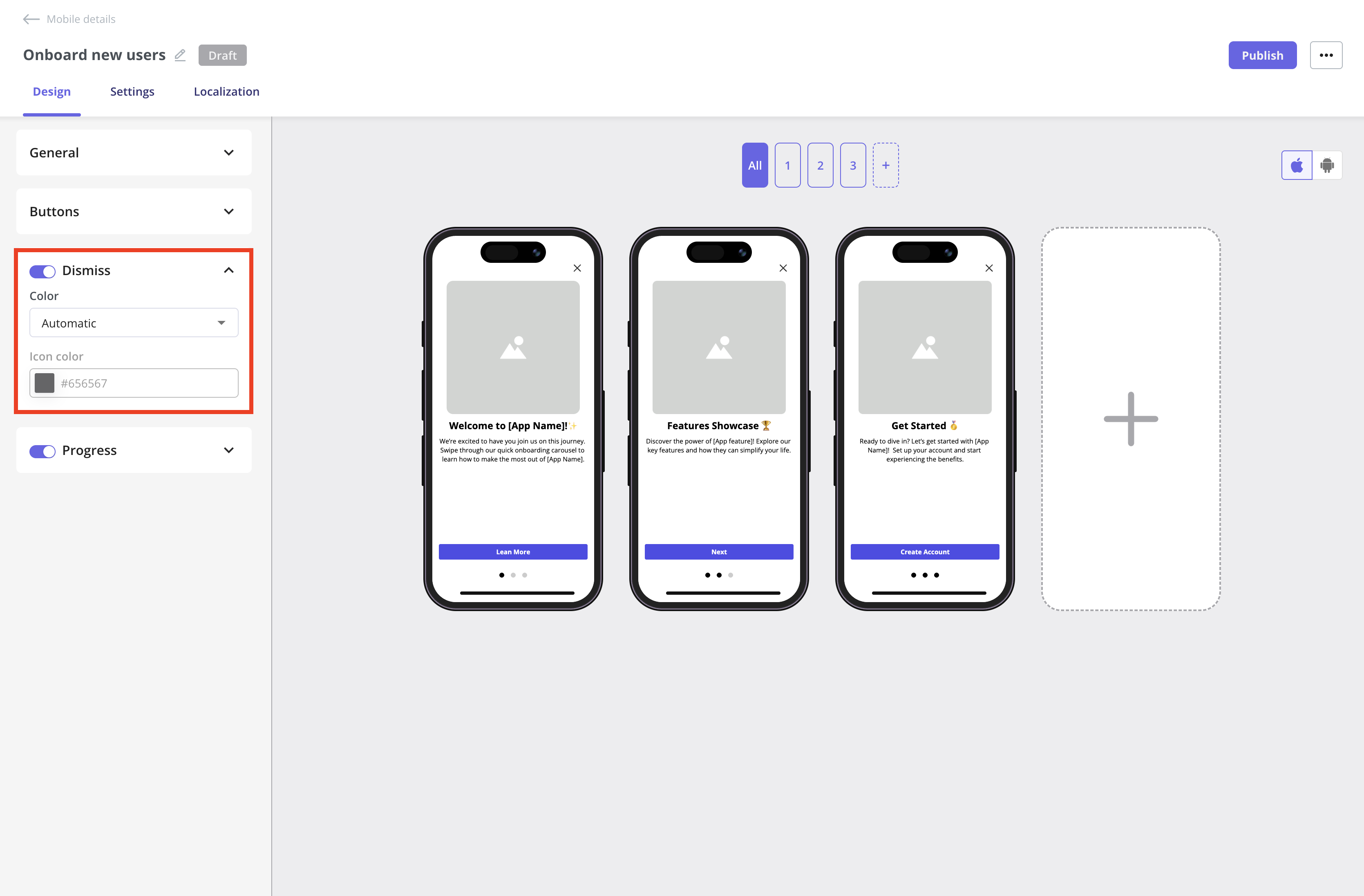
- Color: Lets you choose the color of the dismiss icon (e.g., Automatic to match the theme or a custom color).
- Icon Color: Enables you to specify the exact color of the dismiss icon using a hex code.
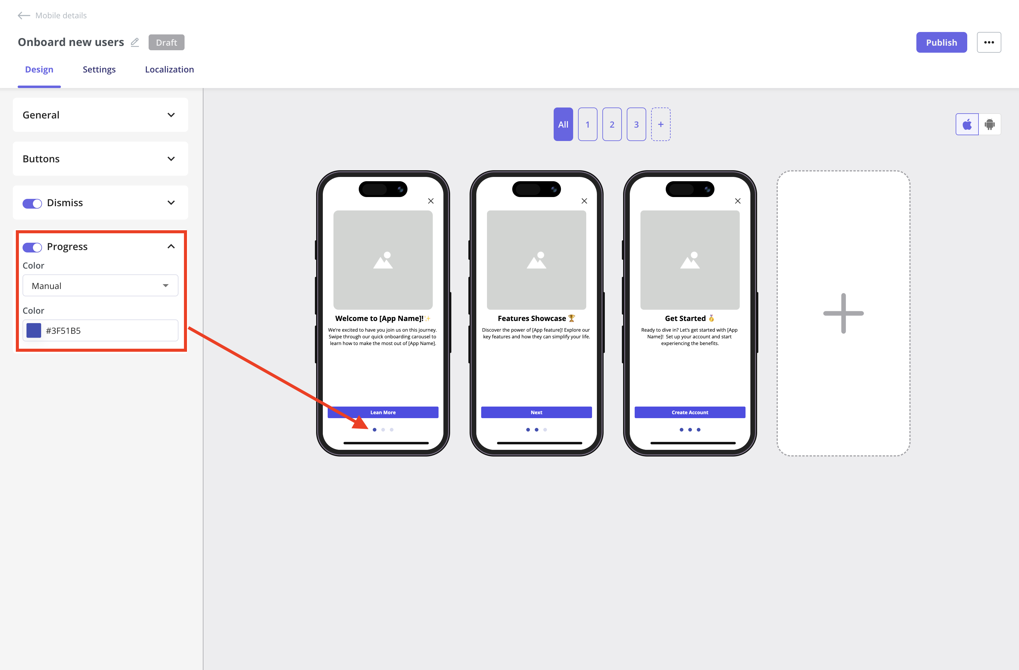
- Color lets you choose the color of the progress dots (e.g., Automatic to match the theme or a custom color).
- Icon Color enables you to specify the exact color of the progress dots using a hex code.
Carousel screens area
The builder area shows all the screens you’ve created. You can edit a single screen by using the screen map above the mobile preview or by clicking the edit icon that appears when you hover over a specific screen..gif?s=a85b6f2479aa655bb671ea44f65c2d76)
.gif?s=bd7f8b35f0609a70759eab2492067cdc)
- The OS preview is just a simulator showing how the content will look on iOS and Android. However, we’re planning to let you connect a real device to test your designs in the future.
- There is no iPad or tablet preview, but Android tablets and iPads are supported.
Design an individual carousel screen
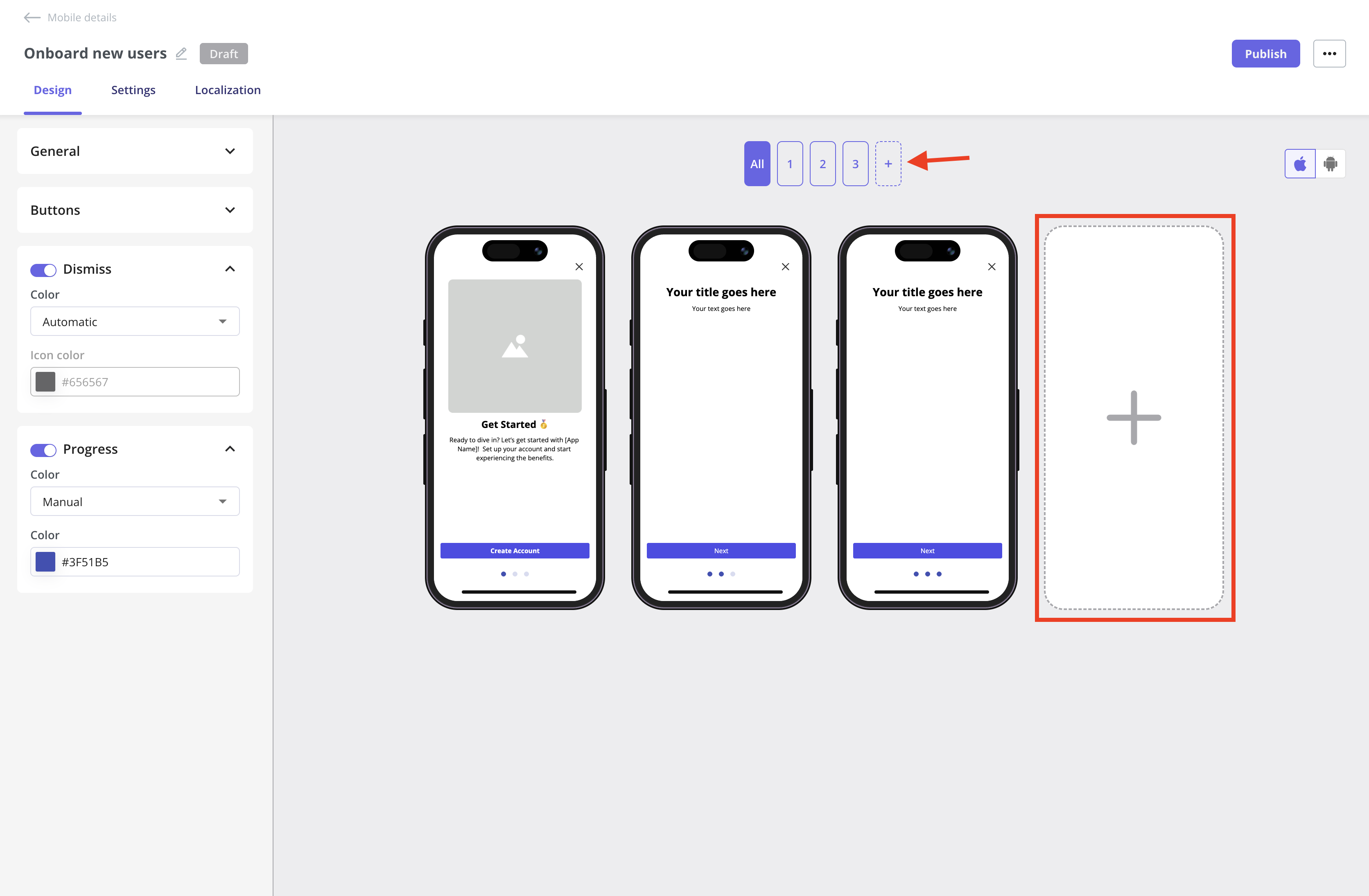
Add a new screen
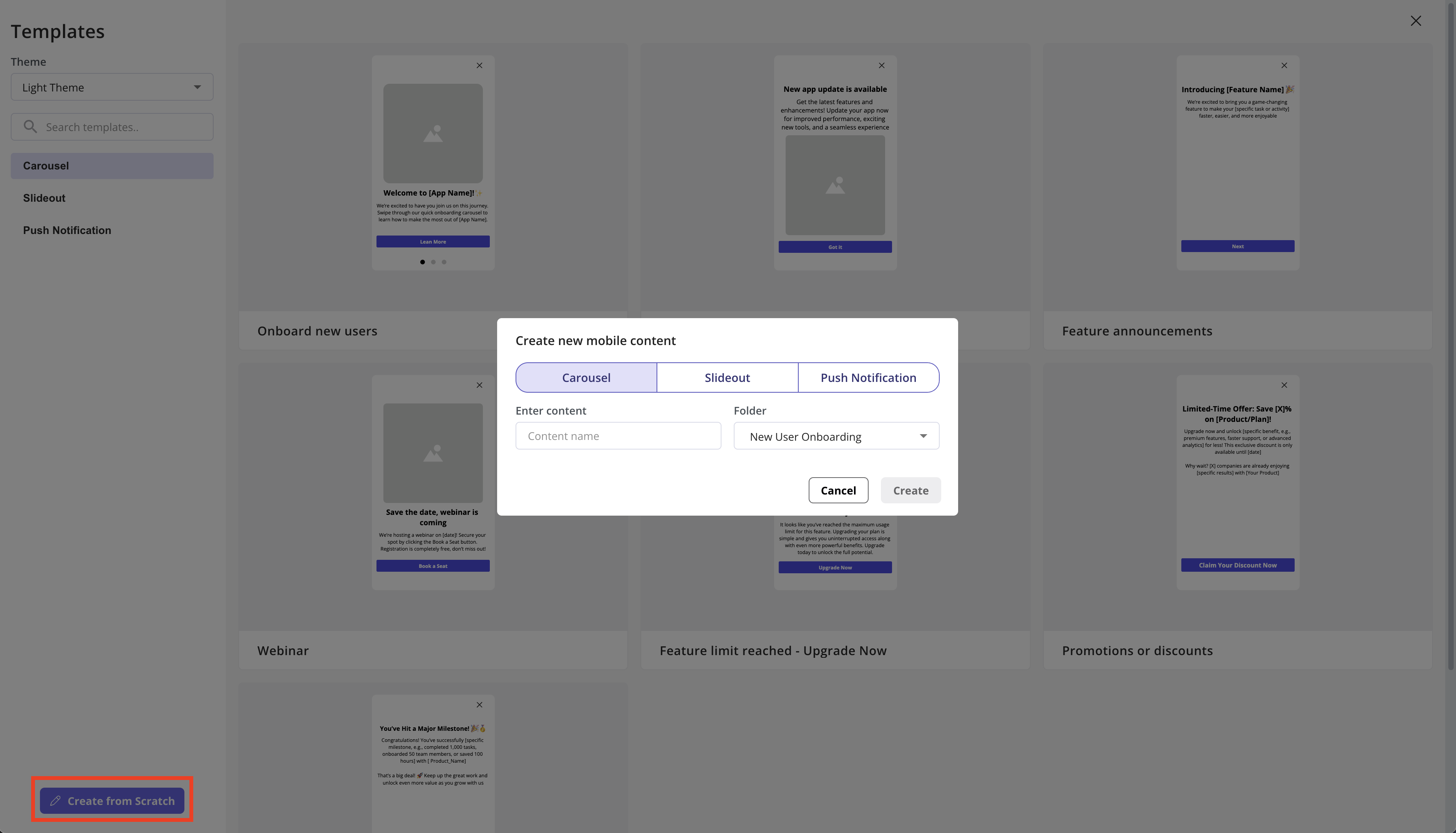
Click the plus icon to add a new screen to your carousel, making it easy to expand and enhance your flow as needed.You can add up to 10 screens to your Mobile Carousels.
Edit screen
Click the edit icon or a screen number to open the detailed view for that screen. This lets you customize the content and design for each screen individually, giving you more flexibility in what you show your users.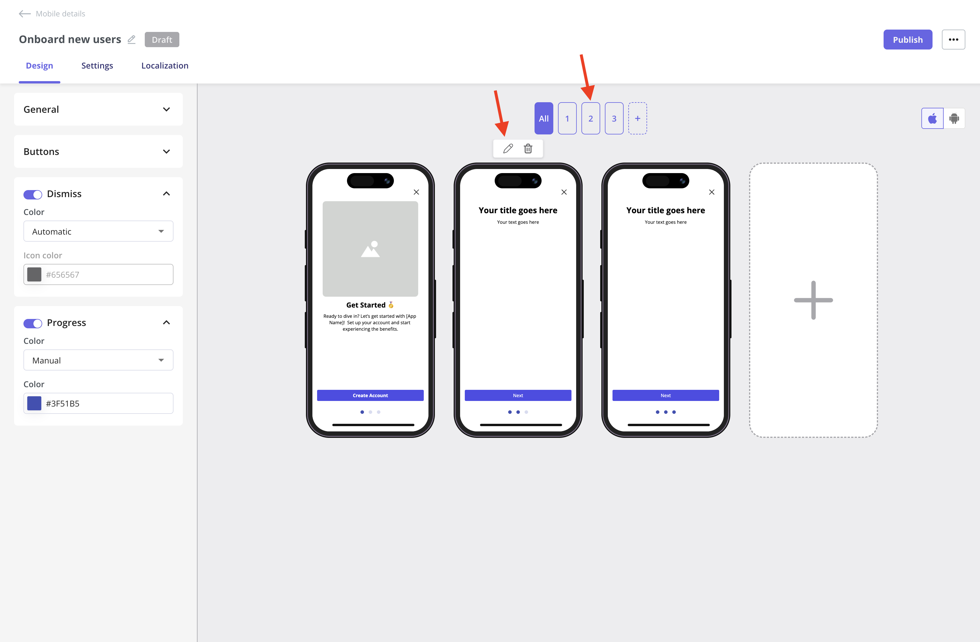
General section
Let’s get started with the General settings for a single screen. The layout defines the arrangement of the image, title, and text. For example, you can place an image at the top with a title and description below, or choose other configurations to match your needs.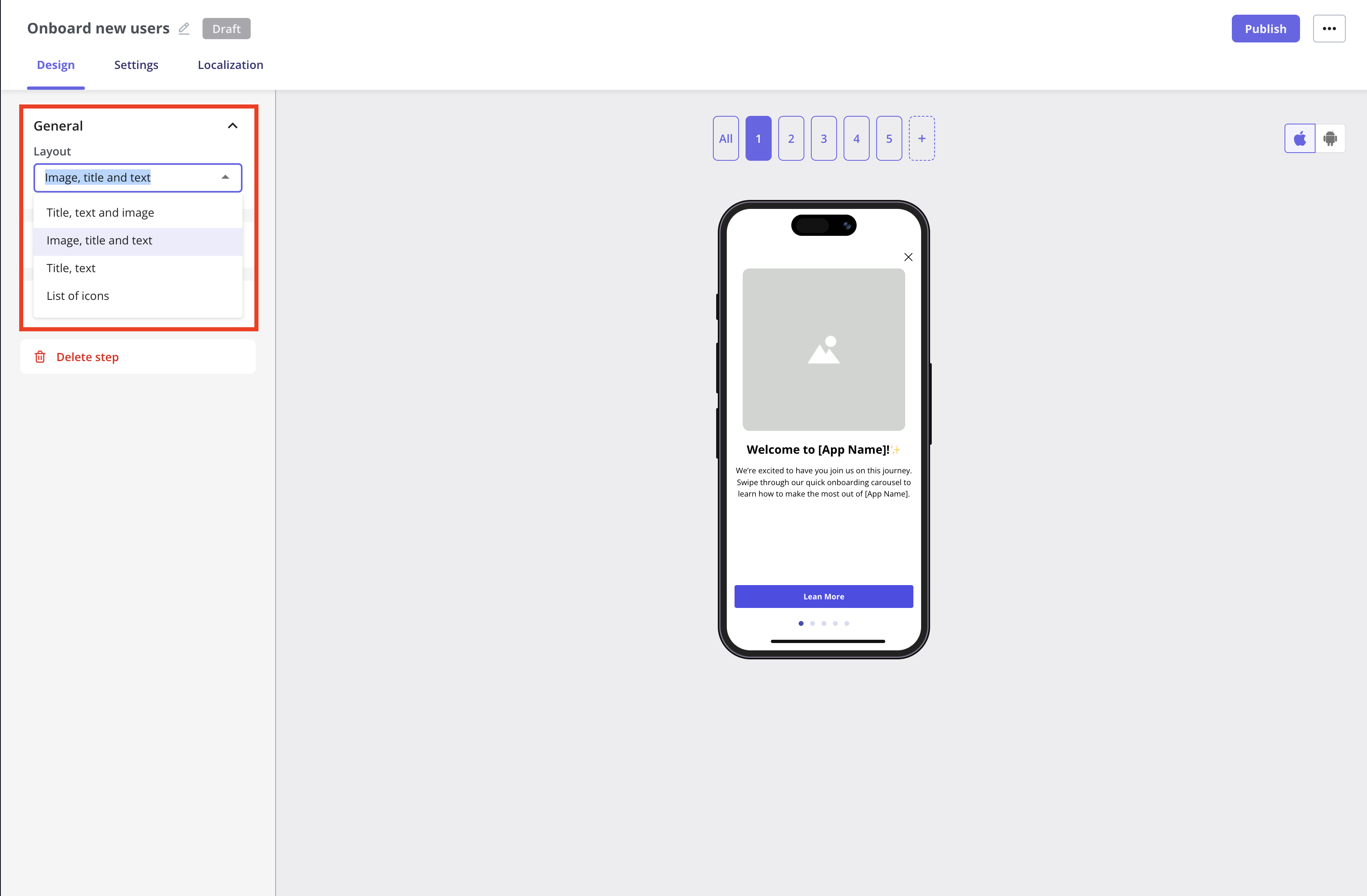
Switching to the List of Icons layout will reset your step’s content.For example, any image and text from the Image, Title, and Text layout will be erased, and vice versa, since the design changes completely.You can’t revert to recover the previous content after changing the layout.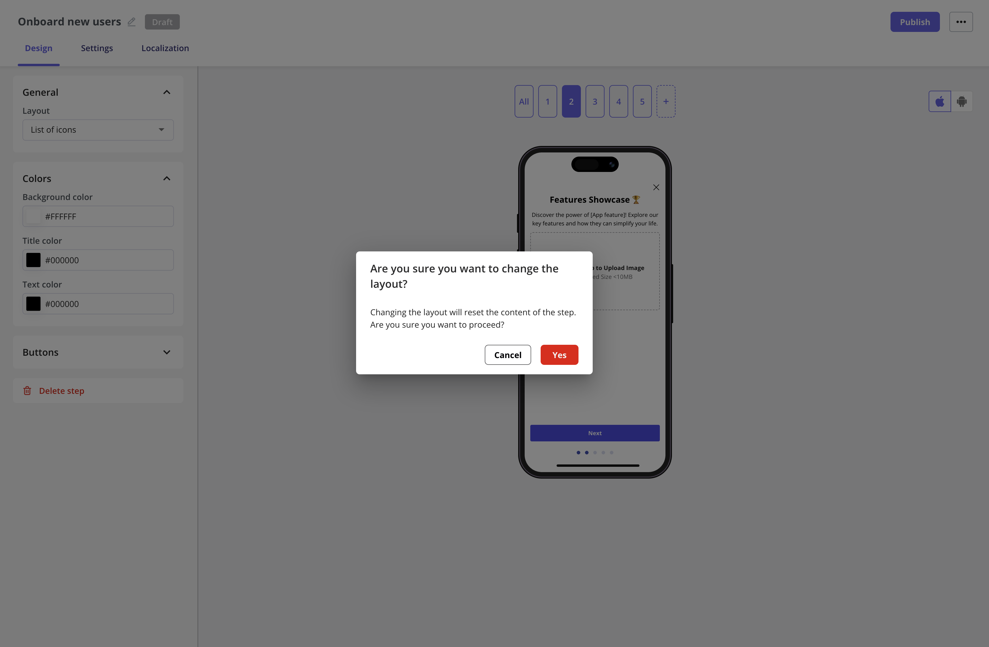
Colors section
You can customize the background color of the carousel screen, as well as the title and text colors, by using a hex code.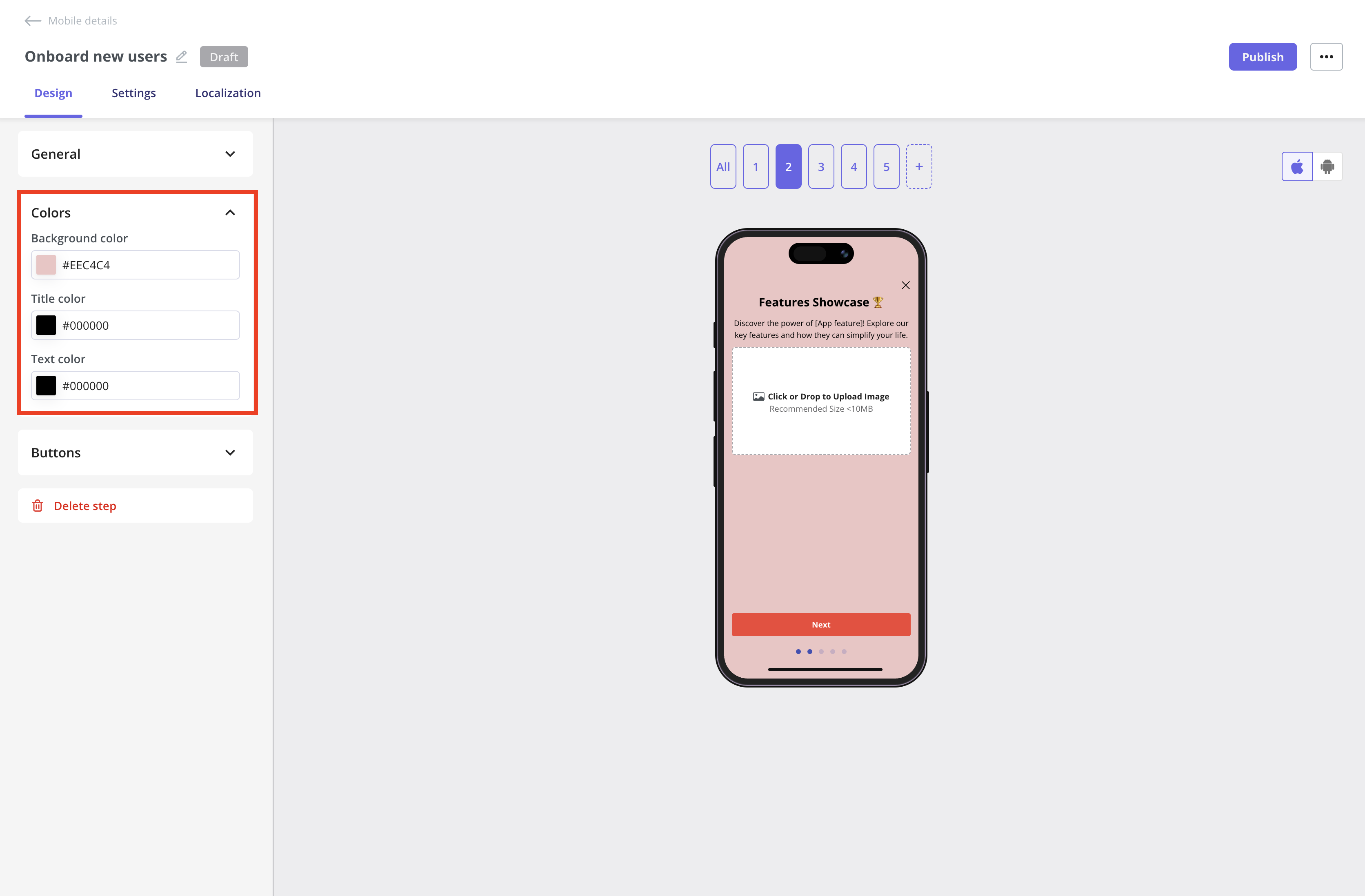
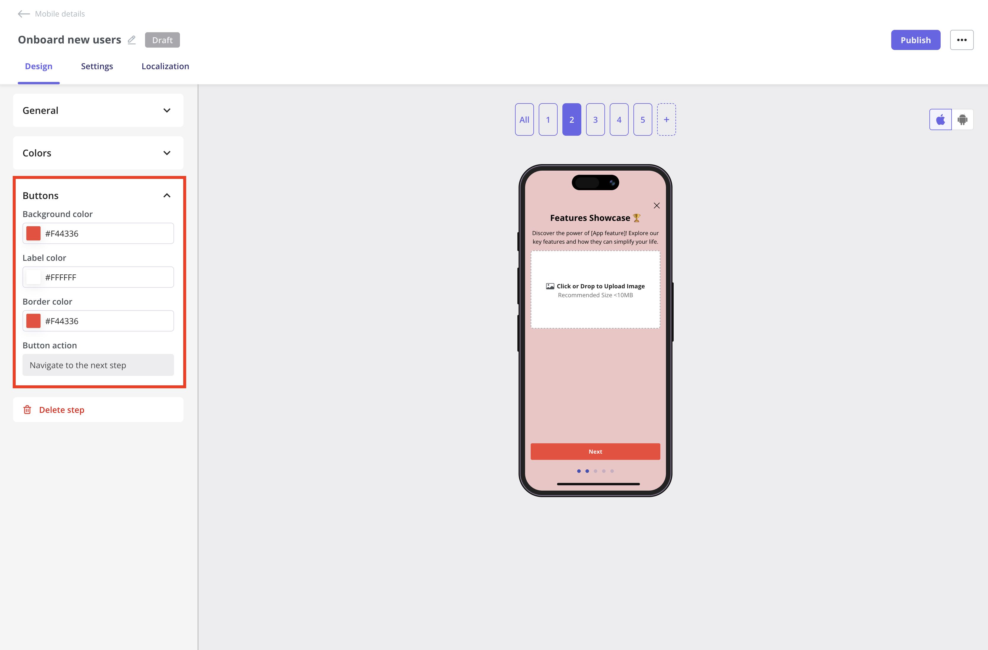
Buttons section
Customize the button and border colors, as well as the button label, using hex codes as needed.The available button actions depend on the screen’s position in the carousel:
- All screens except the last support only the Next step action.
- The last screen (or a single-screen carousel) can instead Close the carousel or Open a Deep Link, which also accepts a URL, to send users to a specific place in your app or on the web.
Delete screen
Lastly, there’s the Delete Step function. You can remove a screen directly from its individual view or click the delete icon when hovering over a step in the All Screens view.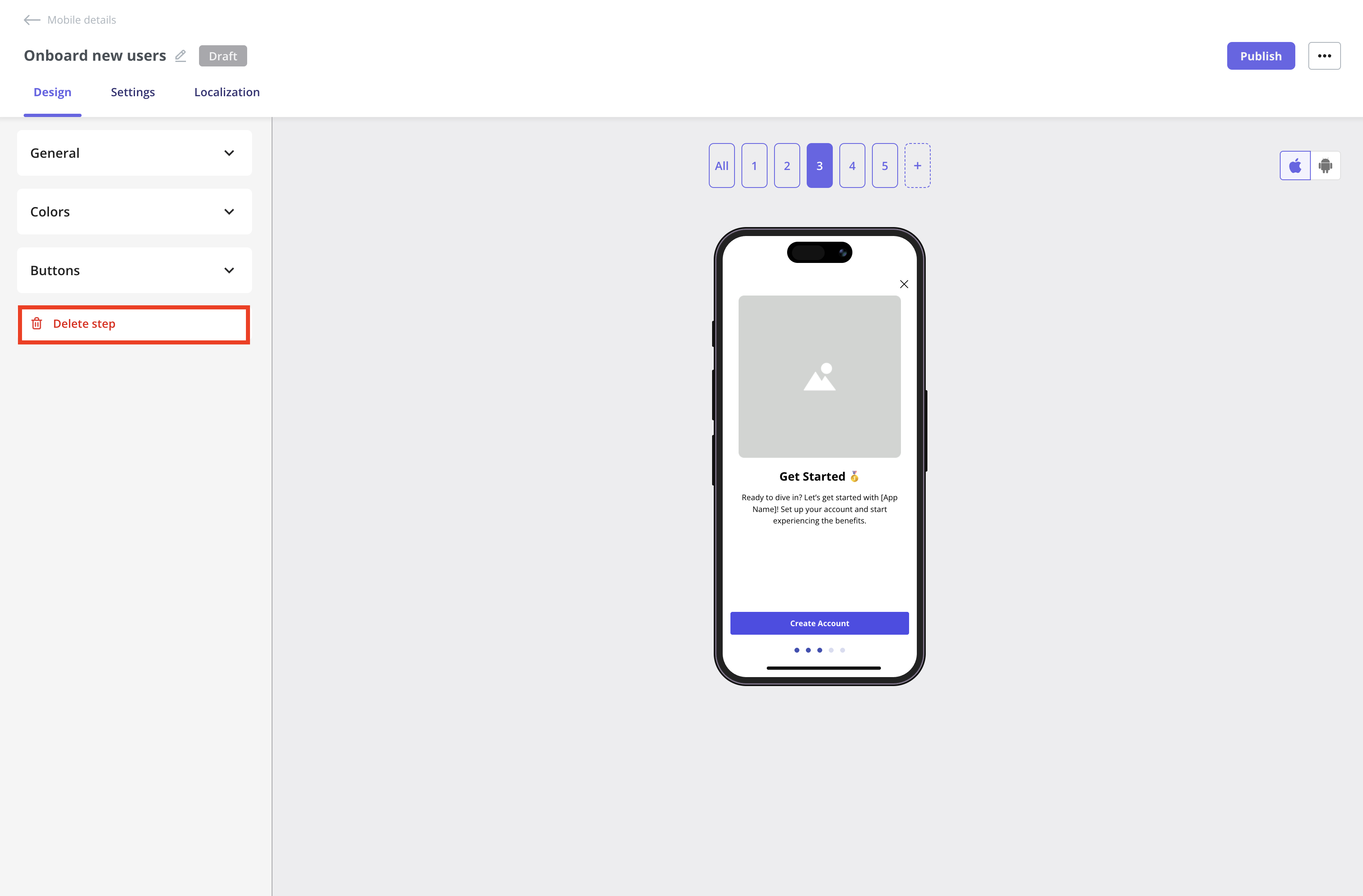
Customize the carousel screen content
The content of each screen can be edited directly inline.Image
You can update the image and alt text to support accessibility by clicking the edit icon, then adjust the Size & Space settings to customize its appearance.- Width and Height: set the dimensions of your image in pixels to control its size on the screen.
- Fill: the image will expand to fill the available space, possibly cropping to maintain coverage. Best for full-width, impactful visuals.
- Fit: the image will resize to fit within the space without cropping, maintaining its original aspect ratio. Best for clear, uncropped images.
- Corner Radius: adjust the roundness of the image corners in pixels for a softer or more modern look.
.gif?s=31246c6cf7860e1b3c23eaa6acaa74f3)
Additional explanation of how Userpilot handles images with Fill and Fit options:Fill is like saying, I want this entire space covered, no matter what.When you choose Fill, Userpilot will stretch or squash the image to completely cover the width and height of the frame.
Now, let’s talk about Fit. This option says, Show my image as it really is, no distortion allowed.When you choose Fit, Userpilot will scale the image proportionally so the entire thing is visible within the frame.
In short:
- It doesn’t preserve the original aspect ratio, which means the image might end up looking distorted if it wasn’t designed for that shape.
- Think of it like stretching a small sticker over a big box: you’ll cover every corner, but it might look a bit warped.
- This option is great for abstract backgrounds or placeholder visuals where distortion isn’t a problem.
- Your frame is 300×300.
- Your image is 200×300.
- Result? It’s stretched to 300×300, changing its proportions to fit perfectly in the space, even if it looks a little off.
Now, let’s talk about Fit. This option says, Show my image as it really is, no distortion allowed.When you choose Fit, Userpilot will scale the image proportionally so the entire thing is visible within the frame.
- The aspect ratio is preserved, so the image keeps its original shape.
- It might not fill the whole space, leaving empty areas (like letterboxing) on the sides or top and bottom.
- This is perfect when you want users to see your logo, product image, or any visual that needs to look exactly right.
- Your frame is 300×300.
- Your image is 200×300.
- Result? The image stays 200×300, perfectly centered, with 50pt padding on either side to fill the space evenly.
In short:
- Choose Fill if you want to cover the entire space, even if that means distorting the image.
- Choose Fit if you want to preserve your image’s original shape, even if there’s empty space around it.
Videos aren’t supported in Mobile Carousels at the moment, but you can include animated GIFs instead.
Header
The following formatting options are supported for the header:- Headings: H1, H2, and H3.
- Horizontal Alignment: Left, Center, and Right.
- Link: Navigate your users to a specific URL. Userpilot will open the browser to display the link.
- Personalization: Insert user or company properties to create a more personalized experience.
Text
The following formatting options are supported for the text:- Font Size: Set your font size in pixels. Userpilot will automatically convert it to the appropriate unit for mobile, adjusting to the device dimensions to ensure the text is readable.
- Horizontal Alignment: Left, Center, or Right.
- Font Style: Apply Bold or Italic styling.
- Link: Direct users to a specific URL. Userpilot will open the browser to display the link.
- Personalization: Insert user or company properties to create a more personalized experience
.gif?s=628a23e8c650f3948d6e4b082ca74956)
Localization
You first need to activate the localization settings from the Settings page. For detailed instructions, follow the steps in this Localization document.
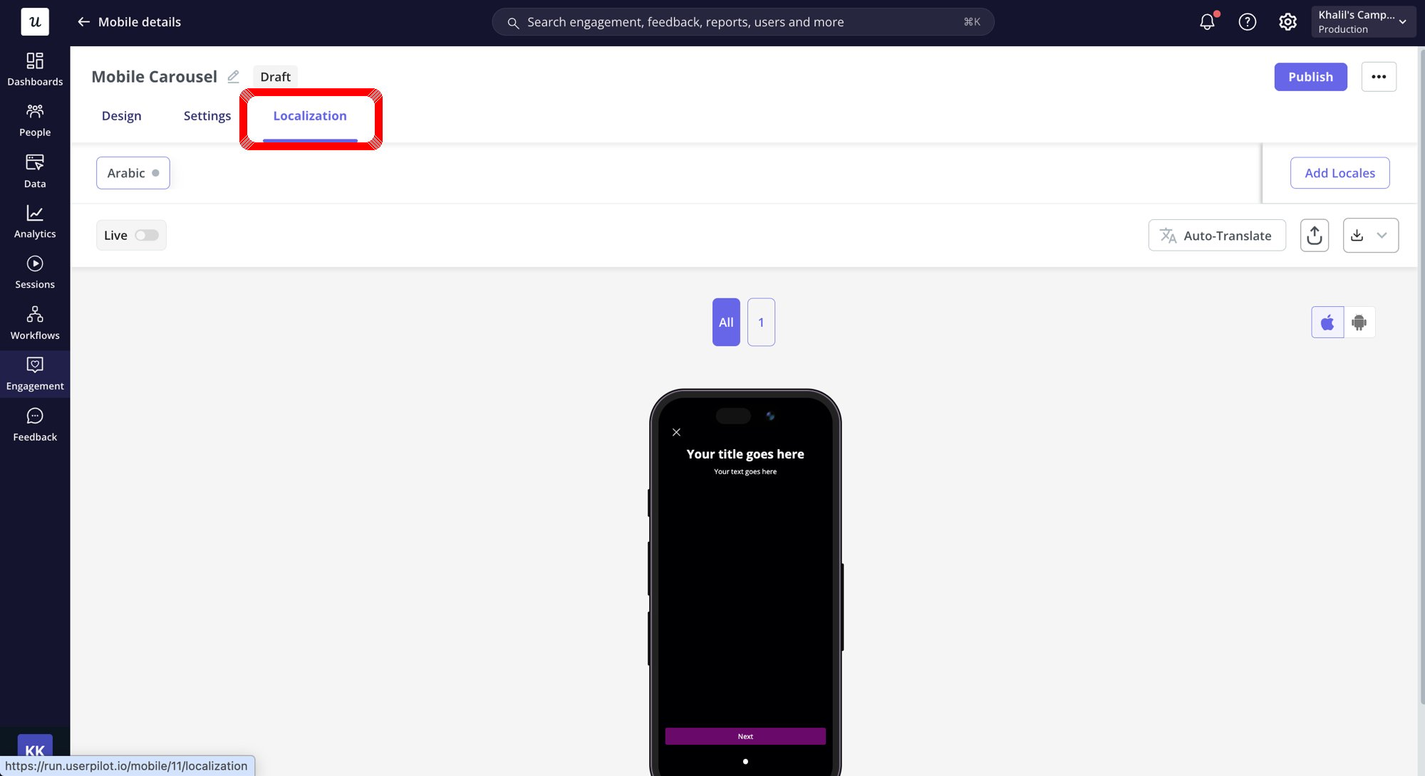
Mobile localization only works when you pass the 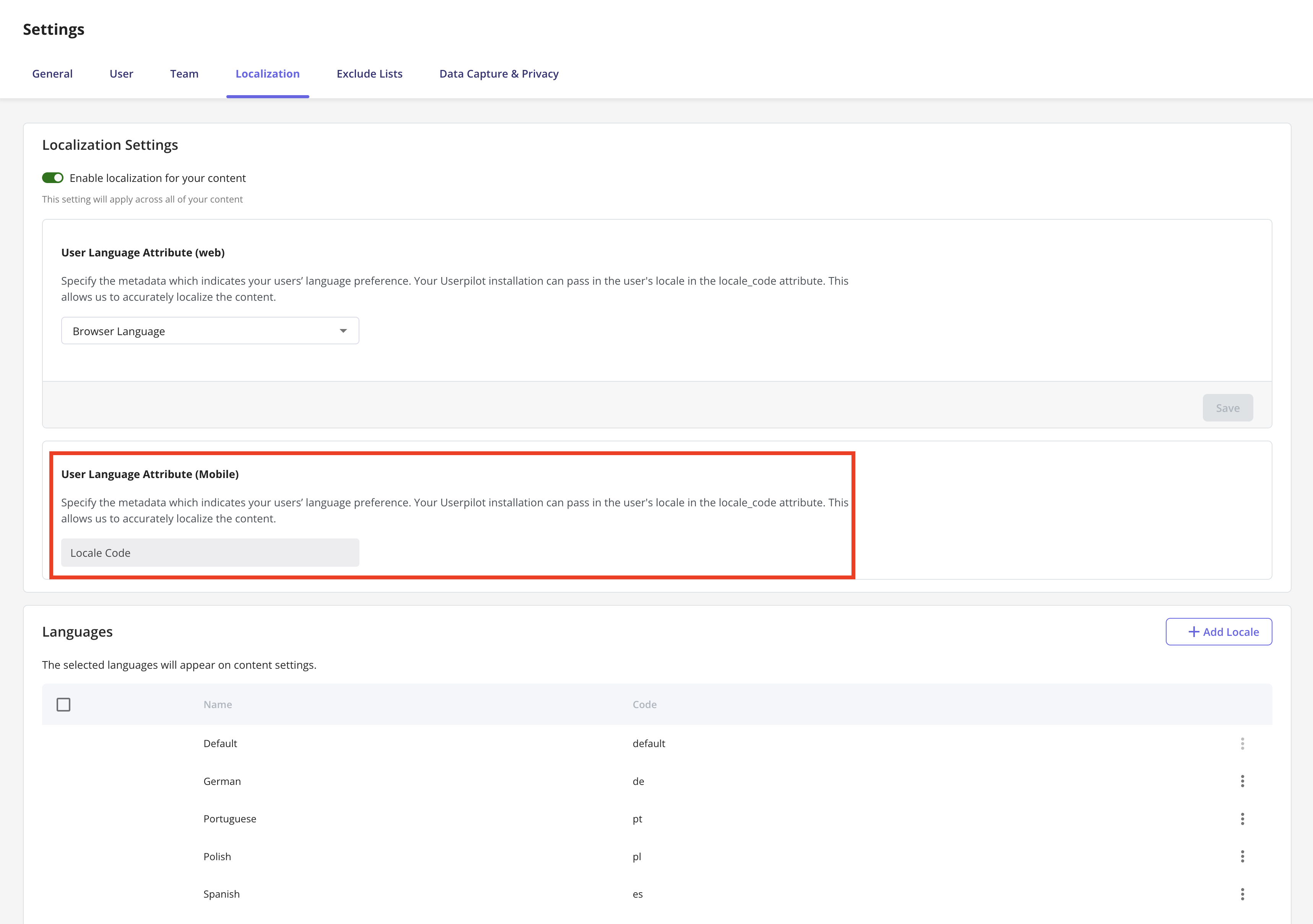
locale_code attribute. Make sure you’re setting up localization for both web and mobile using the locale code, since the browser language won’t automatically work on mobile.Publish your carousel
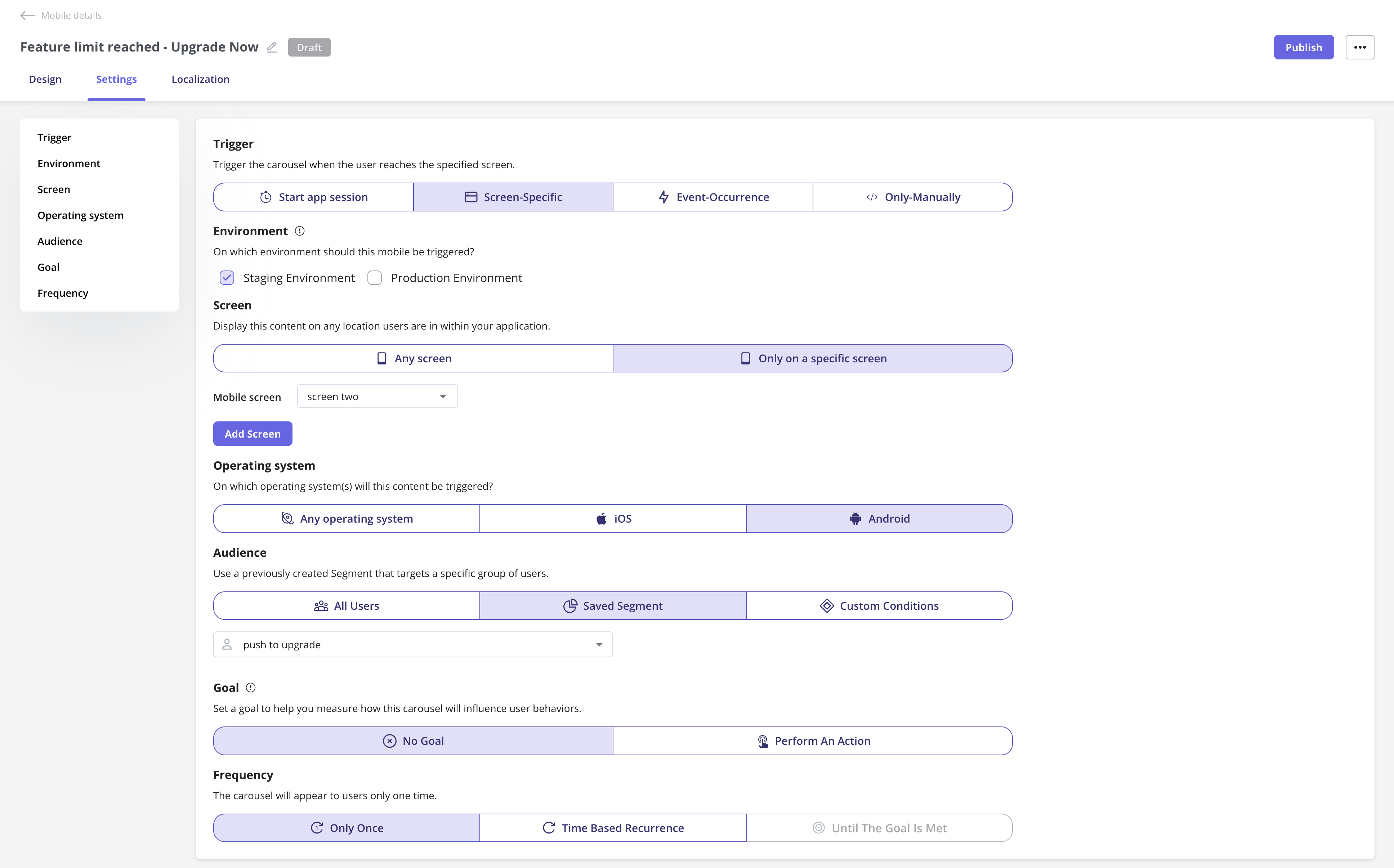
Once you’ve designed your Mobile Carousel and localized the content, the next step is to configure the carousel settings and publish it to your end users.Trigger
Define when the carousel should appear for users. Options include:- Start app session: Perfect for onboarding new users or welcoming them back with important updates as soon as they open the app.
- Screen-Specific: Great for feature adoption, highlight a feature or guide users when they reach a specific screen in the app.
- Event-Occurrence: Ideal for contextual help or upsell prompts, trigger the carousel when users complete an action like making a purchase or saving a setting.
- Only-Manually: Best for advanced use where you want full control. For example, triggering a carousel from a custom button in the mobile app.
You can view the Only-Manually trigger code for both iOS and Android, and share it with your engineering team. They can integrate it into the app’s codebase to trigger the carousel whenever an end user interacts with the specific mobile app element containing the code.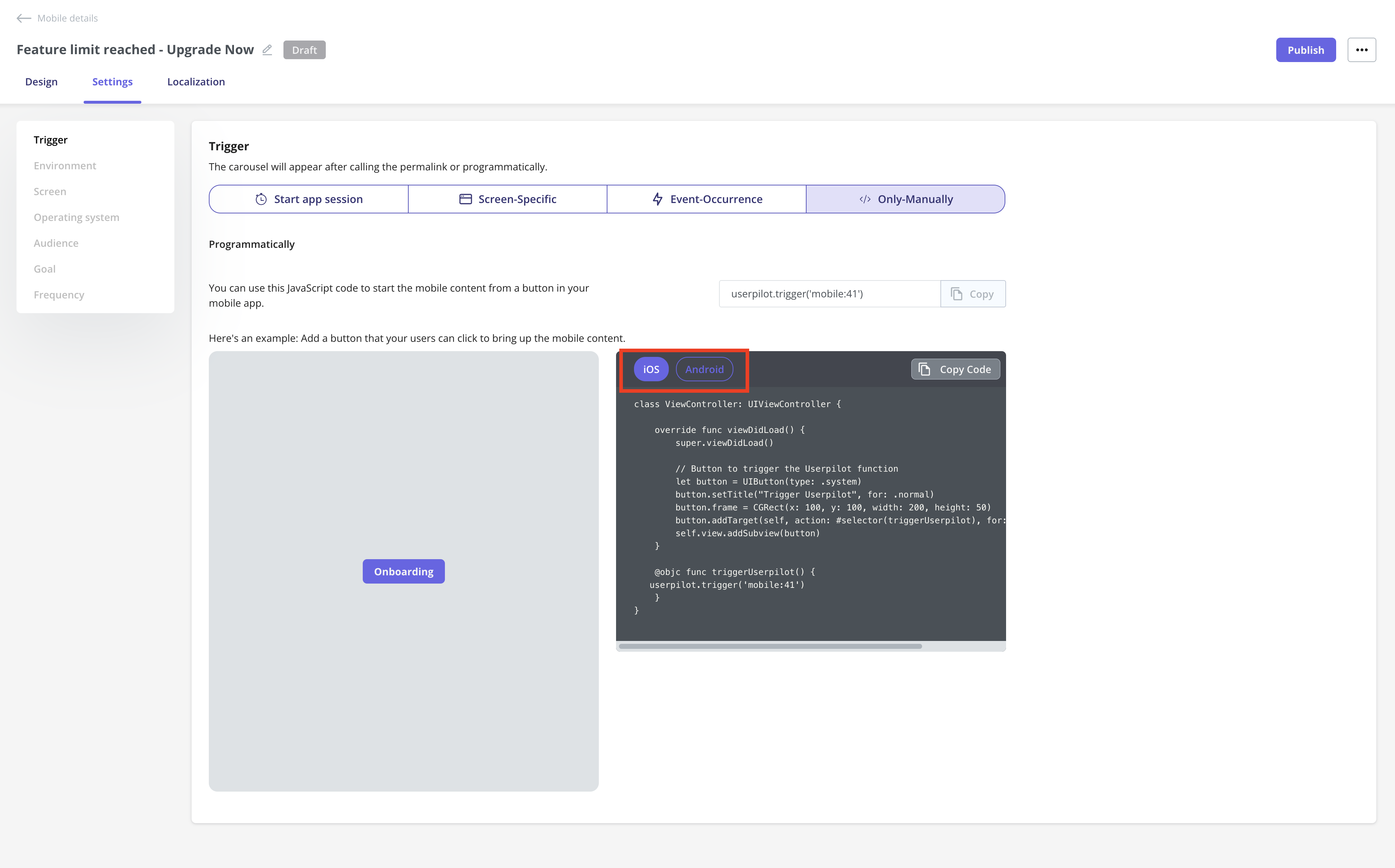
Environment
Choose where this carousel should be triggered:- Staging Environment: For testing and QA.
- Production Environment: For live, end-user experiences.
Operating System
Select which OS your carousel will appear on:- Any operating system: Both iOS and Android.
- iOS: Target only Apple devices.
- Android: Target only Android devices.
Audience
Define who should see your carousel:- All Users: Every identified user in Userpilot who is using the app.
- Saved Segment: A pre-defined user segment.
- Custom Conditions: Set specific rules to target users meeting chosen criteria.
Goal
Set a goal to measure how the carousel influences user behavior:- No Goal: No specific outcome tracked.
- Perform an Action: Track if users complete a key action after seeing the carousel.
Frequency
Control how often users see the carousel:- Only Once: Show a single time per user.
- Time Based Recurrence: Repeat after a set period.
- Until The Goal Is Met: Would normally repeat until the defined goal is achieved.
Schedule your carousel
If you want to schedule your carousel to go live at a specific date and time, you can easily set that up after clicking the Publish button. Simply select the start date and time for when it should be live, and you can even choose when you’d like it to stop showing to users.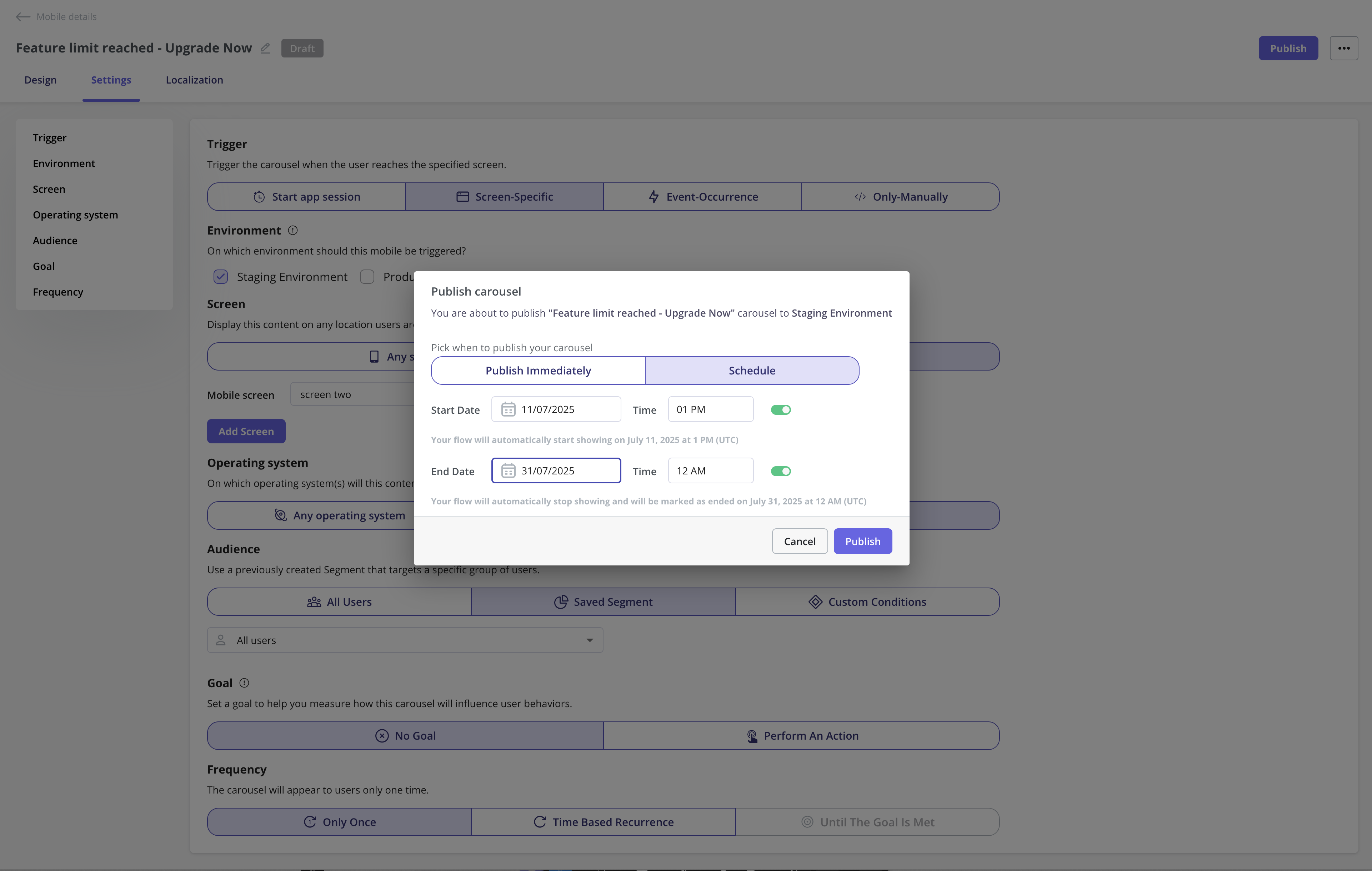
The publication time is based on your account’s time zone set in the General page, not the user’s local time.