Description
The User Activation Dashboard helps Product Managers understand how new users move from sign-up to activation, where they drop off, and how long it takes them to reach meaningful value in the product. It tracks the key events users complete after sign-up and before reaching the final activation moment.Create User Activation Dashboard
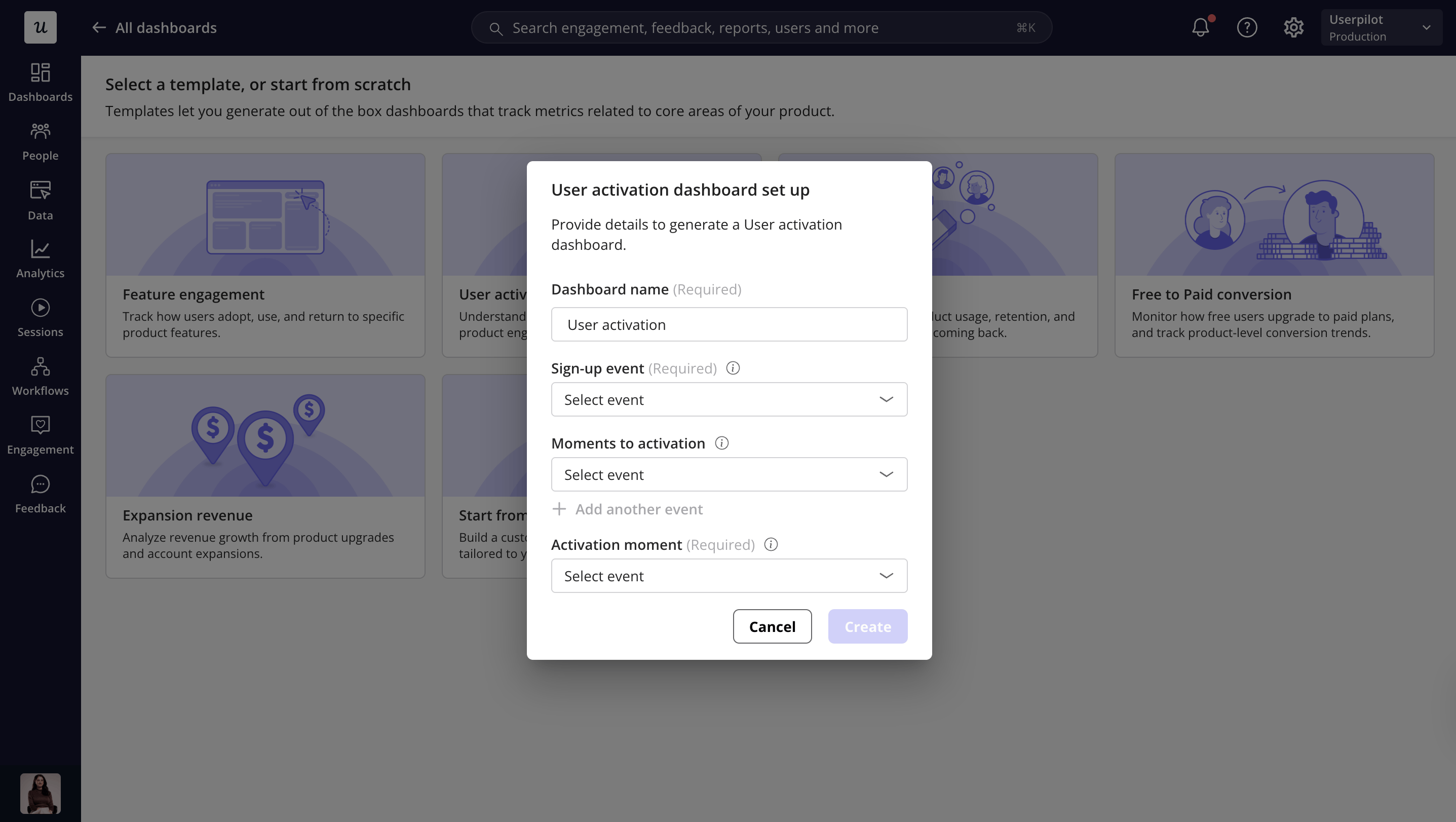
- Dashboard name The name of the dashboard. This helps teams clearly identify the dashboard, especially when creating multiple dashboards for different products, segments, or onboarding journeys.
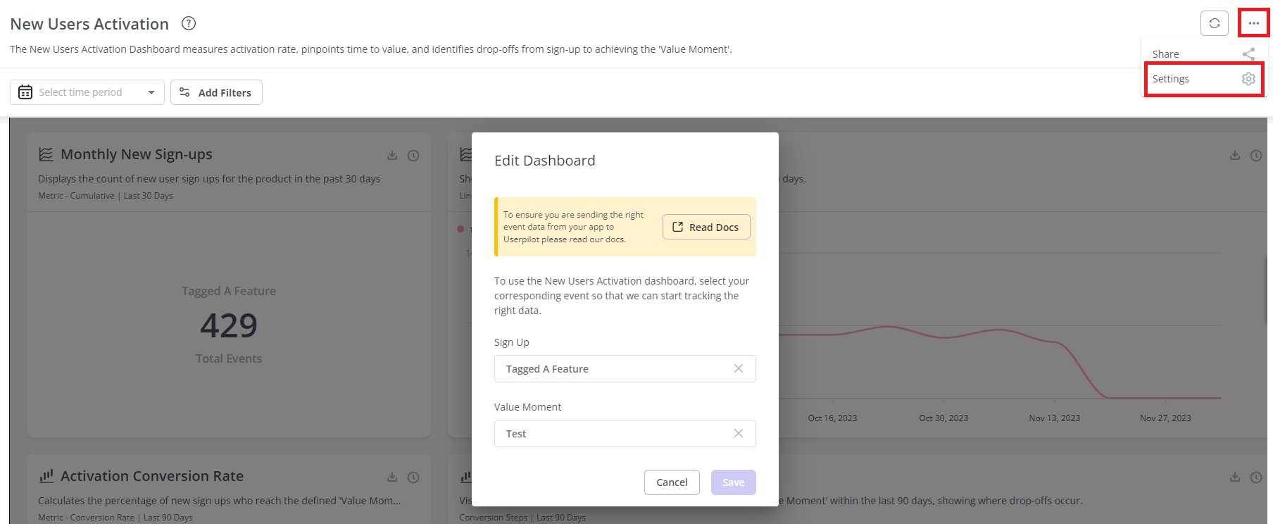
- Sign-up event The event that represents when someone becomes a new user. This event defines the starting point of the activation journey. All activation reports use this event to understand what happens after a user signs up.
- Moments to activation The key events users complete before reaching the final activation moment. You can add more than one event to capture the full journey. Example: Created project → Invited teammate → Completed setup Purpose: These events are used to build a detailed activation funnel and show how users progress step by step before becoming activated.
- Activation moment The event that shows the user has found value in the product. This defines what activation means for the product. It helps the dashboard measure how many users successfully reached value after signing up.
Report groups and report purposes
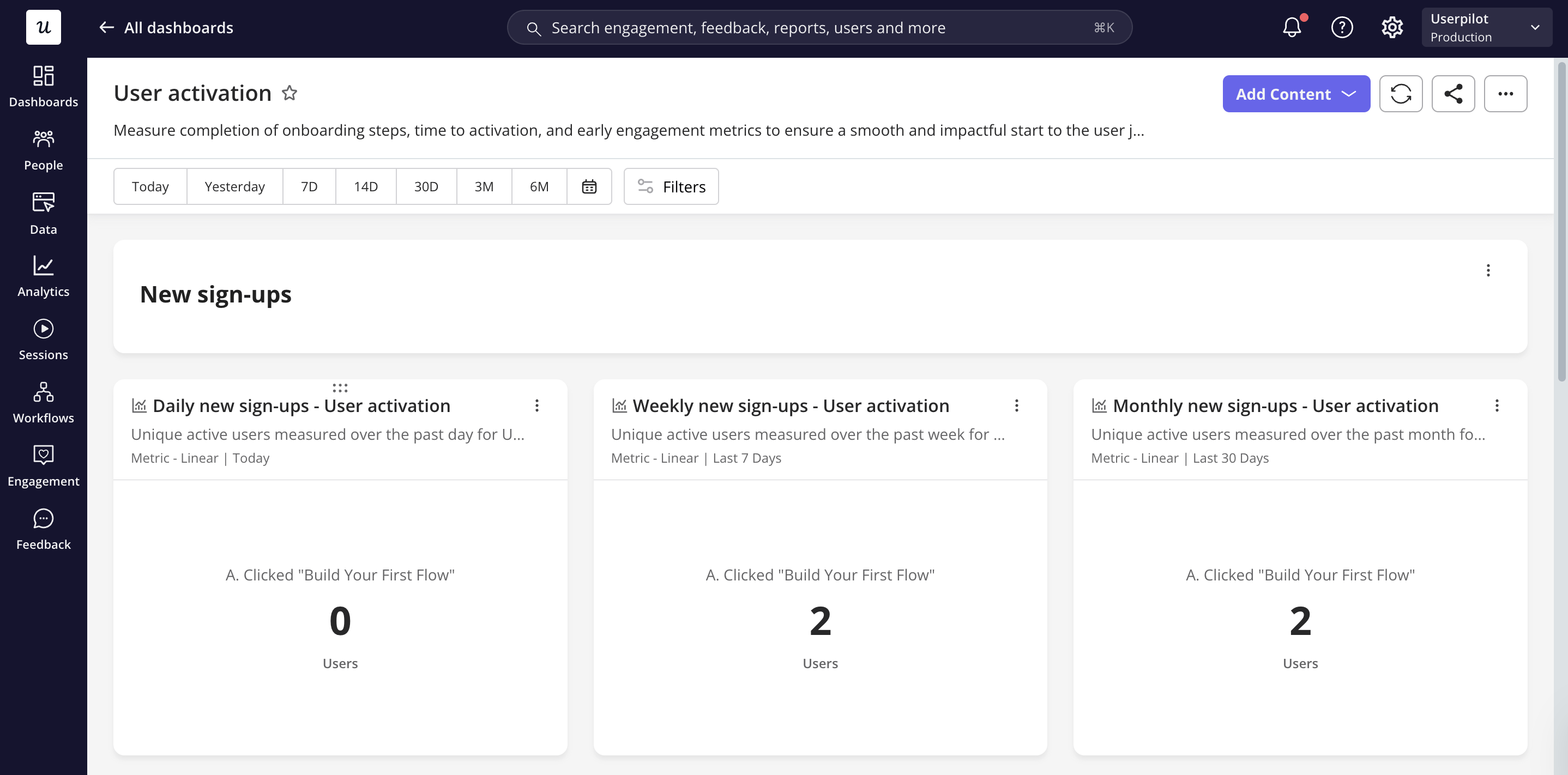
- New sign-ups
- Daily new sign-ups
- Weekly new sign-ups
- Monthly new sign-ups
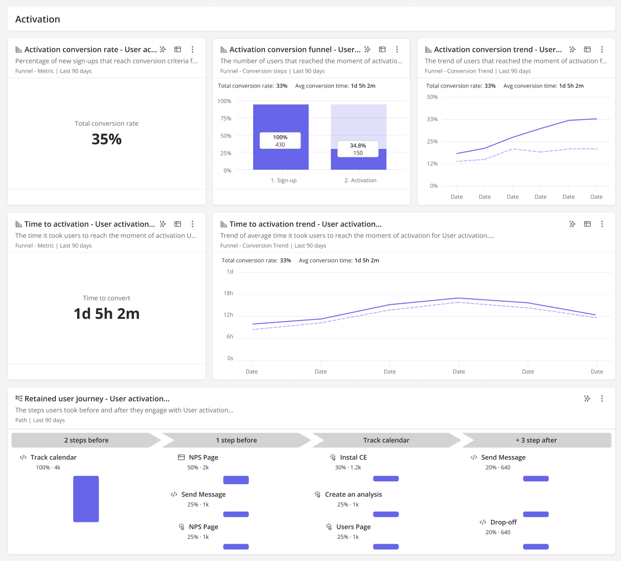
- Activation
- Activation conversion rate
- Activation conversion funnel
- Activation conversion trend
- Time to activation
- Time to activation trend
- Retained user journey
Report card behavior
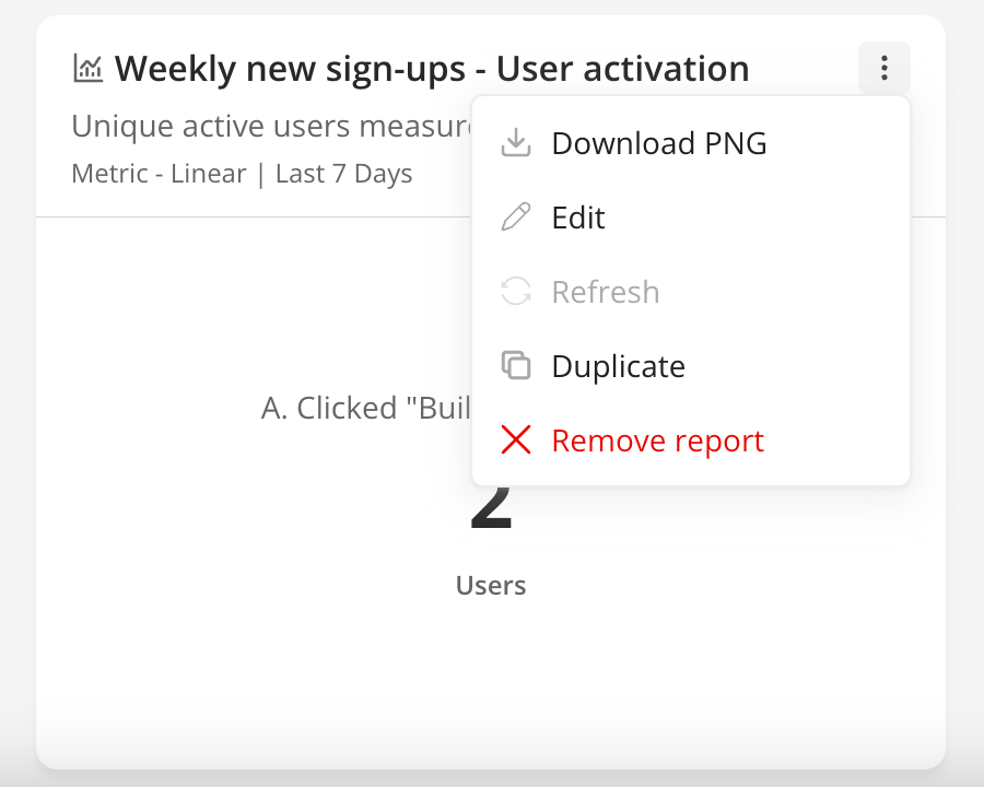
Each report card is designed to support quick exploration and deeper analysis. The report title is clickable and opens the detailed report view. Users can also reorder reports using drag and drop, allowing them to personalize the dashboard based on their workflow and priorities. For Trend, Funnel, and Retention reports, a table view icon is available. When clicked, it shows a breakdown table for the selected events. Each report action menu includes:- Download as PNG
- Edit
- Refresh
- Duplicate
- Remove report
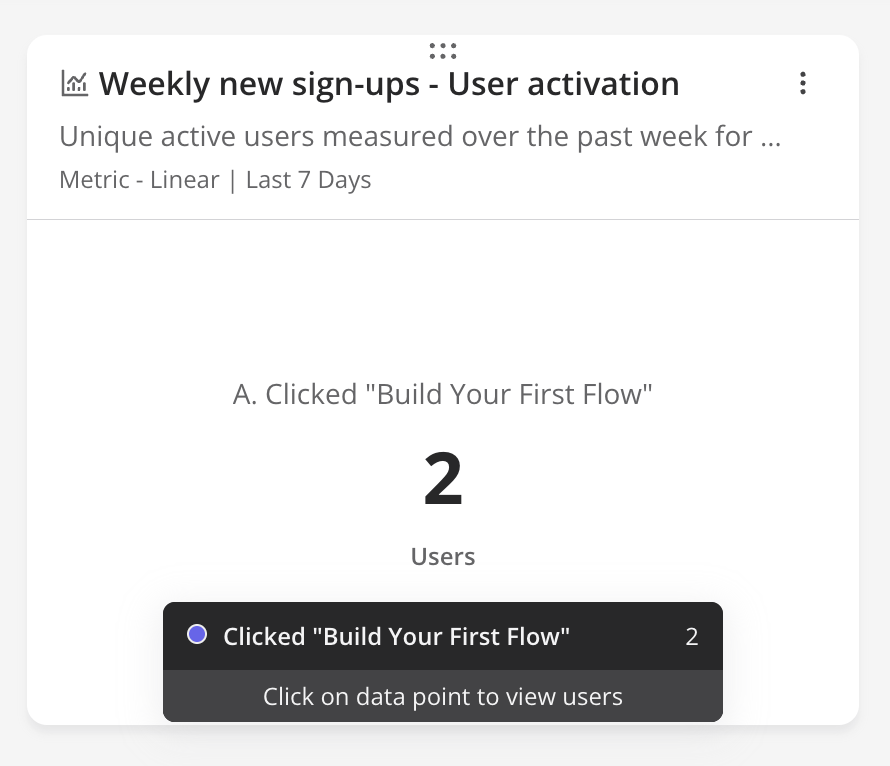
- Click any data point in a report to open the related user list and see which users contributed to that metric directly from the dashboard.
Dashboard actions
Within the header, you can:- Add content: You can add an existing report to the dashboard or create a new report and add it directly.
- Share: Use the three dots in the top-right corner to share the dashboard via email with teammates.
- Refresh: Click the refresh icon in the top-right corner to update the dashboard data (available every 10 minutes).
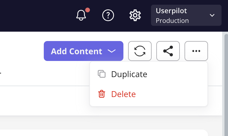
- Action menu: Duplicate and delete.
Dashboard filters
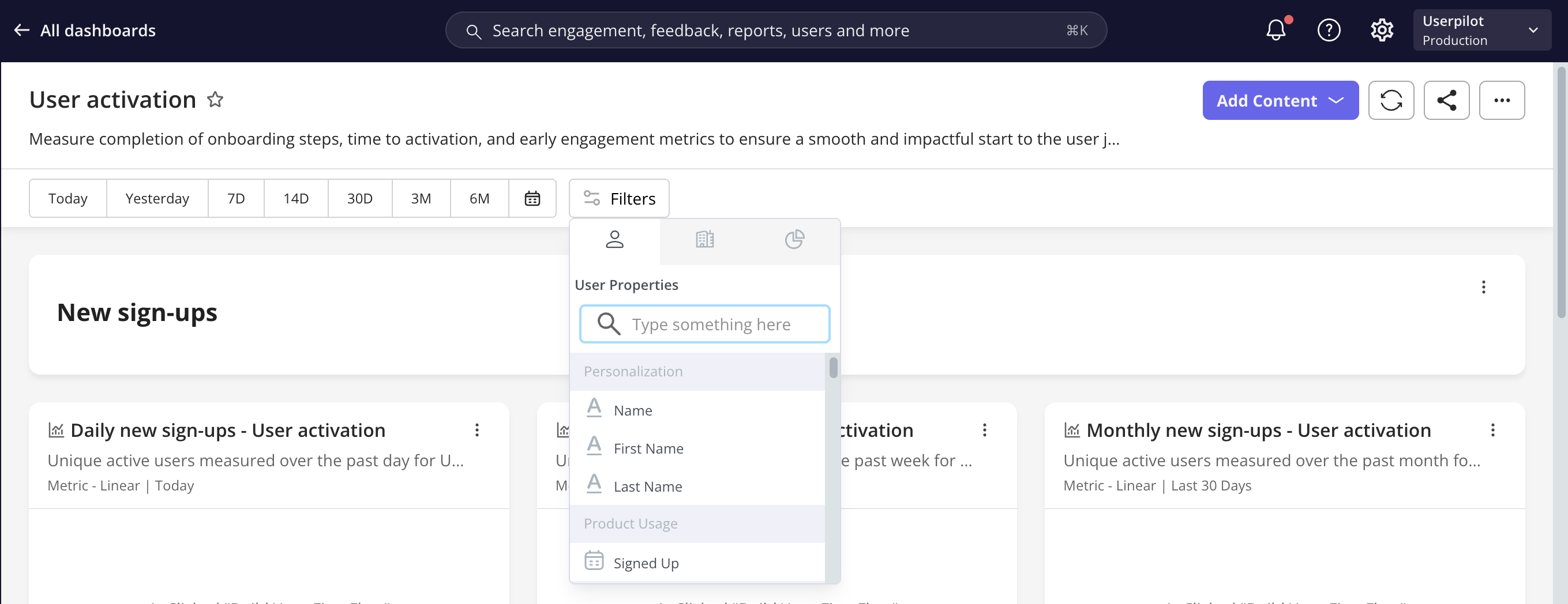
- Add filters: Narrow the dashboard data to focus on a specific group of users by applying user properties, company properties, or segments.
- Time period: Select a specific time range for the data displayed in the dashboard.
- Platform (Mobile only): If Mobile is enabled in your account, choose to display data from all platforms, web only, or mobile only.