The Expansion Revenue dashboard template is only available on Growth and Enterprise plans.
Description
The Expansion Revenue Dashboard provides product-level insights into how existing customers expand their usage or move to higher-value plans.
It helps you understand:
- How many customers upgraded during a selected period
- How upgrade volume changes month over month
- What percentage of active users upgraded
- Which behaviors happen before customers upgrade
- What users do after upgrading their existing plan
This dashboard is useful for tracking expansion performance, identifying upgrade patterns, and understanding which product behaviors may influence customers to move to a higher plan.
The dashboard also supports global filters, comparison periods, editable dashboard details, and the ability to add custom reports when the predefined reports do not fully cover your analysis needs.
Create an Expansion Revenue dashboard
To create an Expansion Revenue Dashboard:
- Go to Dashboards
- Select Expansion revenue from the dashboard templates
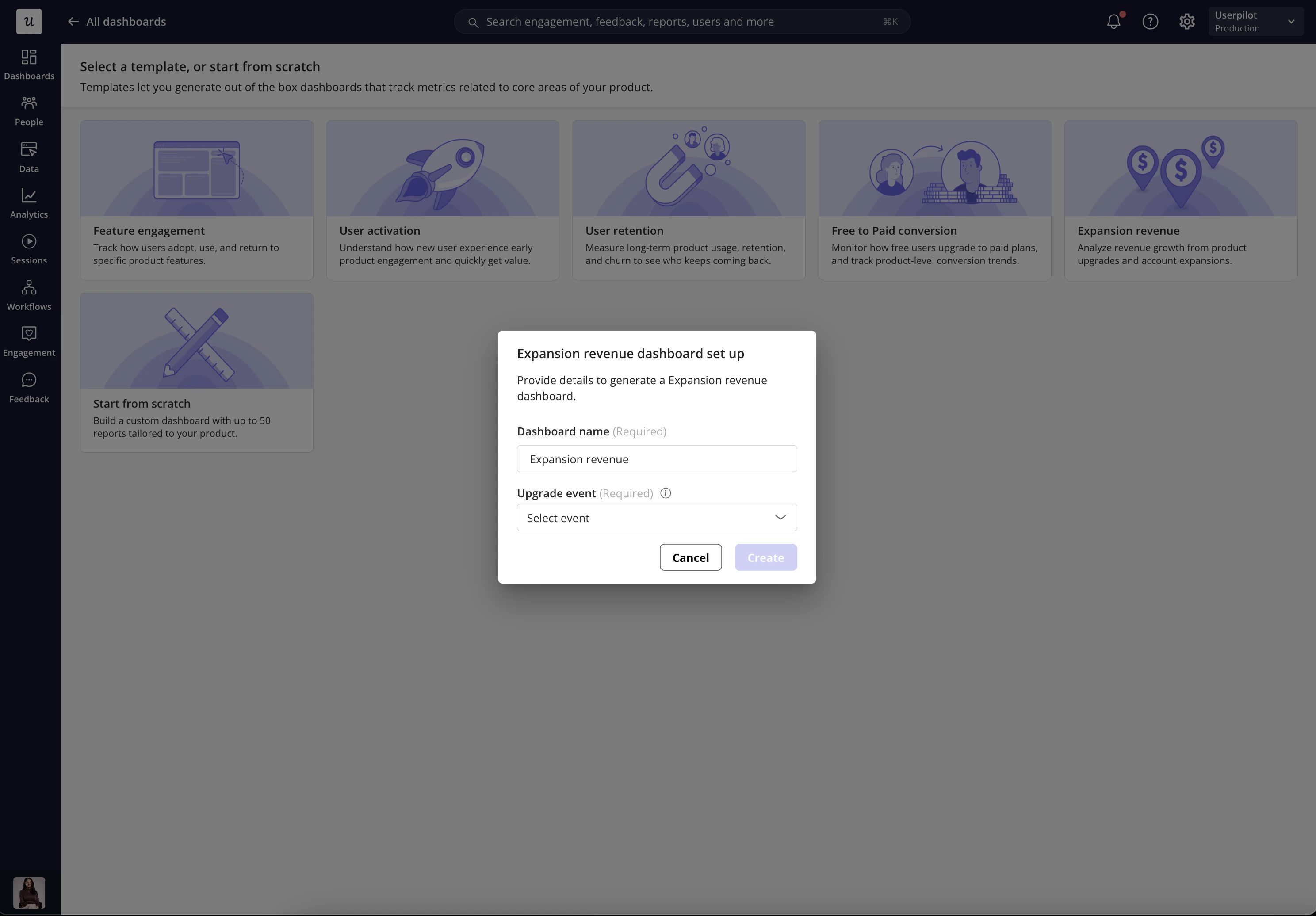
- Complete the setup details in the pop-up
- Click Create
Dashboard setup fields
- Dashboard name
Enter the name of your dashboard. This name is displayed as the dashboard title after creation. You can edit the title later from the dashboard page.
- Upgrade event
Select the event that represents the moment when a customer upgrades their existing plan. This event is used as the main anchor for the dashboard reports, including upgrade count, upgrade trends, and pre/post-upgrade behavior analysis.
Report groups and report purposes
The Expansion Revenue Dashboard is organized into two main report groups:
- Upgrades
- Upgrade Behavior
These reports help you move from high-level upgrade performance to deeper behavioral analysis.
- Upgrades
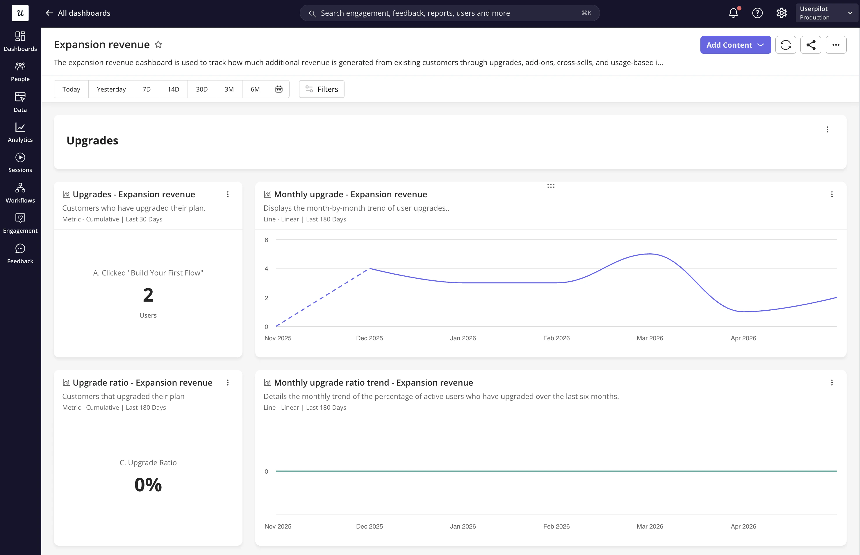
The Upgrades section helps you understand how many customers upgraded, how upgrade volume changes over time, and what percentage of users are upgrading.
Shows the number of customers who upgraded their plan during the selected period. Use this report to quickly understand how many users or customers reached the selected upgrade event.
Shows the month-by-month trend of user upgrades. Use this report to monitor upgrade growth over time and identify months where expansion increased, declined, or remained stable.
This can help you connect upgrade changes to product launches, pricing changes, onboarding improvements, campaigns, or sales and customer success initiatives.
Shows the percentage of active users who upgraded their plan. Use this report to understand upgrade performance relative to the size of your active user base, not just the total number of upgrades.
This is useful when upgrade volume alone does not tell the full story. For example, upgrades may increase because the active user base grew, while the actual upgrade ratio stayed flat.
- Monthly upgrade ratio trend
Shows the monthly trend of the percentage of active users who upgraded over time. Use this report to understand whether a higher or lower share of users are upgrading month over month.
This helps you evaluate whether your expansion motion is becoming more effective, even when total user volume changes.
- Upgrade Behavior
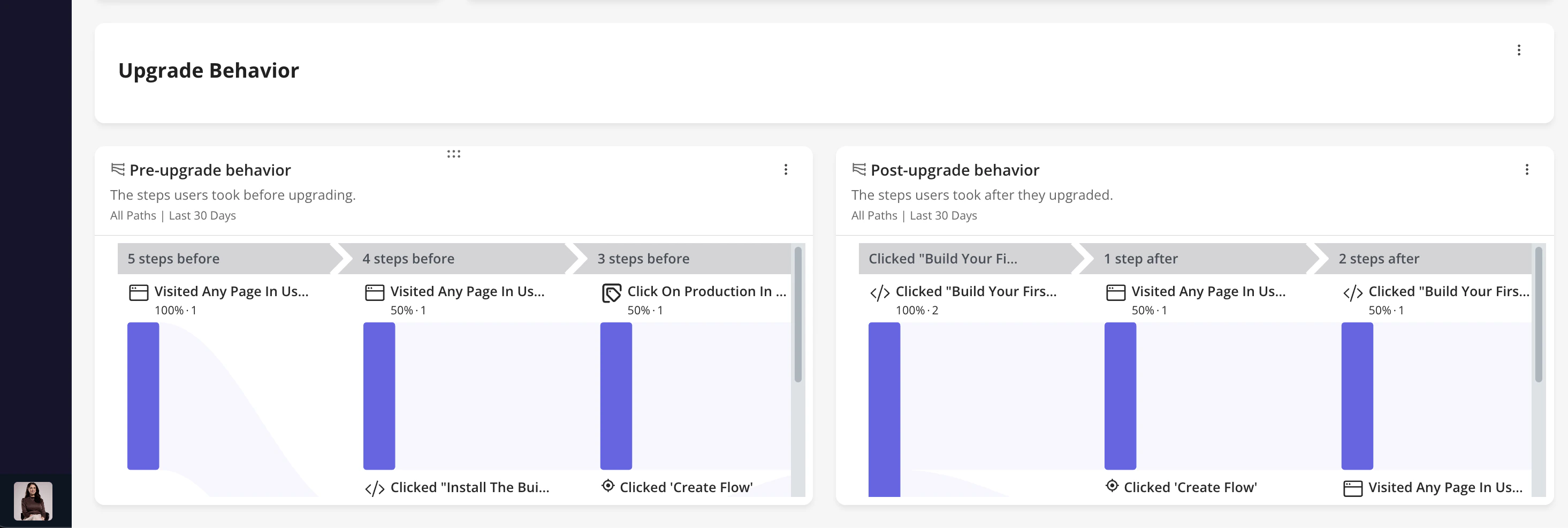
The Upgrade Behavior section helps you understand what users do before and after upgrading.
Shows the steps users took before upgrading. This report uses the selected upgrade event as the anchor, then looks backward at the previous steps users completed before upgrading.
Use this report to understand:
-
Which actions commonly happen before an upgrade
-
Which product behaviors may influence expansion
-
Where users may drop off before upgrading
-
Which parts of the product journey could be improved to encourage upgrades
-
Post-upgrade behavior
Shows the steps users took after they upgraded. This report uses the selected upgrade event as the anchor, then looks forward at the next actions users completed after upgrading.
Use this report to understand:
- What customers do immediately after upgrading
- Whether upgraded customers start using higher-value features
- Whether users need guidance after upgrading
- Which actions may indicate successful expansion adoption
Report card behavior
Each report card is designed to support quick exploration and deeper analysis.
The report title is clickable and opens the detailed report view. Users can also reorder reports using drag and drop, allowing them to personalize the dashboard based on their workflow and priorities.
For Trend, Funnel, and Retention reports, a table view icon is available. When clicked, it shows a breakdown table for the selected events.
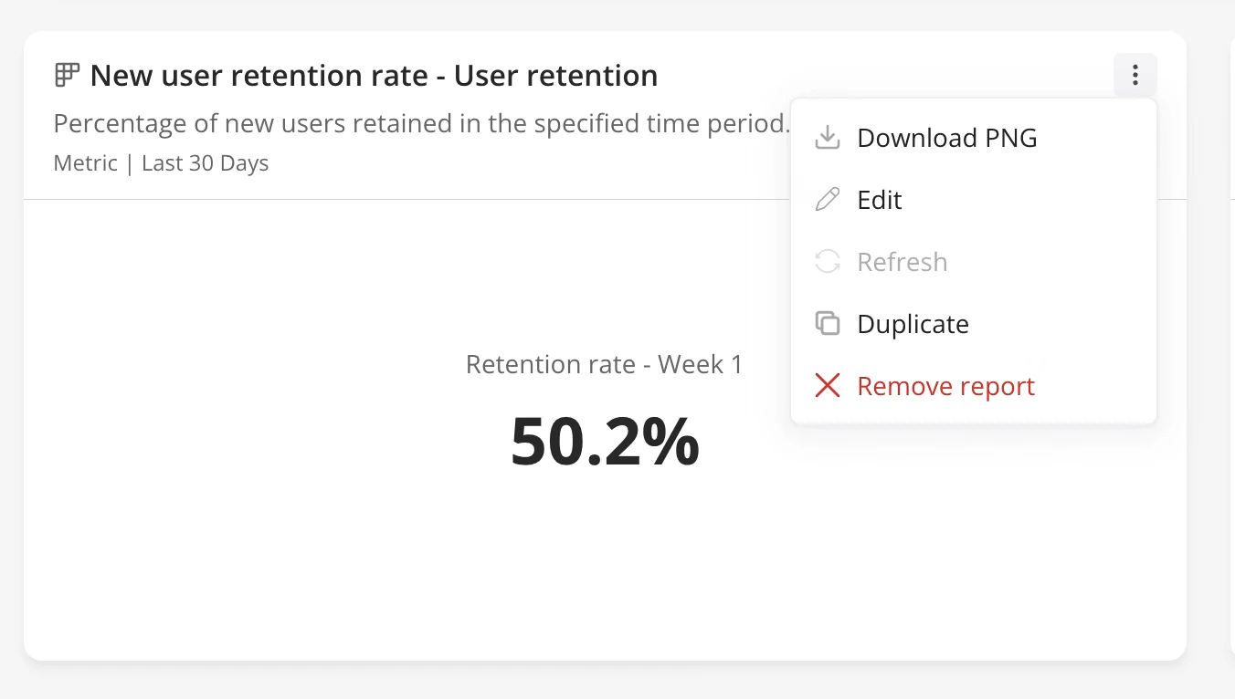
Each report action menu includes:
- Download as PNG
- Edit
- Refresh
- Duplicate
- Remove report
Dashboard actions
Within the header, you can:
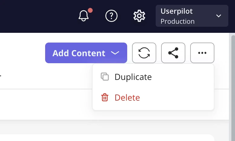
- Add content: You can add an existing report to the dashboard or create a new report and add it directly.
- Share: Use the three dots in the top-right corner to share the dashboard via email with teammates.
- Refresh: Click the refresh icon in the top-right corner to update the dashboard data (available every 10 minutes).
- Action menu: Duplicate and delete.
Dashboard filters
- Add filters: Narrow the dashboard data to focus on a specific group of users by applying user properties, company properties, or segments.
- Time period: Select a specific time range for the data displayed in the dashboard.
- Platform (Mobile only): If Mobile is enabled in your account, choose to display data from all platforms, web only, or mobile only.